The Know It All Guide To Color Psychology In Marketing

 In marketing, color is an emotional cue.
In an ocean of marketing, color can help your marketing stand out.
Color is what gets your audience to see what you want them to see, feel what you want them to feel, and do what you want them to do. Which hues you choose can also affect usability and whether the content is readable or not. This is what makes understanding color psychology so important for the success of your content.
Poor color choice can also negatively change the impact of your message. Get it wrong, and your great content and your amazing call to action will be easily ignored.
Even NASA is concerned about color; enough so that they provide free online resources to help non-designers choose just the right shades.
After reading this post, you'll understand basic color theory and psychology. Plus, we've included a free hex color chart to make picking the right colors easy with any design tool.
Ready to become an expert? Let's jump in!
In marketing, color is an emotional cue.
In an ocean of marketing, color can help your marketing stand out.
Color is what gets your audience to see what you want them to see, feel what you want them to feel, and do what you want them to do. Which hues you choose can also affect usability and whether the content is readable or not. This is what makes understanding color psychology so important for the success of your content.
Poor color choice can also negatively change the impact of your message. Get it wrong, and your great content and your amazing call to action will be easily ignored.
Even NASA is concerned about color; enough so that they provide free online resources to help non-designers choose just the right shades.
After reading this post, you'll understand basic color theory and psychology. Plus, we've included a free hex color chart to make picking the right colors easy with any design tool.
Ready to become an expert? Let's jump in!
The Basics Of Color Theory For Marketing
Understanding how color works isn't just for artists dipping their hands into paint and pigments all day long. Anyone in marketing should understand the basics of color theory because no matter what, you are using color in your content.
Primary Color
Primary colors are the three colors that make all other colors. They are red, blue, and yellow. These three colors can be used to create the next level of colors, called the secondary colors.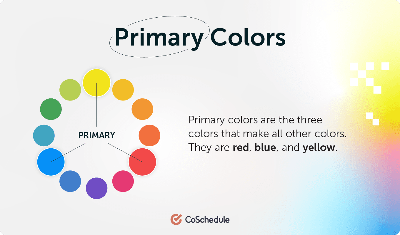 Exceptions, of course, abound when it comes to talking about primary colors.
- If you're talking color theory in regards to light, your primary colors would be cyan, magenta, and yellow.
- Let's not forget CMYK for print and RGB for screens or monitors.
- And, when mixing paint, it matters what particular pigment you're using to get that red in order to come up with the proper new color.
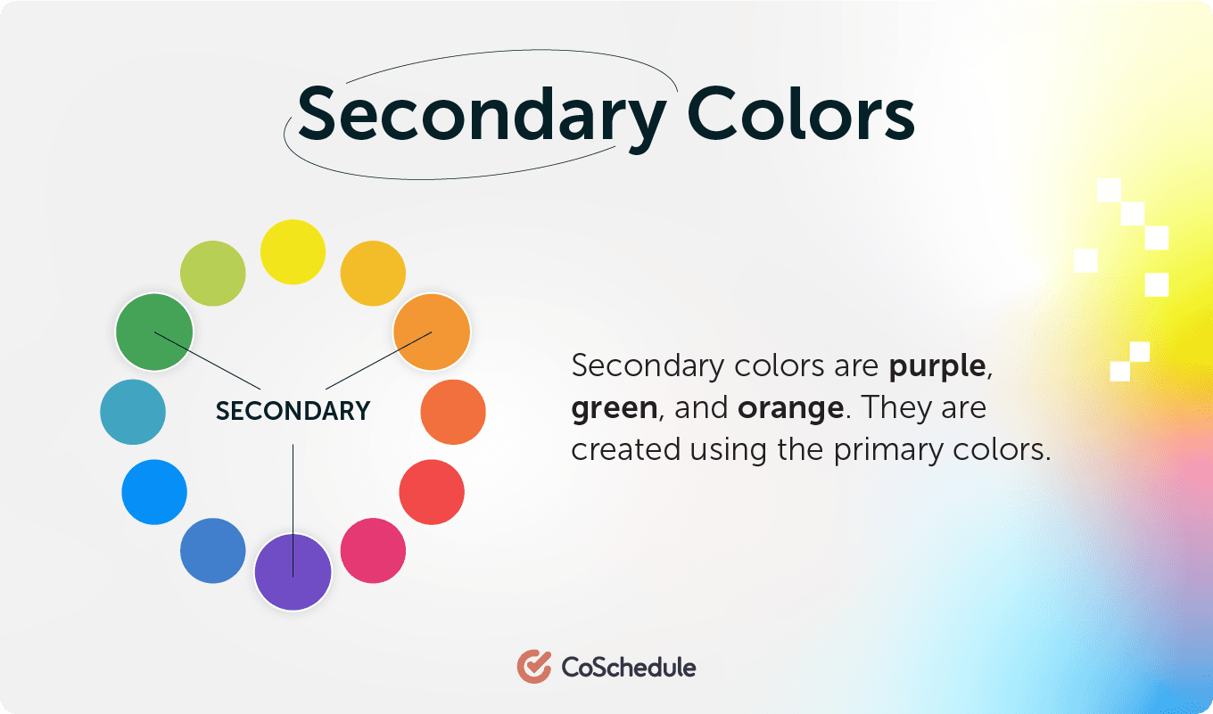
Secondary Color
Secondary colors are purple, green, and orange. They are created using the primary colors. If you look on the color wheel, you'll find the secondary colors in between two primary colors. Color Guide:- red + blue = purple
- blue + yellow = green
- red + yellow = orange
Tertiary Color
Tertiary colors take secondary colors one step further. They are the "two-name" colors, such as red-purple, red-orange, yellow-green, etc. They are created by adding more of one primary color than the other creating not a true secondary color. It ends up being closer to the primary color.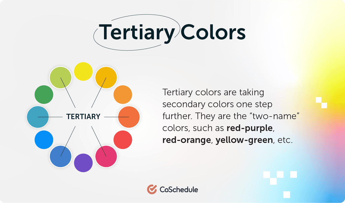
Pure Color
Primary, secondary, and tertiary colors, without the addition of white, black, or a third color, are pure (or saturated) colors. They are intense, bright, cheery, and untainted colors. These are the colors of children's toys, daycare decor, and summer clothes.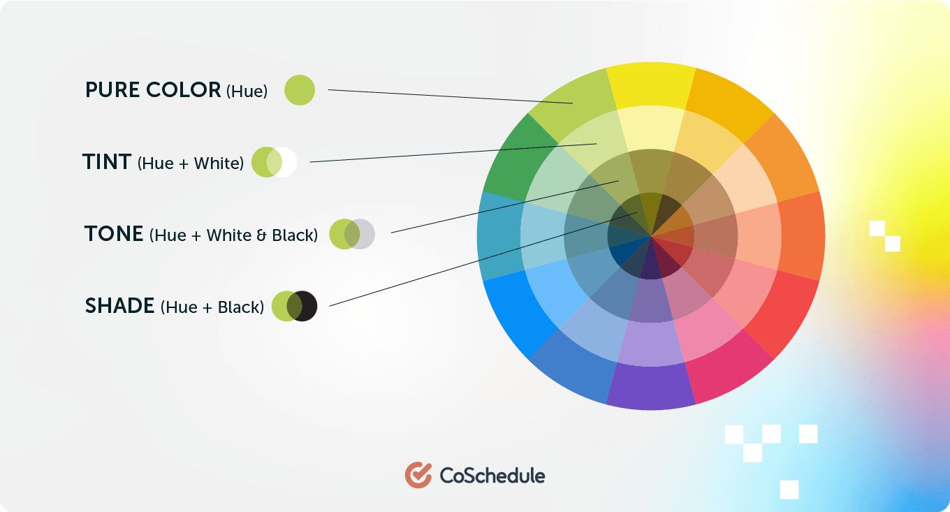
Tints
When white is added to a pure color, you get a tint. Some people refer to these as pastel colors. They are lighter and paler than a pure color, and not as intense. Tints range from slightly whiter to almost-white.Shades
When black is added to a pure color, you create a shade. These darken and dull the brightness of pure colors, and range from slightly darker to almost black.Tones
When gray (black + white) is added to a pure color, you create a tone. You often hear people saying that a color needs to be "toned down", meaning it's too intense and they want to drop the level of intensity. Adding black and white in different amounts to a color subdues the intensity quickly.The Completed Color Wheel
Whew! So there we have it: a complete color wheel with primary, secondary, and tertiary colors, plus their tints, shades, and tones. You can see how it all fits together on the color wheel below.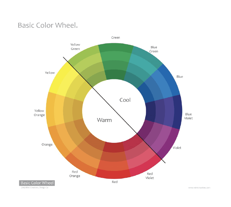 Cool colors are all on the left side of the color wheel, in the blues and greens. The warm colors are all on the right side of the wheel, in the yellows and reds.
Now that you understand color theory and the color wheel, you can start to use color purposefully in your marketing.
Cool colors are all on the left side of the color wheel, in the blues and greens. The warm colors are all on the right side of the wheel, in the yellows and reds.
Now that you understand color theory and the color wheel, you can start to use color purposefully in your marketing.
The Psychology of Colors in Marketing
Color is an essential tool because it has an impact on how we think and behave. Color directs our eye where to look, what to do, and how to interpret something. It puts content into context. It helps us decide what's important and what's not.
That's precisely why, as a marketer, it’s helpful for your career to understand what colors mean to people.
While color psychology has been studied and analyzed over time, the psychological impact of color is still moderately subjective.
We don't all react the same way to colors, as we all have previous experiences with colors from significant events, cultures, people, and memories. However, there are a few generalities about how people respond to color, and that's what we're going to look at.
The Color Psychology of Red
 Red is a primary color.
Red is a very powerful, dynamic color that reflects our physical needs whether to show affection and love, or to portray terror, fear, and survival. Red is also a very energizing color that can portray friendliness and strength, but can also be demanding and show aggression depending on its context.
Overall, if you're looking to have a really powerful presence or get someone's attention fast, red is your go-to color, with research from Atom.com highlighting that 37% of consumers consider red the most exciting color. Just remember to use it sparingly to avoid the extreme negative reactions it can so easily awaken.
Red is commonly seen: Stop lights, Valentine's Day, and horror films.
Red is a primary color.
Red is a very powerful, dynamic color that reflects our physical needs whether to show affection and love, or to portray terror, fear, and survival. Red is also a very energizing color that can portray friendliness and strength, but can also be demanding and show aggression depending on its context.
Overall, if you're looking to have a really powerful presence or get someone's attention fast, red is your go-to color, with research from Atom.com highlighting that 37% of consumers consider red the most exciting color. Just remember to use it sparingly to avoid the extreme negative reactions it can so easily awaken.
Red is commonly seen: Stop lights, Valentine's Day, and horror films.
Using The Color Red In Marketing FAQs
What are the psychological effects of the color red? Researchers Kuniecki, Pilarczyck, and Wichary found that red prompts strong warning signals and can even increase our mind’s reaction time. It also carries strong emotional charges. What brands use the color red in their marketing? Companies with red branding might want to convey passion, like Target and Coca-Cola. It’s also useful for standing out among other products, another reason Coca-Cola chose it. What does the color red do to your mood? Red has been associated with anger, love, passion, and aggression.The Color Psychology of Blue
 Blue is a primary color.
Blue is known for its trust and dependability. It's reliable, responsible, and mentally soothing. For that reason alone, it's one of the most-liked colors across the entire world.
Unlike red, blue lends a more mental reaction rather than physical that allows us to destress, calm down, and think of the most ideal situation. Unfortunately, it also is one of the last colors to be seen, and can be perceived as distant, cold, or unfriendly if used it great amounts.
Overall, blue is a well-liked color that can bring a sense of calmness and trust when building relationships, especially in marketing.
Blue is commonly seen: Workout facilities, hospitals, and spas.
Blue is a primary color.
Blue is known for its trust and dependability. It's reliable, responsible, and mentally soothing. For that reason alone, it's one of the most-liked colors across the entire world.
Unlike red, blue lends a more mental reaction rather than physical that allows us to destress, calm down, and think of the most ideal situation. Unfortunately, it also is one of the last colors to be seen, and can be perceived as distant, cold, or unfriendly if used it great amounts.
Overall, blue is a well-liked color that can bring a sense of calmness and trust when building relationships, especially in marketing.
Blue is commonly seen: Workout facilities, hospitals, and spas.
Using The Color Blue In Marketing FAQs
What are the psychological effects of the color blue? Blue promotes calm and relaxation, along with helping people feel trusting. Some suggest it’s related to blue’s prevalence in nature, like skies and water. What brands use the color blue in their marketing? Blue is one of the most common brand colors, especially in the technology and finance spaces where trust is paramount. For example, IBM, HP, Dell, Merrill Lynch, and Barclays all use it. What does the color blue do to your mood? Blue can make us feel calm, relaxed, and safe.The Color Psychology of Yellow
 Yellow is a primary color.
Yellow is the epitome of joy, happiness, cheerfulness, optimism—you name it. Anything happy is almost always yellow. The wavelength of yellow is particularly long, making it have one of the most powerful psychological meanings while also being the easiest color to visibly see. (Did you know yellow is the first color infants respond to?)
Whenever you need to lift someone's spirits, increase their confidence, or provide inspiration, use yellow. However, avoid using yellow too much because it's also known to make us more critical, causing self-esteem issues, fear, or anxiety. Find the right balance of yellow to motivate rather than bring others down.
Yellow is commonly seen: Traffic crossings and signs, smiley faces, and window-front displays.
Yellow is a primary color.
Yellow is the epitome of joy, happiness, cheerfulness, optimism—you name it. Anything happy is almost always yellow. The wavelength of yellow is particularly long, making it have one of the most powerful psychological meanings while also being the easiest color to visibly see. (Did you know yellow is the first color infants respond to?)
Whenever you need to lift someone's spirits, increase their confidence, or provide inspiration, use yellow. However, avoid using yellow too much because it's also known to make us more critical, causing self-esteem issues, fear, or anxiety. Find the right balance of yellow to motivate rather than bring others down.
Yellow is commonly seen: Traffic crossings and signs, smiley faces, and window-front displays.
Using The Color Yellow In Marketing FAQs
What are the psychological effects of the color yellow? Yellow carries the strongest emotional charge of the different colors associated with playfulness, happiness, and humor. What brands use the color yellow in their marketing? Hertz, Post-It, and Nikon are some brands that use yellow as their main color. It’s also common for food companies like McDonald’s, Denny’s, or Lay’s to pair it with red. What does the color yellow do to your mood? Yellow can be energizing, helping someone feel happy or optimistic.The Color Psychology of Orange
 Orange has a very interesting psychological meaning as it combines red's power and energy with yellow's friendliness and fun. The mix makes orange a good representation of physical comfort in our warmth, food, and shelter. (It even stimulates our appetite, so watch out if you're hungry!)
Orange is also known to be a color of motivation, which lends a positive attitude and general enthusiasm for life. Overall, orange is great for bringing comfort in tough times and creating a sense of fun or freedom in your visuals.
Orange is commonly seen: Fruits, sporting events, and board games.
Orange has a very interesting psychological meaning as it combines red's power and energy with yellow's friendliness and fun. The mix makes orange a good representation of physical comfort in our warmth, food, and shelter. (It even stimulates our appetite, so watch out if you're hungry!)
Orange is also known to be a color of motivation, which lends a positive attitude and general enthusiasm for life. Overall, orange is great for bringing comfort in tough times and creating a sense of fun or freedom in your visuals.
Orange is commonly seen: Fruits, sporting events, and board games.
Using The Color Orange In Marketing FAQs
What are the psychological effects of the color orange? Similarly to yellow, orange can be energizing, promoting excitement, enthusiasm, and joy. It’s also attention-getting, which can be used for either focus or distraction. What brands use the color orange in their marketing? Some brands known for their orange branding include Amazon, Nickelodeon, and Home Depot. What does the color orange do to your mood? Orange can make one’s mood more enthusiastic, happy, or excited.The Color Psychology of Green
 Green is a color of balance and harmony. It lends us a clearer sense of right from wrong since green incorporates a balance of both the logical and emotional. Green is one of the most-seen colors in nature, reflecting life, rest, and peace. It is also a sign of growth, whether that's in a physical object like plants or in our income and wealth.
Overall, if you're looking to portray health, rest, and relieve stress, green is your color. While green does have minor negative aspects like over-possession and materialism, it has a more positive effect than most other colors.
Green is commonly seen: Nature, economic exchange, health-based stores, and restaurants.
Green is a color of balance and harmony. It lends us a clearer sense of right from wrong since green incorporates a balance of both the logical and emotional. Green is one of the most-seen colors in nature, reflecting life, rest, and peace. It is also a sign of growth, whether that's in a physical object like plants or in our income and wealth.
Overall, if you're looking to portray health, rest, and relieve stress, green is your color. While green does have minor negative aspects like over-possession and materialism, it has a more positive effect than most other colors.
Green is commonly seen: Nature, economic exchange, health-based stores, and restaurants.
Using The Color Green In Marketing FAQs
What are the psychological effects of the color green? Like blue, green’s ties to nature helps promote calm, relaxation, and stress relief. It can also increase motivation and be associated with freshness and sustainability. What brands use the color green in their marketing? Brands leaning into green’s relaxation effects include Starbucks and Spotify. Those using green as part of a “natural” brand include Whole Foods and The Body Shop. What does the color green do to your mood? Green can make your mood more optimistic, peaceful, or calm.The Color Psychology of Purple
 Purple is most commonly known for its imagination and spirituality. It possesses the energy and power of red with the stability and reliability of blue, making it a perfect balance between the physical and spiritual. Purple is often used to show luxury, loyalty, courage, mystery, and magic.
It's a very intriguing color as it soothes but also presents space for mystery and new ideas. This is why creativity is most often associated with the color purple. When using purple, avoid using it too often as it can also cause too much introspection or distraction as thoughts begin to wander.
Purple is commonly seen: Magic shows, fairy tales, and luxury products.
Purple is most commonly known for its imagination and spirituality. It possesses the energy and power of red with the stability and reliability of blue, making it a perfect balance between the physical and spiritual. Purple is often used to show luxury, loyalty, courage, mystery, and magic.
It's a very intriguing color as it soothes but also presents space for mystery and new ideas. This is why creativity is most often associated with the color purple. When using purple, avoid using it too often as it can also cause too much introspection or distraction as thoughts begin to wander.
Purple is commonly seen: Magic shows, fairy tales, and luxury products.
Using The Color Purple In Marketing FAQs
What are the psychological effects of the color purple? Purple has been associated with spirituality, royalty, and elegance. It also has ties to imagination and mystery. What brands use the color purple in their marketing? Some brands with purple branding include Hallmark, Cadbury, and Roku. What does the color purple do to your mood? Purple can make you feel more creative, confident, and brave because of its connotations.The Color Psychology of Pink
 Pink is a softer, less intense version of red that creates a sense of compassion and unconditional love. While it's a very physical color, it soothes rather than stimulates, making it a perfect color for caring, understanding, and nurturing those in need.
Pink is a sign of hope. It is also known to be very romantic as it shows empathy and sensitivity. If too much pink is used, it can be very draining, show a lack of power, and even be immature. Overall, pink can be a great counter-option to the color red when used appropriately.
Pink is commonly seen: Cancer patients, little kid objects, and bathroom products.
Pink is a softer, less intense version of red that creates a sense of compassion and unconditional love. While it's a very physical color, it soothes rather than stimulates, making it a perfect color for caring, understanding, and nurturing those in need.
Pink is a sign of hope. It is also known to be very romantic as it shows empathy and sensitivity. If too much pink is used, it can be very draining, show a lack of power, and even be immature. Overall, pink can be a great counter-option to the color red when used appropriately.
Pink is commonly seen: Cancer patients, little kid objects, and bathroom products.
Using The Color Pink In Marketing FAQs
What are the psychological effects of the color pink? Pink’s been observed to have a calming effect that can reduce feelings of aggression. It’s also associated with love and romance. What brands use the color pink in their marketing? A lot of companies with feminine branding, like Barbie, Cosmopolitan, and Victoria’s Secret, use pink in their marketing. Others include Lyft and T-Mobile. What does the color pink do to your mood? Pink can make you calmer, more loving, and less aggressive.The Color Psychology of Brown
 Brown, while maybe not the most visually stimulating color, is a great sign of structure, security, and protection. Whether it's family, friends, or material possessions, brown offers constant support.
It's also a very serious, down-to-earth color you can use where black might be too intense. The downfall to brown is that it's the safest color and can seem reserved, scheduled, and boring. Overall, use it when necessary, but don't depend on it too heavily.
Brown is commonly seen: Campgrounds, home furnishings, and coffee shops.
Brown, while maybe not the most visually stimulating color, is a great sign of structure, security, and protection. Whether it's family, friends, or material possessions, brown offers constant support.
It's also a very serious, down-to-earth color you can use where black might be too intense. The downfall to brown is that it's the safest color and can seem reserved, scheduled, and boring. Overall, use it when necessary, but don't depend on it too heavily.
Brown is commonly seen: Campgrounds, home furnishings, and coffee shops.
Using The Color Brown In Marketing FAQs
What are the psychological effects of the color brown? Brown can create a sense of earthiness, stability, and structure. What brands use the color brown in their marketing? Several chocolate brands like M&M’s and Hershey’s use chocolate to call to mind the product. Others like UPS may use it for its psychological effects. What does the color brown do to your mood? Brown can make you feel safer or more secure, but it may also bring to mind feelings of isolation.The Color Psychology of Gold
 Gold has quite a few different meanings depending on your culture. Across the world, though, gold consistently represents some variation of charm, confidence, luxury, and treasure. It also can have an element of friendliness, abundance, and prosperity that is naturally attractive. Too much gold, however, can seem egotistical, proud, and self-righteous. Similar to colors like brown and black, try to use gold more sparingly to highlight rather than be the main attraction.
Gold is commonly seen: Luxury products, rings, and trophies.
Gold has quite a few different meanings depending on your culture. Across the world, though, gold consistently represents some variation of charm, confidence, luxury, and treasure. It also can have an element of friendliness, abundance, and prosperity that is naturally attractive. Too much gold, however, can seem egotistical, proud, and self-righteous. Similar to colors like brown and black, try to use gold more sparingly to highlight rather than be the main attraction.
Gold is commonly seen: Luxury products, rings, and trophies.
Using The Color Gold In Marketing FAQs
What are the psychological effects of the color gold? Gold is associated with wealth, prosperity, and success due to connections with the rare material the color comes from. What brands use the color gold in their marketing? Brands that want to invoke status or luxury, like Dolce & Gabbana and Porsche, use gold in their marketing. Lindt also uses it as a way to seem more luxurious than other chocolates. What does the color gold do to your mood? Gold can make you feel successful and motivated.The Color Psychology of Black
 Source
Black is a color of sophistication, seriousness, control, and independence. Although, it can also be used to show evil, mystery, depression, and even death. Black is a very reserved color that completely lacks any light as its an absence of all the colors. It likes to stay hidden, in control, and separate from others. For this reason, black is a great color for high contrast and easy legibility. Unfortunately, since it's a very powerful color, too much black can cause sadness and overall negativity, so use it sparingly and in your text more so than the visuals themselves.
Black is commonly seen: Professional attire, luxury products, and limos.
Source
Black is a color of sophistication, seriousness, control, and independence. Although, it can also be used to show evil, mystery, depression, and even death. Black is a very reserved color that completely lacks any light as its an absence of all the colors. It likes to stay hidden, in control, and separate from others. For this reason, black is a great color for high contrast and easy legibility. Unfortunately, since it's a very powerful color, too much black can cause sadness and overall negativity, so use it sparingly and in your text more so than the visuals themselves.
Black is commonly seen: Professional attire, luxury products, and limos.
Using The Color Black In Marketing FAQs
What are the psychological effects of the color black? With implications of darkness, black observed to evoke mystery, fear, and absence. What brands use the color black in their marketing? Sports brands like Adidas, Nike, and Asos all use black in their marketing, likely for the connotations of power. Apple, HBO, and ABC also use it. What does the color black do to your mood? The color black can make you feel powerful, mysterious, and grounded.The Color Psychology of White
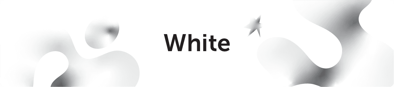 White is a color that is complete and pure, making it a perfect example of purity, innocence, cleanliness, and peace. White can also represent new beginnings, providing a blank slate, and giving refreshment for new ideas. Since white has an equal balance of all the colors, it can exemplify several meanings, with equality outweighing them all. White is a great color for simplicity, cleanliness, and idea creation; however, avoid using too much white as it can cause isolation, loneliness, and emptiness.
White is commonly seen: Weddings, website backgrounds, and doctor's waiting rooms.
White is a color that is complete and pure, making it a perfect example of purity, innocence, cleanliness, and peace. White can also represent new beginnings, providing a blank slate, and giving refreshment for new ideas. Since white has an equal balance of all the colors, it can exemplify several meanings, with equality outweighing them all. White is a great color for simplicity, cleanliness, and idea creation; however, avoid using too much white as it can cause isolation, loneliness, and emptiness.
White is commonly seen: Weddings, website backgrounds, and doctor's waiting rooms.
Using The Color White In Marketing FAQs
What are the psychological effects of the color white? White often represents purity, cleanliness, and simplicity. What brands use the color white in their marketing? White is often used in marketing as a secondary or contrast color, for example, in the cases of Coca-Cola and Facebook pairing it with red and blue. What does the color white do to your mood? White can make your mood more optimistic and refreshed.Color Contrast In Marketing Collateral
When it comes to color techniques, the use of contrast is particularly important, and it's probably the one that will lead you to butt heads with your designer the most.
Contrast is how one color stands apart from another. It's what makes text or objects distinguishable from the background. High contrast is when colors easily stand apart from each other. Low contrast is when they don't.
 Often, people assume a difference in color is what creates contrast, but that's not true. You might have two colors that are completely different but have no contrast at all because their tone is the same. To test out your color's contrast, turn them into grayscale and review their contrast.
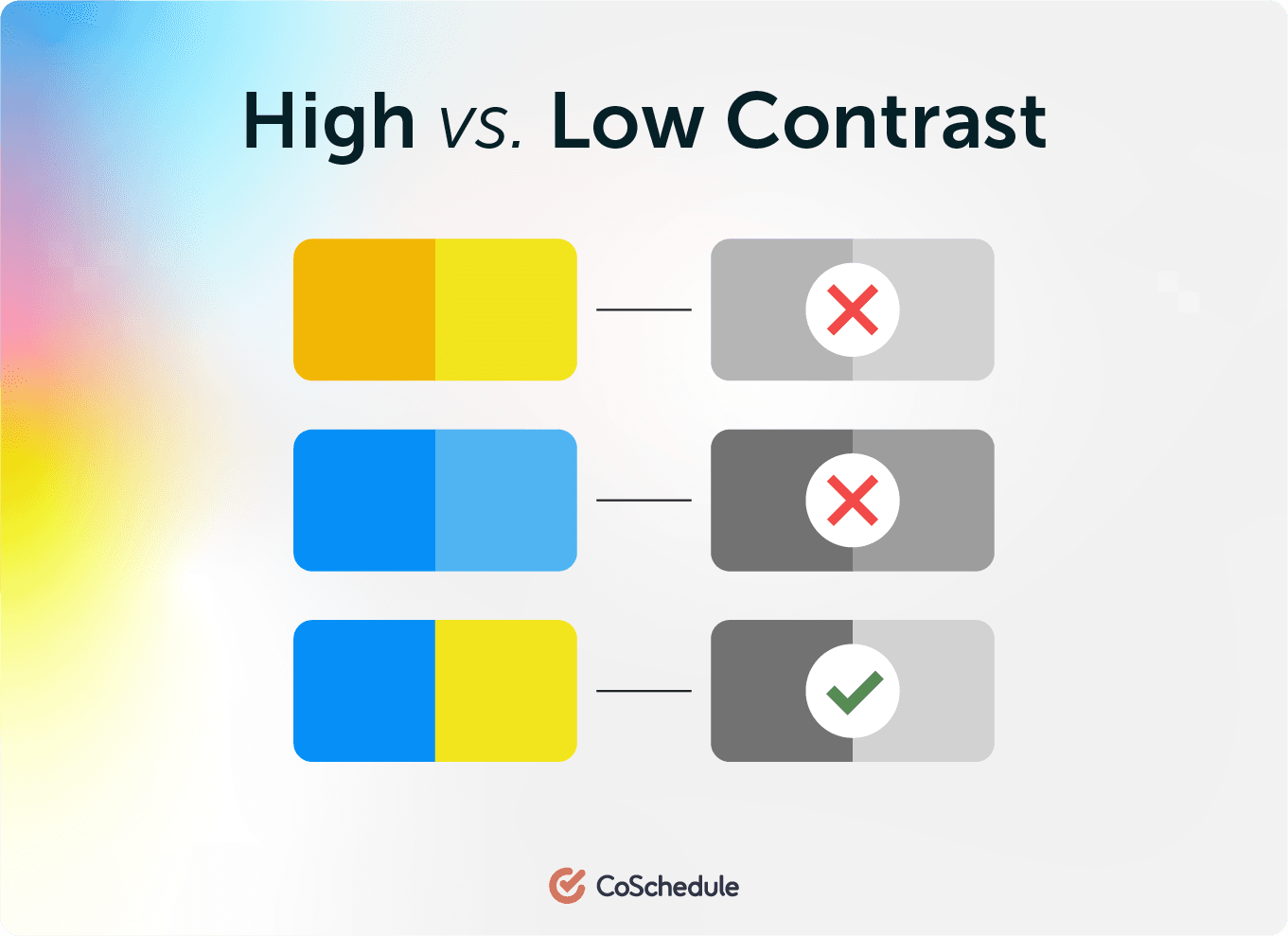 Colors, in their pure form, have inherent differences in how light and dark they are.
Yellow is bright, for example, while blue is darker. Yellow and orange have little contrast with each other, despite being different colors. When different colors have the same tone (level of gray, as you just learned), they will not have much contrast, either. It isn't enough to simply pick two different colors when making decisions about contrast.
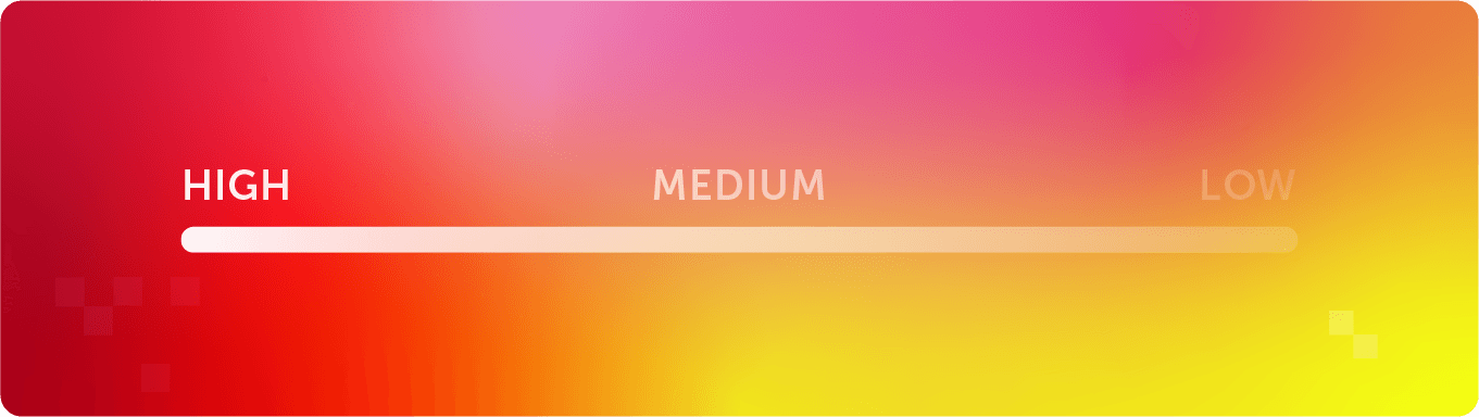
What is high contrast color?
High contrast color is when multiple colors are easy to distinguish between, both between the individual colors and between the colors and background.
What is medium contrast color?
Medium contrast color occurs when the tone of two or more colors can be differentiated, but not easily.
What is low contrast color?
Low contrast color is when a palette and its surrounding colors have a similar or the same tone.
Colors, in their pure form, have inherent differences in how light and dark they are.
Yellow is bright, for example, while blue is darker. Yellow and orange have little contrast with each other, despite being different colors. When different colors have the same tone (level of gray, as you just learned), they will not have much contrast, either. It isn't enough to simply pick two different colors when making decisions about contrast.
What is high contrast color?
High contrast color is when multiple colors are easy to distinguish between, both between the individual colors and between the colors and background.
What is medium contrast color?
Medium contrast color occurs when the tone of two or more colors can be differentiated, but not easily.
What is low contrast color?
Low contrast color is when a palette and its surrounding colors have a similar or the same tone.
Using High & Low Contrast
Generally, high contrast is the best choice for important content because it is most easily seen. Dark on light or light on dark–it's the easiest to read. It might not be exciting, but it is readable. One word of caution, though: If everything is high contrast, nothing stands out, and it's tiring on the eye after a while. (e.g., Think of black computer screens with bright green text.) Designers often prefer low contrast techniques. They like to make things look beautiful, but beauty isn't always the best for readability. Tone-on-tone similar colored combinations are very popular, and while their subtlety is quite attractive, they are also difficult for people to read. Pro Tip: Try to find the balance between beautiful color schemes and legibility for optimal clarity in your visuals. In order to use similar colors while getting the contrast you desire, create a color scheme with both complementary and analogous colors. What's that? Let's keep reading!Choosing Color Combinations For Marketing
The color wheel can help you choose great color combinations for your call-to-action button, your infographics, and your lead collection pop-up.
Keeping your color combinations simple will help you in the long run.
A study from the University of Toronto showed how people using Adobe Kuler revealed most people preferred simple color combinations that relied on only 2 to 3 favorite colors.
People like simplicity; it makes your content easier to understand if they don't have to interpret it through many colors. And remember, color has meaning, so each color adds or takes away from your message.
Too many colors make for a confusing message. So how do you choose those 2 or 3 colors? The color wheel can help.
Using Complementary (Opposite) Colors
Complementary color combinations make things stand out. Complementary colors are "opposite" colors. They are opposite of each other on the color wheel, meaning the one color they lack is the one opposite of them. They are geographically and color-wise the opposite and provide a kind of visual tension because they are so opposed to each other. You might even notice that some of your favorite sports teams use complementary colors. From football to hockey, opposite colors are used for some great color combinations. Blue is the opposite of orange. Red is the opposite of green. Yellow is the opposite of purple. Opposites attract!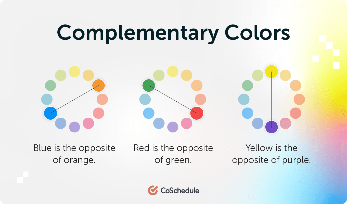 When the human eye sees a painting full of different kinds of greens, any bit of red is going to stand out amazingly well. Why?
Because red is the opposite color of green. When the eye has been looking at a lot of the same color, it wants to see the opposite for a visual break. Using complementary colors is the easiest way to get something to stand out. Use them with caution to keep your content from being too visually jarring.
You don't want 50% orange and 50% blue because neither color wins, and it causes distress to the eyes.
Pro Tip: pick a primary color as your main color, and then accent it with its complementary color for more of a 7:3 ratio. This provides a beautiful color pairing but also lets your eyes break on the opposite color.
When the human eye sees a painting full of different kinds of greens, any bit of red is going to stand out amazingly well. Why?
Because red is the opposite color of green. When the eye has been looking at a lot of the same color, it wants to see the opposite for a visual break. Using complementary colors is the easiest way to get something to stand out. Use them with caution to keep your content from being too visually jarring.
You don't want 50% orange and 50% blue because neither color wins, and it causes distress to the eyes.
Pro Tip: pick a primary color as your main color, and then accent it with its complementary color for more of a 7:3 ratio. This provides a beautiful color pairing but also lets your eyes break on the opposite color.
Caution: Addressing Color Blindness
A quick word of caution: Red and green, two complementary colors, present a sticky problem. Some people have color blindness and cannot distinguish between certain colors, and red and green are a common problematic combination. Colors with heavy amounts of red and green in them get bungled up, too. Did you know that Facebook is blue because Mark Zuckerberg is red-green colorblind? He sees blues the best.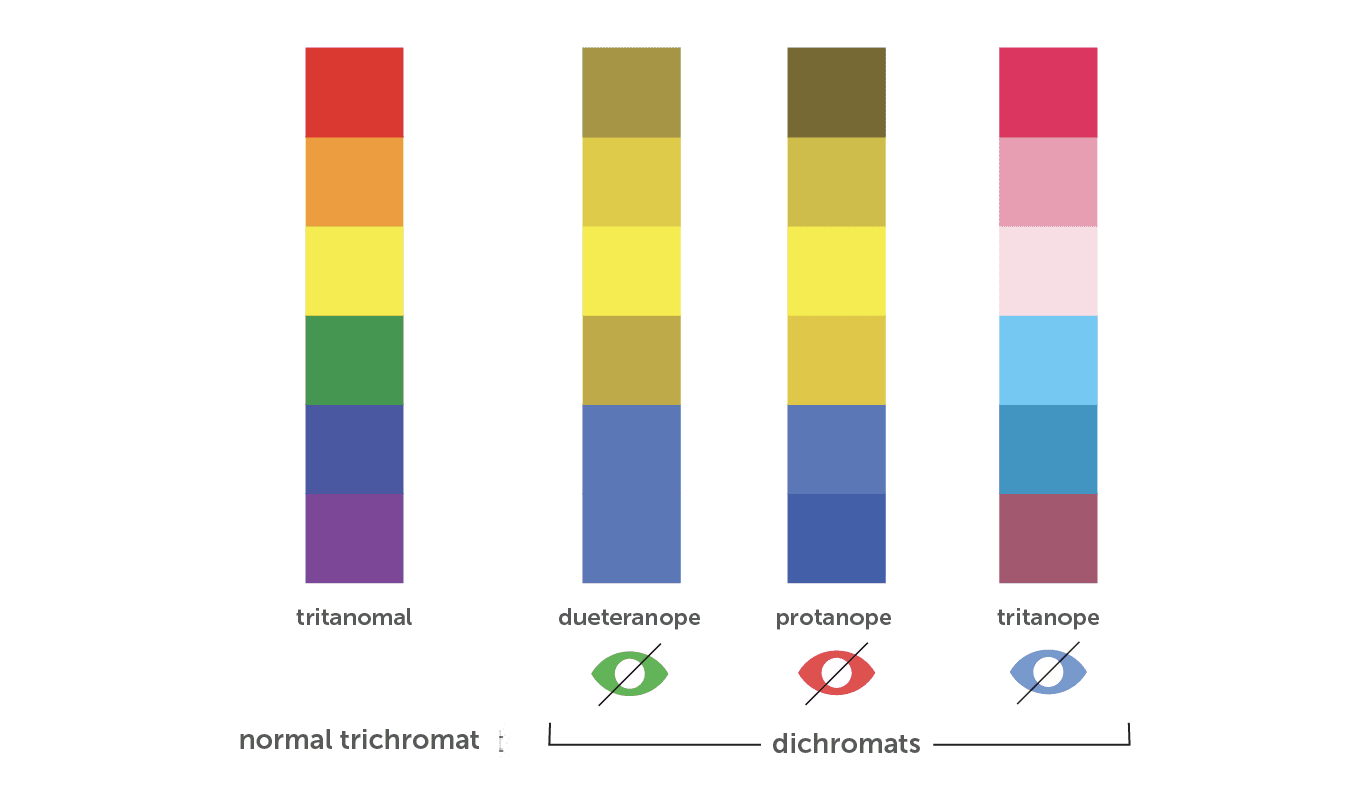 The above example shows the three types of color blindness: Deuteranope, protanope, and tritanope. Similar to Mark, who sees blue best, it's no wonder why blue is one of the more popular colors as it stretches even beyond color blindness.
To help with color blindness when using complementary colors, remember there must be high contrast. Try to never use a color solely as the information source. Include text in graphs and infographics whenever possible as well.
High contrast and additional text will ensure that even when color blindness is present, your visuals will be both readable and enjoyable to see.
The above example shows the three types of color blindness: Deuteranope, protanope, and tritanope. Similar to Mark, who sees blue best, it's no wonder why blue is one of the more popular colors as it stretches even beyond color blindness.
To help with color blindness when using complementary colors, remember there must be high contrast. Try to never use a color solely as the information source. Include text in graphs and infographics whenever possible as well.
High contrast and additional text will ensure that even when color blindness is present, your visuals will be both readable and enjoyable to see.
Using Split Complementary Colors
If you want to use three colors instead of just two, using split complementary color schemes is a way to capitalize on the power of complementary colors but add a third color to your palette. To use split complementary colors, you'll choose one color as your base color and then the two colors adjacent to its opposite. For example, if we decided to choose green as our main color, we'd look across the color wheel for its complementary color, red. Then, look at the two colors directly beside it. Now, we have green, red-orange, and red-purple for a perfect split complementary color scheme.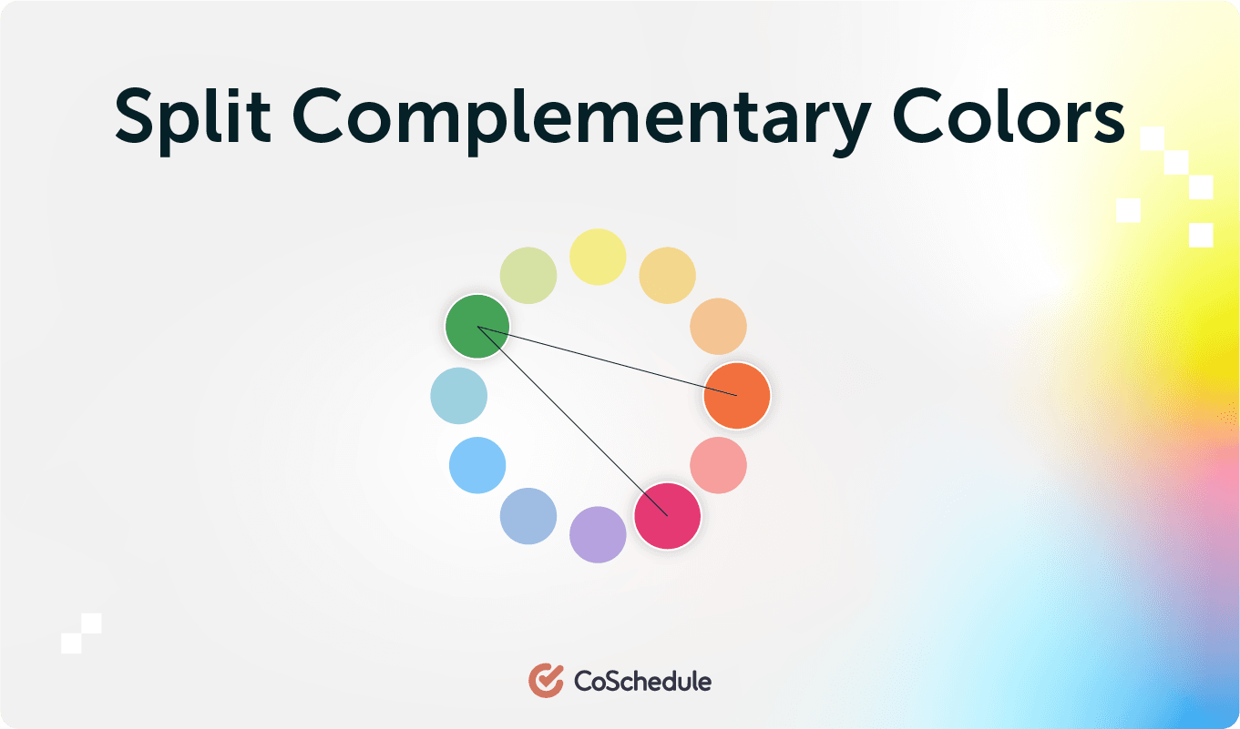 A split complementary color scheme doesn't have quite the same level of tension that a complementary color scheme does, but it's still visually exciting for your eye. It also adds a level of variety to your color scheme that can be used in a very dynamic, meaningful way.
Using Analogous Colors
Analogous colors sit next to each other on the color wheel. They are "related," a kind of family of colors that creates pleasing and relaxed visuals. They aren't jarring, opposite, or clashing. They also don't stand out from one another. Analogous colors can create subtle and beautiful content, but you may need to add a complementary color to get any particular item to stand out.Using Monochromatic Colors
Monochromatic colors are a single color, with its tints, shades, and tones. They are even more soft and subtle than analogous colors since it's a color palette based on one single color. Monochromatic colors work great when paired with a single complementary color. On the CoSchedule website, we use monochromatic blue colors with orange for the content we want to get noticed. Most marketing designers—when using complementary colors—pair a rich collection of monochromatic colors with a single complementary color.Using Triangle, Rectangle, & Square Colors
It isn't difficult to create color combinations that stretch the boundaries of the easy power of complementary opposites and the related analogous and monochromatic palettes. All you need is a triangle, a rectangle, and a square.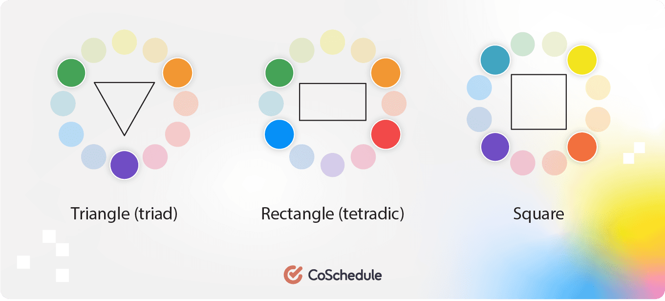
- A triangle (triad) is a color combination made of three colors that are evenly spaced around the color wheel.
- A rectangle (tetradic) is a color combination made of four colors that are made up of two complementary pairs.
- A square is similar to a rectangle palette, but the two sets of complementary pairs are colors evenly spaced around the circle.
More Scientific Findings of Color
Bright Colors
Faber Birren, a 20th-century color researcher and author of Color Psychology And Color Therapy, discovered something interesting about general color groups. He found that bright light and bright colors promoted "big muscle" activity, while softer and deeper colors promoted mental and visual tasks better. He also discovered that red stimulates our nervous system while blue relaxes it. Red and related colors also caused people to overestimate the passage of time while cooler colors like green and blue were the reverse. That means that:- Bright colors promote physical activity but make the passage of time seem slower.
- Cooler and softer colors are better for mental activity and make the time seem to fly by.
Cultural Color
Color also means different things in different cultures. According to researcher Joe Hallock, "Inuits use 17 words for white as applied to different snow conditions, where in the Northwest United States there are only 4 or 5." Every culture understands a color differently. It has a role to play in religion, politics, ceremony, and art. The culture your audience is in affects how they understand deeper meanings of color. Even the context you use the color in affects the meaning of color. For example, in India, red means purity, while in the U.S., it denotes passion and specific holidays.Word Connections To Color
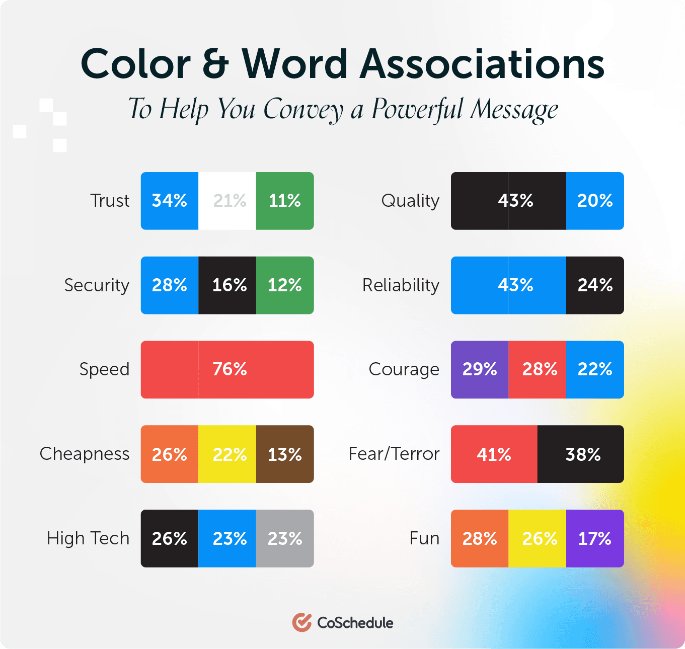
In a survey, people were asked to choose the color they associated with particular words.- Trust: Most chose the color blue (34%), followed by white (21%) and green (11%)
- Security: Blue came out on top (28%), followed by black (16%) and green (12%)
- Speed: Red was overwhelmingly the favorite (76%)
- Cheapness: Orange came first (26%), followed by yellow (22%) and brown (13%)
- High Quality: Black was the clear winner (43%), then blue (20%)
- High Tech: This was almost evenly split, with black the top choice (26%) and blue and gray second (both 23%)
- Reliability: Blue was the top choice (43%), followed by black (24%)
- Courage: Most chose purple (29%), then red (28%), and finally blue (22%)
- Fear/Terror: Red came in first (41%) followed by black (38%)
- Fun: Orange was the top choice (28%), followed closely by yellow (26%) and then purple (17%)
 Blue is clearly a color people are positively drawn to, but beyond that, little else can be said.
Depending upon the context of the rest of your content, black can mean high quality and trust, or it can mean fear and terror. It can't do it on its own, but surrounded by your content, a color choice can bump up your intended meaning a notch.
Blue is clearly a color people are positively drawn to, but beyond that, little else can be said.
Depending upon the context of the rest of your content, black can mean high quality and trust, or it can mean fear and terror. It can't do it on its own, but surrounded by your content, a color choice can bump up your intended meaning a notch.
Preferred Colors By Gender
Compiling the results of many studies, the Kissmetrics blog came up with an excellent infographic on how men and women experience and react to color differently. Men and women have different color preferences.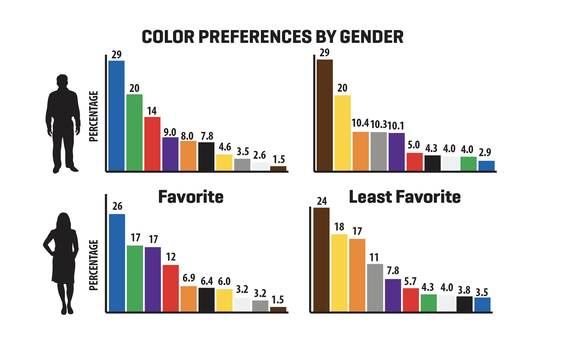 According to both the Kissmetrics blog and Hallock:
- Blue is the favored color by both men (57%) and women (35%), though it is more heavily favored by men.
- Men dislike brown the most while women dislike orange the most.
- Colors that were disliked were also seen as "cheap."
- Men tolerate achromatic colors (i.e., shades of gray) better.
- Women preferred tints while men preferred pure or shaded colors.
- A majority of men (56%) and women (76%) preferred cool colors in general.
- Orange and yellow grow increasingly disliked as both genders get older.
Mood Colors And Emotions (Infographic)
There are a few generalized understandings of what specific colors often mean to a large cross-section of people, with each color having negative and positive emotions associated with it.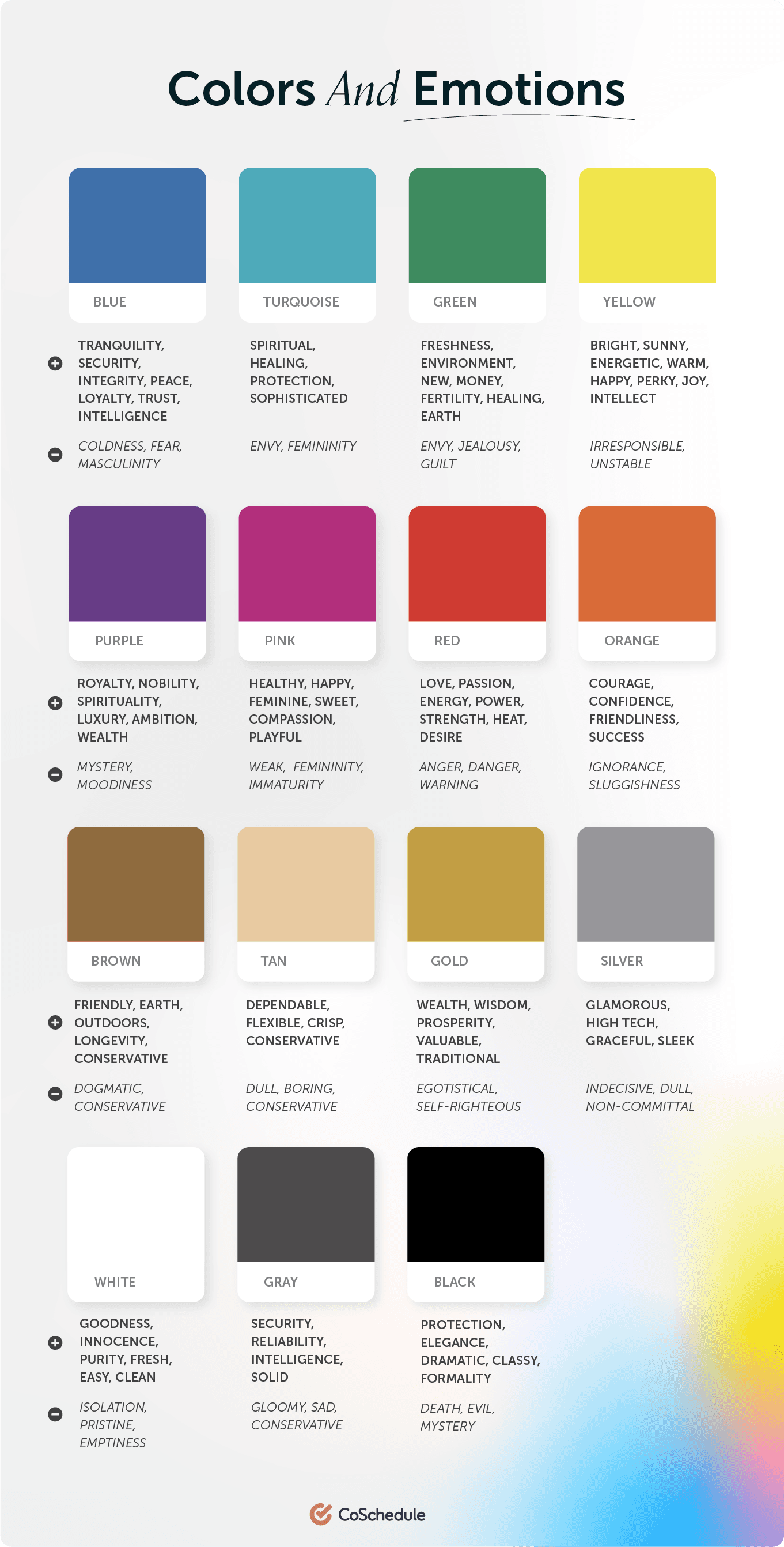 The cooler colors displayed in the top row evoke emotions related to peace, spirituality, and happiness but also have less desirable negative connotations.
Warmer, red-based colors elicit bold emotions like passion, power, ambition, and courage.
Brown-based colors signify earthiness and being grounded.
Finally, black, gray, and white are all associated with safety, security, and protection.
The cooler colors displayed in the top row evoke emotions related to peace, spirituality, and happiness but also have less desirable negative connotations.
Warmer, red-based colors elicit bold emotions like passion, power, ambition, and courage.
Brown-based colors signify earthiness and being grounded.
Finally, black, gray, and white are all associated with safety, security, and protection.
Color & Brand Recognition
How people behave when they see color has a direct effect on your conversions. Will they click the button on your CTA? Will they read your pop-up graphic? Will they notice your email subscription box? According to the Institute for Color Research, people make a judgment about your content in 90 seconds or less. And, up to 90% of that judgment in that brief amount of time is influenced by the colors they see. Blogger Neil Patel gives further proof of how colors affect your conversion rate, revealing that 85% of consumers base buying decisions on color and that full-color ads in magazines get recognized 26% more often than plain old black and white ads. In fact, color helps people recognize your brand by up to 80%. It's important to choose your color carefully and stick with it. Source
When it comes to getting people to click a button or sign up, it's not a question of which color is magic and makes it happen all the time. It's a question of passive and active colors, of high and low contrasts, and of opposites, like our CoSchedule example where the orange button stood out from the blue.
And it's a question of which color tested best for you.
Recommended Reading: How To Create A Marketing Strategy That Will Skyrocket Your Results By 9,360%
Source
When it comes to getting people to click a button or sign up, it's not a question of which color is magic and makes it happen all the time. It's a question of passive and active colors, of high and low contrasts, and of opposites, like our CoSchedule example where the orange button stood out from the blue.
And it's a question of which color tested best for you.
Recommended Reading: How To Create A Marketing Strategy That Will Skyrocket Your Results By 9,360%
Testing Your Best Colors: A CoSchedule Case Study
The color combination of orange and blue is a powerful one. It's fairly safe with respect to color blindness and repeatedly gets favorable marks by people as a combination.
But is it enough to just pick a great combination?
Not at all; you need to know how to use those colors individually. Let's look at CoSchedule and our Facebook promotions as an example. We've created several designs over the last year, some with blue backgrounds and others with orange backgrounds.
 The promotions with the orange backgrounds consistently made people more likely to click than those with the blue backgrounds! It made sense, though. Think about Facebook. It is a predominantly blue network, and so our orange image stood out more than our blue image did.
This doesn't mean that orange is the color you must use. It means we tested our two colors and found that orange worked the best
It means we tested our two colors and found that orange worked the best for us on Facebook. It might even vary from social network to social network so make sure that you do your own testing.
What worked on Facebook might look different than on Twitter. You need to find out if your red button beats your green button (as Hubspot discovered) on your own. The color of the rest of the page, your content, and the placement of objects will make your results different from what someone else has discovered.
The promotions with the orange backgrounds consistently made people more likely to click than those with the blue backgrounds! It made sense, though. Think about Facebook. It is a predominantly blue network, and so our orange image stood out more than our blue image did.
This doesn't mean that orange is the color you must use. It means we tested our two colors and found that orange worked the best
It means we tested our two colors and found that orange worked the best for us on Facebook. It might even vary from social network to social network so make sure that you do your own testing.
What worked on Facebook might look different than on Twitter. You need to find out if your red button beats your green button (as Hubspot discovered) on your own. The color of the rest of the page, your content, and the placement of objects will make your results different from what someone else has discovered.
Color Psychology In Marketing FAQs
What Are The Most Professional Colors?
Neutrals like black, gray, brown, and white are often considered professional, while blue is also popular in professional settings.What Are The “Nicest” Colors?
Given its association with happiness and energy, yellow is a “nice” color. Pink and orange are also related to friendliness.What Are The “Happiest” Colors?
The happiest colors are ones associated with energy and passion, like yellow, orange, red, and pink.How Do Colors Work?
All light is made up of different wavelengths, and different objects reflect and absorb different wavelengths. The reflected light hits receptors in our eyes, which then signal to our brains the “color” of the object.What Moods Do Colors Create?
- Red: strong, passionate, aggressive
- Blue: trusting, calm, relaxed
- Yellow: happy, optimistic, cheerful
- Orange: motivated, comfortable, enthusiastic
- Green: refreshed, relaxed, motivated
- Purple: spiritual, luxurious, mysterious
- Pink: romantic, empathetic, calm
- Brown: safe, secure, grounded
- Gold: successful, confident, prosperous
- Black: mysterious, fearful, sophisticated
- White: peaceful, refreshed
Now You're A Marketing Color Psychology Expert!
Color, in general, is fascinating to study from both a theoretical and psychological standpoint.
From Newton, Goethe, Itten, Hering, Young-Helmholtz, Birren, and Müller (yes, there have been many theories on color throughout history), the lowly color wheel has been considered and reconsidered again and again. The effect color has on us, and our behavior has been studied repeatedly.
When it comes to choosing colors, you must test. You cannot know how your audience will respond to your colors in your content and layout without creating thoughtful A/B tests to determine which color combinations and placements generate the most leads and traffic in your content.
An earlier draft of this post was written and created by Julie Neidlinger. It was updated on Aug. 29, 2018, by Ashton Hauff. Tim Walker most recently and significantly updated this content in May 2022 and September 2022.


