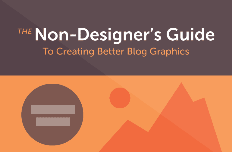
How To Make The Best Blog Graphics (For Non-Designers)

 As bloggers and content marketers, one of your biggest challenges is making sure that your blog posts not only read well, but also look awesome.
You probably know why: Posts with better graphics are easier to read and get more shares.
The problem is that you may not have the budget, nor the skills necessary for creating blog post graphics from scratch. You also like to do things yourself, or just don’t have the means to hire a freelance designer every time you need a new header image for a blog post.
That puts you at a slight disadvantage against your competitors who are already rocking great blog graphics.
The good news is that you can learn to create your own blog post graphics fairly quickly. A handful of dollars in stock graphics, a few hours in Photoshop, and you will be on your way to making your blog look better in no time.
As bloggers and content marketers, one of your biggest challenges is making sure that your blog posts not only read well, but also look awesome.
You probably know why: Posts with better graphics are easier to read and get more shares.
The problem is that you may not have the budget, nor the skills necessary for creating blog post graphics from scratch. You also like to do things yourself, or just don’t have the means to hire a freelance designer every time you need a new header image for a blog post.
That puts you at a slight disadvantage against your competitors who are already rocking great blog graphics.
The good news is that you can learn to create your own blog post graphics fairly quickly. A handful of dollars in stock graphics, a few hours in Photoshop, and you will be on your way to making your blog look better in no time.
How To Make The Best #Blog Graphics (For Non-Designers) via @puranjaycom
Click To Tweet
Why Your Blog Posts Need More Visual Content
Human beings are visual creatures. Our brains process images 60,000 times faster than text. This is a crucial stat for bloggers and content marketers—it means readers are more likely to engage with your visuals than with your words. (Which also explains why infographics tend to be so successful). There are dozens of reasons why you need to add more graphics to your blog posts, but the five most important ones I can think of are:- Higher engagement: Articles with relevant images get 94% more page views than those without.
- Highlight crucial data: In-post graphics are a good way to highlight the most important data points within an article. If there is something you really want your readers to see, you’re better off putting it into a mini infographic than the main post body (especially considering how most visitors read just 20% of a Web page on average).
- Get more shares: Pages with pictures see 50% more shares.
- Create better post structure: In-post graphics are a great way to give better structure to your post by dividing the content into different sections—an oft-ignored benefit.
- More credibility: 67% of consumers consider detailed images to carry even more weight than customer ratings, reviews, and product descriptions.
Recommended Reading: 10 Stunning Examples Of Visual Content Marketing
Now that we know why we need visuals, let’s look at how we can create our own blog graphics.
The Building Blocks Of Awesome Blog Graphics
You don’t need to know a lot to create your own blog graphics. In fact, this article assumes that your design skills don’t extend beyond cropping an image and adding a filter to it in Photoshop (explained below). That said, you can greatly accelerate the graphic-creation process by mastering a few simple Photoshop skills and building up a library of stock graphics that will serve as the ‘building blocks’ for all your visuals. Let’s look at each of these in detail.Essential Photoshop skills to create blog graphics.
You don’t have to master Photoshop to create good looking designs. Being familiar with the interface and understanding a few basic skills will be more than enough. At the very least, you should know the following:- Cropping, resizing and selecting images, or parts of images.
- Layers and how they work.
- Blending modes and Layer blending options.
- Creating simple shapes such as circles, rounded rectangles, etc.
- Using the font tool.
- Importing and using patterns, brushes, and shapes.
- Using grids and guides to lay out individual elements.
There are only 7 things you need to know with Photoshop to create awesome #blog graphics.
Click To TweetChoose your colors.
Color is the non-designer’s Achilles heel. We either use too many colors, or often, too few—neither of which leads to desirable results. “What colors should I use?” is the number one question I get asked by non-designers (and the question I often find asking myself). For answers, follow the two step process below:1. Pick one dominant color.
Take a look at any popular website and you will see one thing in common: They all use a single dominant color everywhere. Facebook has its blue, TechCrunch is green and Snapchat is overwhelmingly yellow. All reports, blog posts, and visuals they put out follow the same color palette. For your own blog graphics, follow the same strategy: Pick one dominant color (ideally, the same as your site color) and use it everywhere. Complement it with lighter variations of the same color when needed. You can always branch out and experiment with more colors of course (it would be a dull world if you couldn’t), but for simplicity’s sake, stick to one dominant color when you’re starting out.Recommended Reading: Why Visual Brand Consistency Is Important
2. For additional colors, use the Google material design color palette.
One of the harder things to understand as an amateur designer is how different colors work with each other and the subtle differences between, say, #FA4B00 and #F04800 (two hexadecimal numbers for different colors). The good news: You don’t have to learn all this on your own. By taking advantage of pre-existing, professional color palettes, you can jump right in and use proven colors in your designs. To start with, use the Google material design color system. These are Google-approved colors for the Android UI. They look good and cover a huge range of colors. If you get tired of your ‘one dominant color’, pick a few shades from this palette and start experimenting.
Pro Tip: Download the palette as a swatch and open it in Photoshop to get immediate access to all colors.
Recommended Reading: Color Psychology In Marketing: The Complete Guide
Pick your fonts.
After color, typography is the most widely misunderstood aspect of design. You’ve probably seen this in action yourself: flyers with Papyrus, memos written entirely in Comic Sans, and websites that use nothing but Times New Roman. Designers can talk for hours about kerning and line height and letter spacing, but as bloggers, we don’t really need all that. Instead, all we need to know is:- What fonts look good.
- How to pick a good font pair.
1. What fonts look good?
Some good fonts are expensive (a single license of a professional font can cost upwards of $200), so I’m going to focus entirely on free fonts for now. Fortunately for us, high-quality free fonts have never been easier to find. Your first stop should be Google Fonts. This free font library will give you access to all the fonts you need. It can be overwhelming at first, so I suggest sticking to these tried and tested fonts, for now: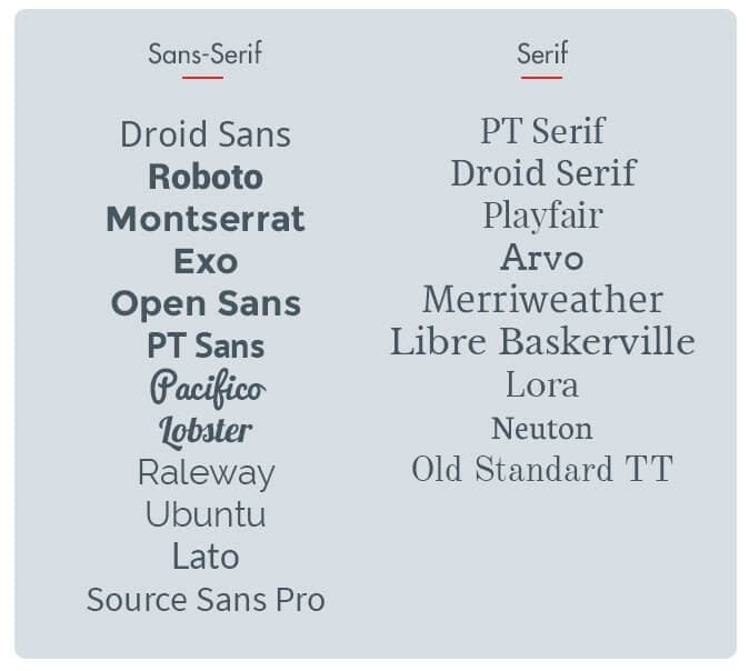 If you need something beyond this selection, stop by Typekit.com and check out the fonts that come pre-loaded with a free account (only 25k pageviews/month though—not for you popular bloggers). Next, check out Typography.com and the nearly weekly giveaways at CreativeMarket.com. If you are willing to splurge, you can also check out some boutique font foundries at FontShop.com.
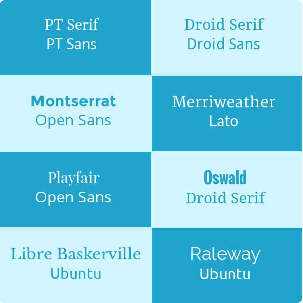
2. How should you pair fonts?
There are two guidelines to pairing fonts:- Fonts from the same family go well together. For obvious reasons, if two fonts are from the same family (say, PT Sans and PT Sans-Serif), they will look good together.
- Combine serif with sans-serif fonts. For optimum results, combine a serif font with a sans-serif font. If your posts are long and wordy, use serif in the body text, sans-serif in the headings. For shorter posts (under 2,000 words—a majority of posts), use sans-serif in the body, serif in headlines.
 For inspiration, install WhatFont extension and see what fonts your favorite websites are using. Wired.com, for instance, uses Exchange, while Buzzfeed uses Proxima Nova for both headings and body text.
Choose your images.
Most bloggers turn to SXC.hu, Pixabay, or any of the countless other stock pictures websites for their image needs. Images here are free and easy to find, but also tend to be low in quality and poor in contextual relevancy. Plus, since they’ve been used by bloggers ad infinitum, they tend to look jaded and overused.Recommended Reading: Should You Use Stock Or Free Images For Blog Posts?
Below, I’ve shared some of my favorite methods to get better images:
1. Buy stock images.
With prices as low as $1/image, you really don’t have an excuse for not taking this route already. The picture quality is far superior and they all look ‘fresh’ to readers since they haven’t been used by every blogger in existence. You also don’t need resolutions wider than 640px for most images, which brings down initial purchase cost as well. If you do plan to modify the image, make sure that the image license permits it. Check out ShutterStock.com, Fotolia.com, BigStock.com, etc. to get started. But what if you don’t have $1 to spare? In that case, use option #2, below.With prices as low as $1/image, you really don’t have an excuse to use great images. #blogging
Click To Tweet2. Use free hero images.
Startups need high quality images to build their sites. Thankfully, a number of designers and photographers have stepped up to the challenge and started offering stunning pictures for free. These are called ‘hero’ images, and for bloggers, they are (largely) untapped goldmines. Here are some sites to get you started: Unsplash.com, DeathToTheStockPhoto.com, LittleVisuals.co, Superfamous.com, and PicJumbo.com. The image quality here is incredible, but you can’t search by keyword, so be prepared to dig deep to find the right image. Some pictures (especially from Unsplash.com) have also been overused by startups. If it looks a little too familiar, it’s probably a good idea to not use it.If a stock photo seems a little familiar, it's best not to use it. #blogging
Click To Tweet3. Try paid hero images.
An alternative to stock image marketplaces is to buy splash or hero images from marketplaces like CreativeMarket. You can either buy images individually, or you can buy image packs of hundreds of images for as low as $10. It's a useful strategy if you want something more exclusive than what Unsplash.com or the others have to offer.Choose your shapes, brushes, patterns, and icons.
Strong colors, bold fonts, and breathtaking stock imagery are good enough to make your blog stand out. But to create blog graphics, you will need a few extra building blocks—namely brushes, patterns, icons, and shapes. You can find thousands of these design elements online on sources both free and paid. The hard part is figuring out what to download, and where to download it.
For a start, grab the following:
1. Patterns.
A clean, subtle pattern can make the most ordinary design pop and sparkle. There are countless websites peddling patterns online, but for the most projects, you don’t need to look beyond SubtlePatterns.com.
Start with the following patterns – Concrete Seamless, Crossword, Stardust, Squared Metal, Notebook, Triangular, and Mooning—and grab more as you learn how to use them.
2. Icons.
You will use icons a lot in your blog graphics, mostly to visualize data and highlight key points. I suggest starting out at IcoMoon.io, then exploring free icon packs such as Line icons, Modern UI icons, 350 Pixel Perfect icons, flat icons, and 3600 flat icons. To get something more exclusive, buy a set of icon packs from CreativeMarket.
3. Brushes, shapes, and vectors.
There is no telling what shapes, vectors, and brushes you will need in your graphics projects. Since our aim is to keep costs low, I suggest grabbing the ones listed below, then buying up separate design elements as needed.
Start with the graphics library at Pixeden.com. Grab virtually all the free stuff you can, then head over to MediaLoot.com, PremiumPixels.com, Brusheezy.com, and GraphicHive.net.
For paid alternatives, check out CreativeMarket.com and GraphicRiver.com. I also suggest buying some credits at a stock marketplace such as VectorStock.com. A contextually relevant vector image can make your designs really stand out.
Also look to grab some of the ‘infographics packs’ at CreativeMarket. You can use elements from these packs to create your own mini-infographics inside posts.
This concludes the basic building blocks of our blog graphics project. Now let’s take a look at some strategies for putting these together to create header images and in-post graphics.
You can find thousands of these design elements online on sources both free and paid. The hard part is figuring out what to download, and where to download it.
For a start, grab the following:
1. Patterns.
A clean, subtle pattern can make the most ordinary design pop and sparkle. There are countless websites peddling patterns online, but for the most projects, you don’t need to look beyond SubtlePatterns.com.
Start with the following patterns – Concrete Seamless, Crossword, Stardust, Squared Metal, Notebook, Triangular, and Mooning—and grab more as you learn how to use them.
2. Icons.
You will use icons a lot in your blog graphics, mostly to visualize data and highlight key points. I suggest starting out at IcoMoon.io, then exploring free icon packs such as Line icons, Modern UI icons, 350 Pixel Perfect icons, flat icons, and 3600 flat icons. To get something more exclusive, buy a set of icon packs from CreativeMarket.
3. Brushes, shapes, and vectors.
There is no telling what shapes, vectors, and brushes you will need in your graphics projects. Since our aim is to keep costs low, I suggest grabbing the ones listed below, then buying up separate design elements as needed.
Start with the graphics library at Pixeden.com. Grab virtually all the free stuff you can, then head over to MediaLoot.com, PremiumPixels.com, Brusheezy.com, and GraphicHive.net.
For paid alternatives, check out CreativeMarket.com and GraphicRiver.com. I also suggest buying some credits at a stock marketplace such as VectorStock.com. A contextually relevant vector image can make your designs really stand out.
Also look to grab some of the ‘infographics packs’ at CreativeMarket. You can use elements from these packs to create your own mini-infographics inside posts.
This concludes the basic building blocks of our blog graphics project. Now let’s take a look at some strategies for putting these together to create header images and in-post graphics.
The Non-Designer's Guide to Creating Better #Blog Graphics
Click To TweetHow to Create Better Blog Graphics
Start with your header images.
Header images are more than just design filler. They give readers a glimpse of your post’s content, and show up in social media. In essence, these are the ‘anchor’ images for your post and offer readers an idea of what to expect not just from a post, but the blog as a whole. It’s easy to get lazy with header images. You might very well be tempted to stick a stock image from SXC.hu on top and call it a day. The problem is that such stock images not only look bad, but they also don’t get as many page views. The alternative: customized header images. Let’s look at a couple of strategies for creating these.1. Use good stock images, add text and a color tint.
One of my favorite ways to create better header images in a jiffy is to use a high-quality stock image, add some text (usually the post title, shortened for clarity) and a color tint, like this: Creating this is easy enough: Grab a picture from Unsplash.com and add some text in a font from the list above. For the color tint, add a color layer in Photoshop, fill it with a color from the Google Material Design color palette, then drag it beneath the base image layer. Change the ‘blend’ mode for the base image to ‘Multiply’, and you’re all set.
2. Add borders, shapes, and different fonts.
Add some complexity to your header image by throwing in some shapes, borders, and font combinations. Try the elegant font + light base color + dark border combination: Or the color gradient + pattern + gradient filled text. In the example below, I’ve used a blue-pink gradient on top of the Triangular pattern fill from SubtlePatterns.com:
 An easy way to make the post title stand out is to enclose it within a shape, like this:
 Another personal favorite is to use a vector graphic against a solid background. Below, I’ve used the ‘camera’ icon from the ET-Line icons set:
 None of these styles are complicated or particularly hard to copy. Try recreating them in Photoshop to get a hang of things.
For further inspiration, see the header image gallery at Canva.com.
None of these styles are complicated or particularly hard to copy. Try recreating them in Photoshop to get a hang of things.
For further inspiration, see the header image gallery at Canva.com.
Create your in-post graphics.
In-post graphics are a wonderful way to give additional structure to your posts and highlight key information. They are also highly sharable. I try to add at least a couple of graphics to all my posts. With a set of existing templates, it often takes less than 10 minutes to create unique graphics for every piece of content.3 things for awesome #blog graphics: what to visualize, how to represent it, find design elements.
Click To Tweet1. Understand what to visualize.
Not every piece of content works well when visualized. For your posts, limit your graphics to:- Easily chartable data (say, a statistic saying that ‘80% of the world’s population owns smartphones’ that can be represented with a pie-chart).
- Quotes.
- Key information, such as a list of must-see sights within a city.
- Data you want readers to share or focus on.
2. Figure out how to best represent it.
Once you know what to visualize, it’s time to figure out how to do it. There are usually many ways to visualize the same information. For example, consider a made-up statistic: “80% of the respondents in a survey prefer Pepsi over Coke.” You could visualize this as a pie-chart: Or do something like this:
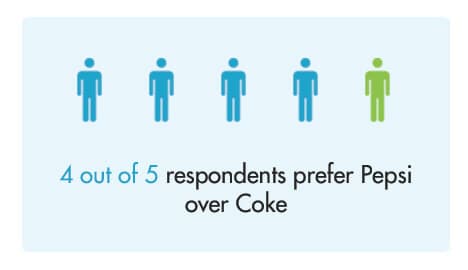 Both ways work, though one may be harder than the other depending on your skills and the size of your design library.
To figure out the how part, ask yourself two questions:
Both ways work, though one may be harder than the other depending on your skills and the size of your design library.
To figure out the how part, ask yourself two questions:
- What is the easiest way for my readers to understand this information?
- What is the easiest way for me to represent this information?
3. Mix and match different design elements.
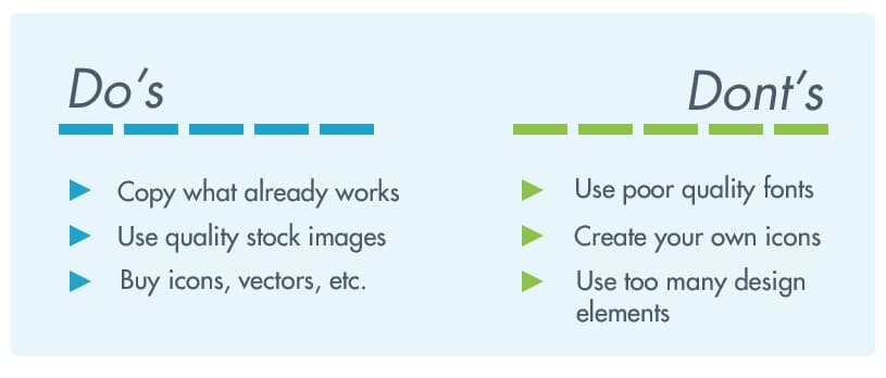
This is where our library of fonts, colors, pictures, and design elements will come in handy. Combine them together in different shapes, sizes, and colors to represent post information visually. I usually have a few stand-by templates for representing different bits of information. For example, for quotes, I find a picture of the original author, add a black and white filter, then throw the quote inside a colorful speech bubble: For Do’s and Don’ts, a simple table works well enough:
 This is a matter of trial and error. The more blog graphics you make, the easier it will be to make them.
It’s also a good idea to copy what others are already doing successfully on their blogs instead of reinventing the wheel.
This is a matter of trial and error. The more blog graphics you make, the easier it will be to make them.
It’s also a good idea to copy what others are already doing successfully on their blogs instead of reinventing the wheel.
3 tips for creating awesome blog graphics.
For non-designers, the idea of creating production-ready blog graphics can be intimidating. Follow these tips to make the process easier, and a bit more enjoyable.1. Keep it simple.
It’s important to remember that you are a blogger, not a designer. Your designs may not look as good as a professional’s. And they don’t have to, either. As long as they get the information across without being aesthetically revolting, you will do fine. Keep this in mind every time you find yourself learning a complicated design trick, or spending too long making things ‘perfect’.Recommended Reading: How To Blog With As Little As Possible
2. Copy what already works.
Being original is wonderful, but as a blogger, your first instinct should be to copy what already works instead of reinventing the wheel. Look at the most successful websites and blogs in your niche. How are they creating their visuals? What tricks can you borrow from them? I like to keep an Evernote notebook filled with design inspiration I can quickly tap into when I’m running out of ideas. I suggest you do the same—it will save you hours of “designer’s block” (which is like writer’s block, but less romanticized).3. Buy what you can’t create.
As a non-designer, you can easily tap into an army of designers to help you with your work. You can either buy their time (through freelancing websites), or licenses to their designs (through marketplaces such as CreativeMarket, GraphicsRiver). This drastically reduces the work you have to do—all you need to do is aggregate design elements instead of creating your own.---
No serious blogger can choose to ignore the visual side of blogging. Learning a few basic Photoshop tricks, buying a handful of design elements, and putting them together can give you the resources you need to take your blog from good to great.