The Content Creator That You’ve Always Wanted Is Here (Plus A Peek At New Features)
 Back in March I started making calls. Tons of them. The recipient?
You.
Since this past April, I’ve talked to more than 100 different CoSchedule customers or potential customers that were trying our product for the first time.
I learned a few things.
- There are a lot of marketing projects, and teams, that need organizing.
- There are even more spreadsheets that still need eliminating.
- There was a lot more that we could do here at CoSchedule to make your life way easier. Like waaaaaaay easier.
 Here are three big changes that roll out today, plus a few amazing new features that are up next.
Change #1: We Hid The Things You Didn’t Need
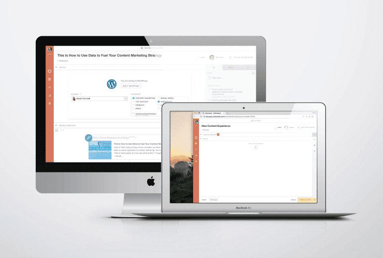
One of the problems we wanted to address was the “clutter” that had taken place in the content creator. As we’ve added new features, we’ve been forced to augment our existing design which wasn’t built to handle all of that power. We’ve made it work, but it’s was ultimately time for something better.CoSchedule is powerful, but that doesn’t mean it needs to look complicated. #ui #redesign
Click To Tweet- Hide things that you didn’t need. A few examples of this include making the Headline Analyzer Studio an optional integration, along with the social queue itself (which has been renamed to Social Campaigns).
- Utilize the entire screen. Our new “full-screen” editing experience on the calendar gives you the space you need to do your best work.
 I think the results speak for themselves. The interface is cleaner, more user-friendly, and better organized around keeping your entire marketing process right on track.
Change #2: We Made CoSchedule Even More Team Friendly
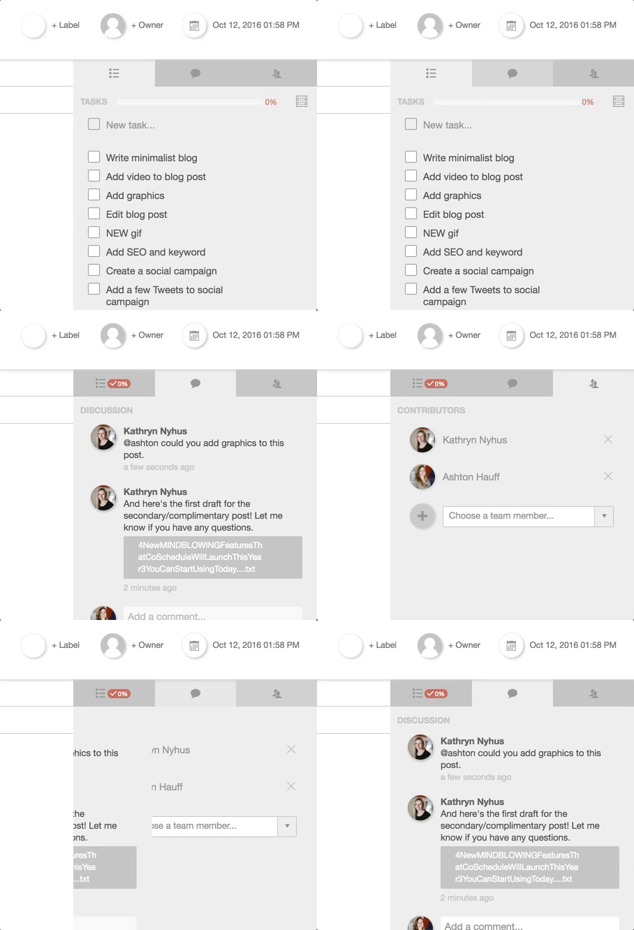
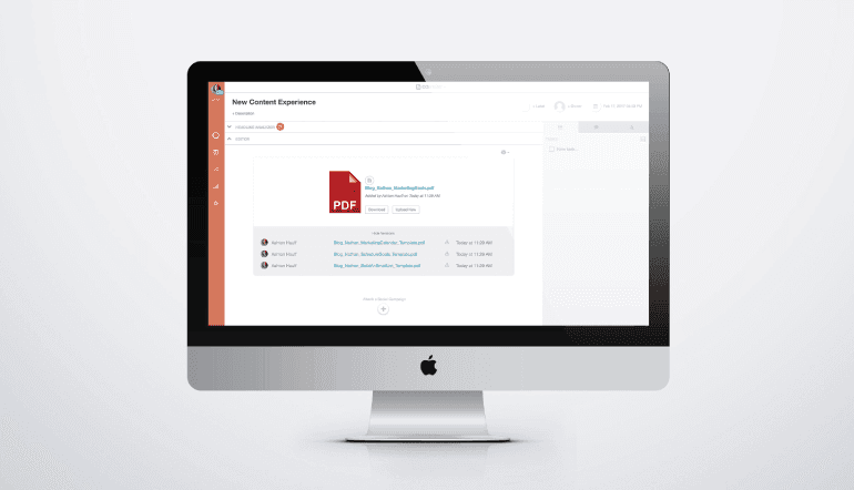
Teamwork is important. To make it easier for teams to work together, we’ve added an all-new sidebar to manage all of your project activity. Tasks, comments, and team contributors are now managed in separate tabs rather than our long long-running lists. This redesign will prevent the excessive scrolling that sometime came with larger projects. Additionally, we’ve introduced some major updates to our task management features such as the addition of unscheduled tasks, drag and drop task sorting, and an all-new “files” tab which will be launching soon.
The new activity sidebar also does a better job of reporting new activity and clearing out older comments and data that are no longer as relevant.
Some of our users have reported that on-boarding new team members to CoSchedule can be a challenge. We hope that these changes start making that process much easier.
Change #3: Make Content Creation Easier
The content editor in CoSchedule has undergone an extreme makeover. First, we’ve completely replaced the built-in text editor with a brand new version. The new editor supports more formatting and is far more reliable than our previous solution. Creating content inside of CoSchedule should now be a seamless experience.
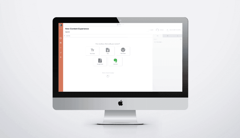
Second, we added some clarity to the editor selection process, which we learned was a regular source of confusion. Now, when you create a new piece of content in CoSchedule you will be asked to select a single editing mode. The options include:
- Our *NEW* built-in text editor
- Google Docs
- Evernote
- WordPress
- File upload (Microsoft Word, images, etc.)
 It’s the best way to bring a real-time like workflow to those tools that aren’t quite real time! Soon, we’ll also be adding support for converting Word Docs into WordPress Blog posts, so be on the lookout for that update.
New to #CoSchedule: File Version Control.
Click To TweetChange #4, #5, #6, and #7: Coming Soon!
We have a lot more in store for our content creator – all based on your suggestions. Here are a few of the things that are up next. Custom Content Types We will be rolling out an update in a few weeks that will allow you to customize the menu you use to add new content to CoSchedule. Fill it up as much or as little as you want. Further down the road we hope to add even more ways to create custom content types as a way to separate your content. Multiple Color Labels This feature will allow you to select multiple color labels for each piece of content you create. This overhaul will also include the ability to add your own custom labels. Tags! Tags! Tags! Wouldn’t it be great if you could add tags to each piece of content you create for further customization? We think so too. Look for this to ship soon. Marketing Projects This feature will allow you to combine several different pieces of content or social campaigns into a single project. With this update you’ll be able to manage even the most complex of marketing projects from CoSchedule. Look for this one early 2017. And More! Of course, there’s a lot more to come that we aren’t ready to share. Please keep your features requests coming as well. We are always on the look out for the next big thing!See #CoSchedule's newly redesigned content creator UX.
Click To Tweet

