What Is The Best Placement For Successful Social Media Buttons?

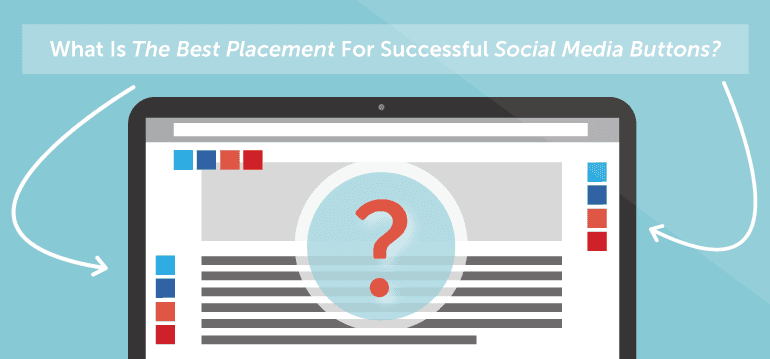 Have you ever wondered where the best place to put social media buttons on your blog is?
If so, you're not alone.
Back when we first added social sharing analytics to CoSchedule over a year ago, I wondered the same thing. There are so many small tweaks that you can make to your blog layout that'll improve conversions and reader experience. Surely, I thought, there has to be a set of best practices for social media buttons as well.
I set out to find all the data on which best influences social sharing on our blog. What I found may actually surprise you. Are you ready to see how you can improve social media sharing on your on blog? If so, read on!
Have you ever wondered where the best place to put social media buttons on your blog is?
If so, you're not alone.
Back when we first added social sharing analytics to CoSchedule over a year ago, I wondered the same thing. There are so many small tweaks that you can make to your blog layout that'll improve conversions and reader experience. Surely, I thought, there has to be a set of best practices for social media buttons as well.
I set out to find all the data on which best influences social sharing on our blog. What I found may actually surprise you. Are you ready to see how you can improve social media sharing on your on blog? If so, read on!
I'm going to improve my #socialmedia button placement to get more social sharing. #blogging
Click To TweetInterested in driving more traffic to your blog from social media?
Check out Actionable Marketing Institute’s Social Media Strategy Certification course. You’ll get 11 premium tutorials & 8 templates to create a results-driven social media strategy that helps grow your blog traffic (and influences other goals). Learn more.
Why Worry About Social Media Buttons?
This is a common question, and the answer is a bit more complicated than it might seem at first. In 2016, social media is as important as ever. However, there is still some debate whether or not social media buttons drive clicks. Part of the reason for that discussion likely derives from how many blogs and sites implement social media buttons ineffectively. It's not entirely fair to judge a design decision that isn't set up for success, but we also don't want to make decisions that can't be supported by accurate data. That's why it's important to make sure you get the design and placement of your buttons correct. It's not enough that your buttons simply look good, or that they are just present somewhere on your pages. They need to be placed where they're going to catch your readers attention and make it easy to share your awesome content with their followers.So Many Options, So Many Opinions
By now, you've probably gathered that there's a lot of chatter about this topic. A quick Google search reveals this discussion at Stack Exchange, which considers whether social media buttons should be placed at the beginning or end of a blog post. Despite all of the discussion, there is little evidence to back those ideas up. Even this conversation over at Moz.com fails to provide solid evidence on the subject. It seems like we may be just guessing. Can't we do better than that? To start digging, I looked at what some of the most common options are. I started with the question, "Where do some of the biggest sites on the web place their social media buttons?" The answer? Everywhere!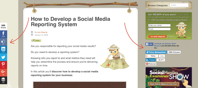
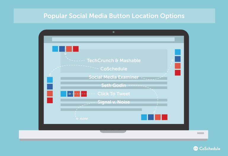
Popular Placement Options For Social Media Buttons:
Top of post - Do users share before they actually read the article? This is one of the most common placement options frequently used by sites like TechCrunch and Mashable.
Left of post - Placing social buttons to the left of the blog post makes a lot of sense, as readers follow text left to right. This is the placement that we use here at CoSchedule.
Right of post - This one surprised me, but it is out there. Social Media Examiner is a good example of a site with this placement.
Bottom of post - Placing social media buttons at the bottom of the post was very common, and the only place you will find social buttons on Seth Godin's blog. Is he missing out on possible shares because of this placement?
In-line of post - A growing trend is to actually place shareable content inline with the rest of your content. We do this regularly on our blog using our Click To Tweet plugin.
No social buttons at all - This is a surprising and growing trend heralded by sites like the Signal v. Noise blog by Basecamp. Are they hurting their chances for viral success? We'll look into this in a minute, but for now, that's the playing field.
Data Point #1: Prominence Matters More Than Placement
Popular social sharing tool AddThis provides some excellent insight on this topic. Their advice to users is as follows:- Pick a prominent position: The more visible the button is the more people will bookmark and share your content, which will lead more traffic back to your site.
- Keep your button near the top of the page: Avoid making your readers scroll to find your sharing button. It is okay to have the button at the top and bottom of the page, but users will find it easier at the top.
- Place the button in close proximity to the content being shared: This helps readers understand what they are sharing.
- Watch out for navigation: Be careful about placing the button too close to navigation, so users don't interact with it by accident.
Data Point #2: Users Interact With The Top Left Side The Most
According to usability icon Jacob Nielson and a study that he conducted in 2006, eyetracking visualizations show that users often read Web pages in an F-shaped pattern: two horizontal stripes followed by a vertical stripe.Readers view your page in an F-style pattern. Keep this in mind when placing #socialmedia buttons. #blogging
Click To TweetData Point #3: Too Many Social Buttons Will Make Things Worse
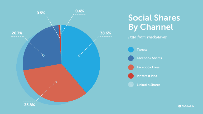
Doug Antkowiak makes a great point about social media buttons on the Search Engine Journal blog. He points out that too many social buttons may negatively impact the speed of your website. This is a big red flag, as site speed has been clearly linked to better readership and SEO performance. The most valuable conclusion that we can draw from this is that we should limit the number of social media buttons that we display to as few as possible. The risks of slowing down our site just isn't worth it. Social media buttons provide one of those situations where more is not necessarily better. The data here continues: After polling 50 of the most popular websites in the world, Webaholic.co.in found that Facebook and Twitter were easily the most-used social media buttons on the web with Linkedin and Google+ also showing strong results. They concluded that the utility of each of those networks fluctuated quite a bit depending on the audience type for each site.
Data Point #4: Under-Used Social Buttons Provide Negative Social Proof
Social proof is a psychological phenomenon where people use the actions of others to guide their own behavior. In essence, it's the psychological term for "monkey see monkey do." As one of our own writers, Julie once pointed out:“Social proof is a shortcut in the thought process. We don’t have to think. The others already did (we assume).”The reality is that social proof plays a big role in social sharing and can make a big impact on the success of social media buttons.
 Negative social proof diminishes the value of the social sharing button.
In a now classic A/B test, Taloon.com (a Finland-based hardware eCommerce store) found that social media buttons were actually hurting their conversion rates.
When they removed the social media buttons from their page, they recorded an 11.9% increase in CTA clickthroughs as compared to the original page. If the results surprise you, you can read more here, but social proof gives us a clear answer for this result.
Because very few people actually “like” product pages, the near zero results on social media buttons were actually providing negative social proof—preventing users from purchasing what they were perceiving as an unpopular product. As Chris Coyer points out on his CSS-Tricks blog, "low numbers can look embarrassing."
Negative social proof diminishes the value of the social sharing button.
In a now classic A/B test, Taloon.com (a Finland-based hardware eCommerce store) found that social media buttons were actually hurting their conversion rates.
When they removed the social media buttons from their page, they recorded an 11.9% increase in CTA clickthroughs as compared to the original page. If the results surprise you, you can read more here, but social proof gives us a clear answer for this result.
Because very few people actually “like” product pages, the near zero results on social media buttons were actually providing negative social proof—preventing users from purchasing what they were perceiving as an unpopular product. As Chris Coyer points out on his CSS-Tricks blog, "low numbers can look embarrassing."
Near zero results on #socialmediabuttons may actually be providing near-negative social proof. #socialmedia #blogging
Click To TweetData Point #5: Social Sharing Buttons Can Bring Traffic
In one of the more complete (but not scientific) studies on the value of social sharing buttons, blogger Joshua Benton concludes that many news organizations receive 20% of their Twitter traffic from Tweet buttons available on their page. That's actually a pretty big deal!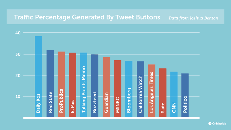 For example, 16.3 percent of tweets to the New York Times in his tests actually came from a Twitter social media button on the site itself. For the Wall Street Journal, the share rate was more like 20.2 percent. Not bad, huh? Social media buttons can help traffic after all.
20.2% of tweets to the #WallStreetJournal actually came from their Twitter share button.
Click To TweetData Point #6: Negative Sentiment Against Social Sharing Buttons Is Gaining Momentum, But Why?
Despite the results from the New York Times and The Wall Street Journal, not all publications have seen the same success. UK blog Inside GOV.UK reported a paltry 0.2% increase in shares after adding social media buttons to their site. While buttons being placed at the bottom of the page couldn't have helped, their results are in line with conclusions developed by Luke Wroblewski, who felt that only 0.25% of Tweets were actually attributable to a social media button after analyzing more than 18 million page views. Others, like Signal v. Noise just prefer the way their site looks and loads without them and believes that if someone wants to share their content, they will find a way. To each their own, of course, but there is definitely some truth in the matter. Just a quick survey around the office concludes that most social sharing takes place outside of the article itself, and can be attributed to a variety of other tools. A few examples of this include:- Buffer Chrome Extensions
- Other Social Browser Extensions
- Feedly, FlipBook, and Other RSS/Content Readers
- Mobile browsers
- And more than we can list
Conclusion: Where Is The Best Place To Put Social Media Buttons On My Blog?
The opinions about social sharing buttons are wide, but often not particularly deep. Reality is, that it just depends on your own blog and audience type. But, being the adventurous sort that I am, I think that we can easily answer this question (at least to find what's true in most cases). And the winner is...
Best place to put social media sharing buttons? Above or left of your content. #contentmarketing
Click To Tweet- Social media buttons do work, and you probably want to use them. (See data point #5)
- Great content is still the key to social sharing. Most users WILL find a way to share your content if they want to. (See data point #6)
- If you're going to use social sharing buttons, the top/left side of the page seems to do the best. (See data point #1 and #2)
- You should definitely limit the networks you include when using social media buttons. (See data point #3)
- Facebook and Twitter will provide the most shares, but make this decision based on your individual audience. For example, Google+ has good traction for many blogs. (See data point #3)
- Social proof can be a major hazard. If your blog gets a few shares, you might be doing more harm than good with your social button. Consider a sharing widget that takes social proof into account like this one. (See data point #4)


