How to Master UX Writing in 4 Simple Steps (+ Template)

 You know a good web app when you see it.
After a cursory scan through the homepage, you immediately understand how the product works, what value it provides, and what you should do next. It’s easy to get started and discover new features. In fact, you can’t shake off the deja vu feeling that you’ve used this app before.
In other words, great web apps are intuitive and simple, and make you cackle once in a while.
You know a good web app when you see it.
After a cursory scan through the homepage, you immediately understand how the product works, what value it provides, and what you should do next. It’s easy to get started and discover new features. In fact, you can’t shake off the deja vu feeling that you’ve used this app before.
In other words, great web apps are intuitive and simple, and make you cackle once in a while.
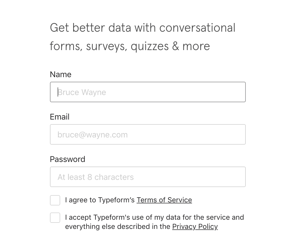 Typeform uses humor in its signup form to make the onboarding experience more delightful.
And if you think that Batman reference is an accidental Easter egg, you are very wrong.
It’s one of the several UX copywriting tricks Typeform and many other web apps use to make your experience with them oh-so-delightful.
Wait, but isn’t it UX (User Experience) and copywriting?
No, not anymore. Today, writing and design teams are jointly obsessing over the tiniest product details such as form names and layout, pronoun usage, button texts, and colors, among other elements.
Typeform uses humor in its signup form to make the onboarding experience more delightful.
And if you think that Batman reference is an accidental Easter egg, you are very wrong.
It’s one of the several UX copywriting tricks Typeform and many other web apps use to make your experience with them oh-so-delightful.
Wait, but isn’t it UX (User Experience) and copywriting?
No, not anymore. Today, writing and design teams are jointly obsessing over the tiniest product details such as form names and layout, pronoun usage, button texts, and colors, among other elements.
How to Master UX Writing in 4 Simple Steps (+ Template)
Click To TweetDownload Your Easy to Use UX Copy Doc Template
This post is packed with advice that's easier to implement with this Word template. Use it to write and review every UX copy project you take on:So What Is UX Copywriting?
As the name implies, we have two components here:- UX (User Experience) summarizes what we feel when interacting with a product online or in person. In this post, we’ll focus on digital experiences only.
- Copywriting is the art of persuasion. Effective content (copy) compels the reader to take a certain action. Preferably, the one you want them to take.
- Conducting audience and user research
- Developing brand guidelines for content
- Mapping out information architecture and designing new content flows
- Creating copy for web and mobile products
- Incorporating important product KPIs in the content strategy
- Collaborating with the design team and other product stakeholders
Recommended Reading: 13 of the Best Research Strategies to Create Amazing Content
What Makes UX Copywriting So Important?
Nina Feinberg, Senior Product Designer at The New York Times, best summed it up in her post on Medium:“I’ve come to believe that language is one of the most powerful design tools we have.”When working on a new NYT product, Nina noticed that using actual texts for titles, buttons, and other design elements, instead of lorem ipsum, massively improved the production process. The team could evaluate early on if they were using the right design components to deliver the right message and locate gaps in information architecture. In Nina’s words: “I discovered that we were able to create a stronger and more deliberate product when we considered the words we used.” The Google Design team shares the same sentiment. In this video
, the company’s UX director Maggie Stanphill and Senior UX writer Joscelin Cooper said that “design and content should always be created in tandem.” +Writing+Summarized&utm_medium=email&utm_source=Revue+newsletter Because wireframes without text are just shapes that bring little value. Sprinkling them with words improves your decision-making at early product design stages. For teams, the practice of UX copywriting
- Removes the guesswork from the design process
- Improves message consistency
- Helps provide more on-point messaging based on the context
- Ensures consistent style and experience cross-app
Recommended Reading: How to Plan an Effective Editorial Workflow in 4 Steps (Template)
UX Writing 101 – 4-Step Blueprint
The goal of UX copywriting is to help users accomplish their goals with the least friction. But how do you know what each user wants? Aarron Walter, author of Designing for Emotion, already has the answer for you. His theory suggests that every user has a simple hierarchy of needs: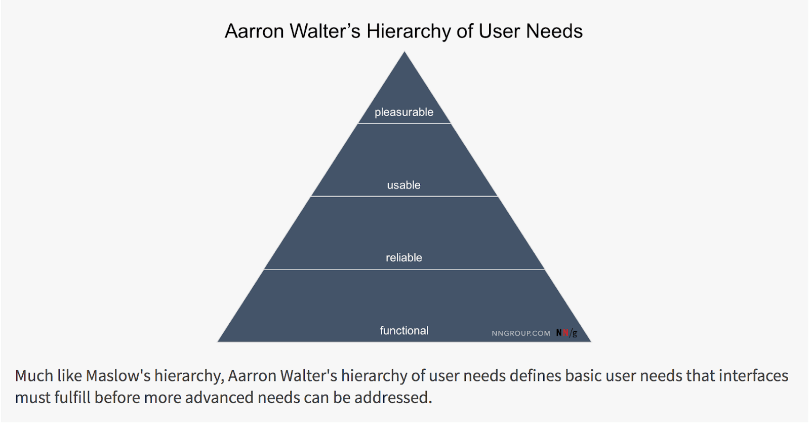 Source: Nielsen Norman Group
UX design mainly concentrates on fulfilling the bottom needs – functionality and reliability. UX copywriting helps make the product more usable and delightful.
At the same time, copywriting and design also reinforce one another. Because a beautiful app with great copy can be absolutely non-functional (bringing no value to the user), thus failing to satisfy their basic needs.
Also, there are plenty of ‘utilitarian’ products that are robust and get the job done. Yet they are clunky and non-intuitive, and users eventually abandon them for a more elegant alternative.
Walter’s theory perfectly explains why Goldilocks was so happy to find the “just right porridge”: deep down inside, we all want products that satisfy all our needs at once.
UX design and UX copywriting, like jelly and peanut butter, deliver that delicious combo of taste to the user.
Below is your blueprint for writing highly delightful and functional copy for web products.
Source: Nielsen Norman Group
UX design mainly concentrates on fulfilling the bottom needs – functionality and reliability. UX copywriting helps make the product more usable and delightful.
At the same time, copywriting and design also reinforce one another. Because a beautiful app with great copy can be absolutely non-functional (bringing no value to the user), thus failing to satisfy their basic needs.
Also, there are plenty of ‘utilitarian’ products that are robust and get the job done. Yet they are clunky and non-intuitive, and users eventually abandon them for a more elegant alternative.
Walter’s theory perfectly explains why Goldilocks was so happy to find the “just right porridge”: deep down inside, we all want products that satisfy all our needs at once.
UX design and UX copywriting, like jelly and peanut butter, deliver that delicious combo of taste to the user.
Below is your blueprint for writing highly delightful and functional copy for web products.
Step 1: Collect Voice of the Customer Data
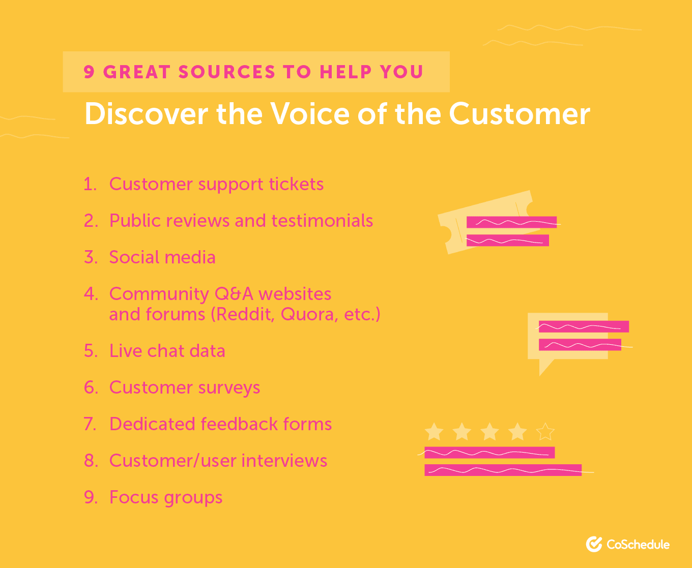
David Ogilvy once said:“If you’re trying to persuade people to do something, or buy something, it seems to me you should use their language.”His hunch has further scientific proof. Linguists found that we naturally tend to mimic another person’s function words and pronouns. The more engaged we are, the more likely it is that the ‘borrowing’ will occur. This tendency is called Language Style Matching (LSM) and it can have a strong impact on why we like some people (and products) more than others. One group of researchers decided to analyze couples’ LSM at a speed dating event. Based on the conversation recordings, they estimated the level of LSM between different couples and extrapolated their compatibility. The results? 77% of couples with high LSM scores were still dating 3 months later versus 52% of couples with below-average scores. So yes, “mirroring customers’ language” is solid copywriting advice and the reason why you need to line up Voice of the Customer (VoC) data before you start writing any interface copy. Here are a few solid VoC goldmines to dig into:
- Customer support tickets
- Public reviews and testimonials
- Social media
- Community Q&A websites and forums (Reddit, Quora, etc.)
- Live chat data
- Customer surveys
- Dedicated feedback forms
- Customer/user interviews
- Focus groups
 Just what kind of VoC data do you need to capture?
- Sentiment indicating how your users communicate with others (= how they want to be spoken to)
- Frequent feelings they display when using your product (at different stages)
- Their key goals, struggles, and current pain points
Step 2: Master the Art of UX-Friendly Headlines
Headlines are copywriter’s pick-up lines – they entice further conversation. A good headline gives a preview of the underlying information that’s coming up next. Any copywriter will tell you that writing good headlines is both an art and a science that requires a lot of practice and experimentation. So, for now, let’s just focus on what makes a great headline from a user experience perspective:- Good headlines are succinct and descriptive – they work out of context and complement the narrative.
- Strong headlines are short and catchy – ditch all nonessential words and focus on the main benefit of the page. Also, aim for 16-18 words for the best engagement.
- Headlines should come close to respective subsections. This reinforces their connection to other design elements.
- Use indirect claims to make your headlines more persuasive. Indirect claims prompt the user to construct their meaning around the fact you are stating, rather than take your word for it. This tricks our brain into thinking that we are the source of information, and thus that it’s more trustworthy.
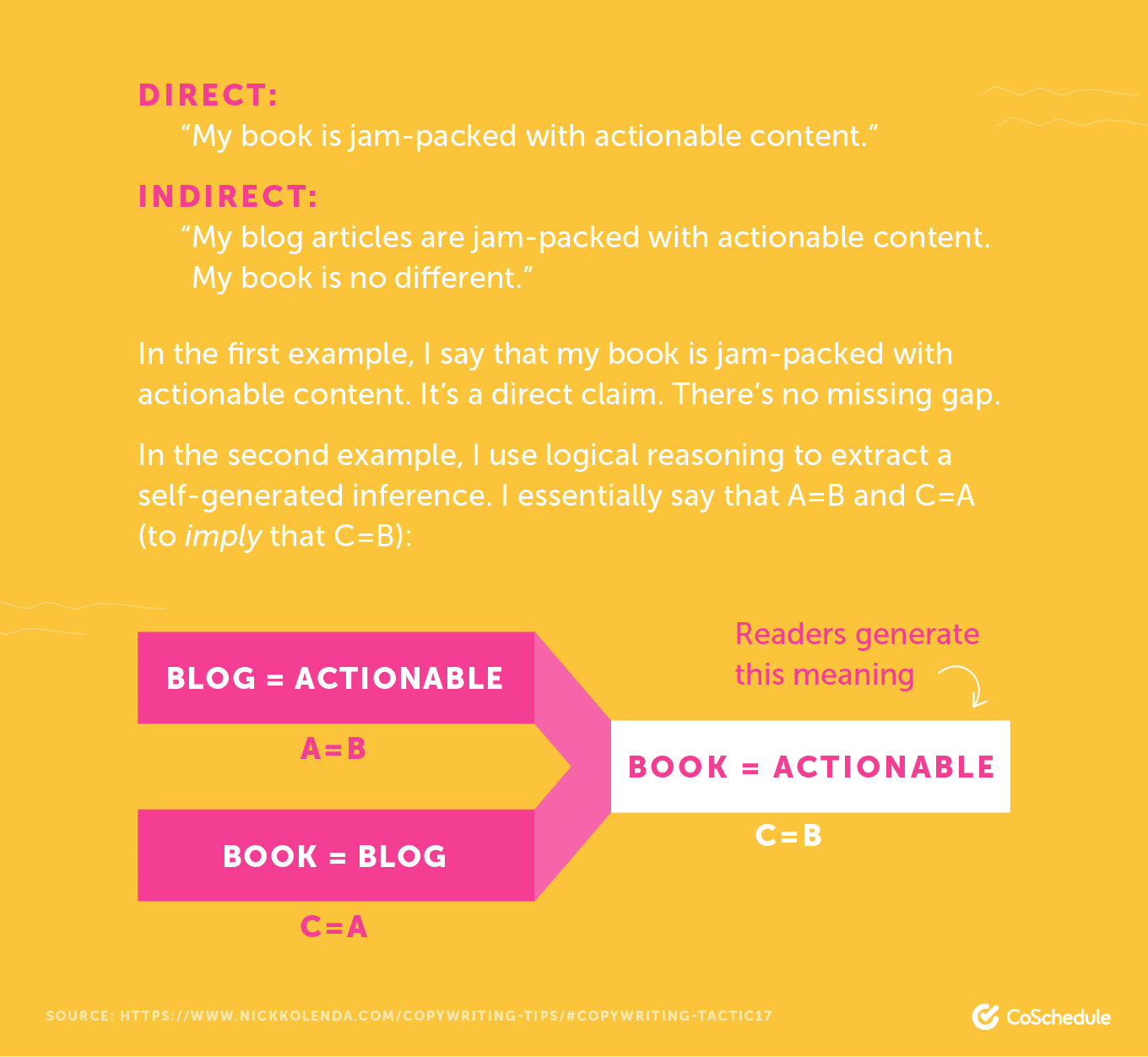 Source: Nick Kolenda
Remember: The goal of your headline is to capture the user’s attention and entice them to keep interacting with your product.
Source: Nick Kolenda
Remember: The goal of your headline is to capture the user’s attention and entice them to keep interacting with your product.
Step 3: Spice Up Your Microcopy with Power Words
Microcopy stands for all the tiny content cues you provide to users within your app to describe interface features. Examples include contact form explainers, button texts, pop-up hints, etc. Those tiny words may seem insignificant, but they can have a massive impact on conversions and churn rates. That’s why UX writers spend a lot of time selecting and testing different ‘power word’ combos. Let’s start with a simple example. Do you know which is the most boring verb in the English language? It’s “is.” “Is” doesn’t convey a lot of information; it just states that something exists. The problem is that you already have a lot of design elements to show that something is available. The user can tell without your help that “here is feature A.” What they might not guess is why they should be thrilled with it. The goal of UX copywriting is to communicate what the user can do with all those nuts and bolts at their disposal. Compare these two messages: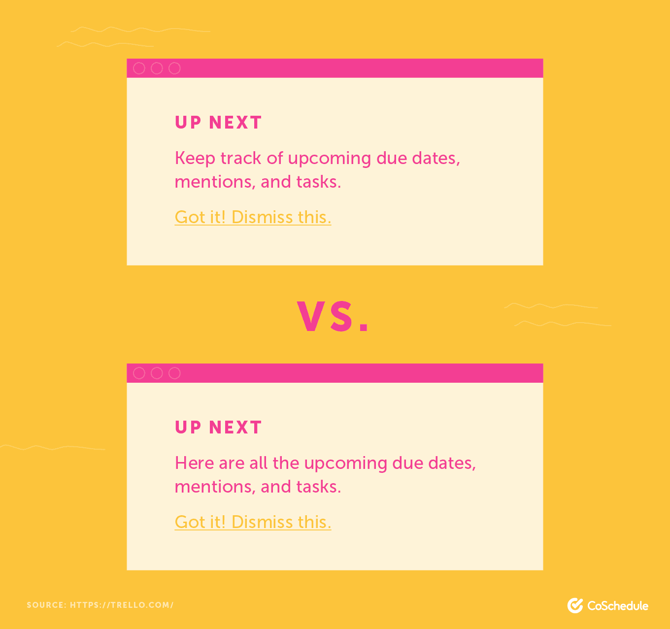 Top: Actual version from Trello. Bottom: Modified version with “are.”
The original UX copy better conveys the intention of ‘Highlights’ sections – it helps users to stay informed. The second version just makes users want to hit ‘Dismiss’ because it’s stating the obvious.
Considering that interface space is a hot commodity, we don’t have the luxury of wasting it on a bland verb or a weak statement.
Give your web app a facelift and replace all the wonky feature descriptions with more actionable power words, communicating more value and intention to the users.
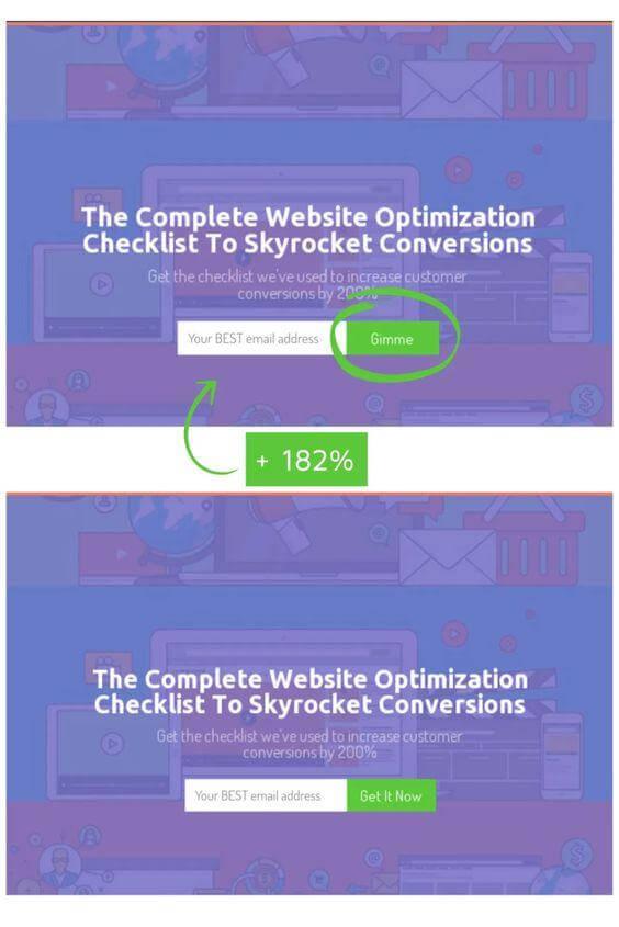
The same goes for other microcopy. Inspect email subscription forms, pop-ups, check-out forms, price calculators, etc. Changing one word or adding a few extra ones can make a major difference conversion-wise.
Case in point: After updating button CTA for one of its opt-ins, Sumo saw a 182% increase in conversions.
Top: Actual version from Trello. Bottom: Modified version with “are.”
The original UX copy better conveys the intention of ‘Highlights’ sections – it helps users to stay informed. The second version just makes users want to hit ‘Dismiss’ because it’s stating the obvious.
Considering that interface space is a hot commodity, we don’t have the luxury of wasting it on a bland verb or a weak statement.
Give your web app a facelift and replace all the wonky feature descriptions with more actionable power words, communicating more value and intention to the users.
The same goes for other microcopy. Inspect email subscription forms, pop-ups, check-out forms, price calculators, etc. Changing one word or adding a few extra ones can make a major difference conversion-wise.
Case in point: After updating button CTA for one of its opt-ins, Sumo saw a 182% increase in conversions.
 Source: Sumo
The funkier “Gimme” verb is something a lot of its target audience would use, bringing us back to Step 1: research and use VoC data to create stronger LSM bonds.
Lastly, pay closer attention to how you use adjectives in your microcopy.
Descriptive words are important to indicate what type of user experience comes next. But there’s one problem with using them without much thought: adjectives are hard to visualize.
Can you picture the following features?
Source: Sumo
The funkier “Gimme” verb is something a lot of its target audience would use, bringing us back to Step 1: research and use VoC data to create stronger LSM bonds.
Lastly, pay closer attention to how you use adjectives in your microcopy.
Descriptive words are important to indicate what type of user experience comes next. But there’s one problem with using them without much thought: adjectives are hard to visualize.
Can you picture the following features?
- Robust process automation
- Quick results
- Effective workstreams
- Describing new/complex/unfamiliar product features
- Improving clarity during user onboarding
- Making product demos more delightful
 Source: Airtable
To sum up, verbs and adjectives are your frenemies. They can help you convey the right information to the users. Or they can create extra confusion. Use both responsibly.
Source: Airtable
To sum up, verbs and adjectives are your frenemies. They can help you convey the right information to the users. Or they can create extra confusion. Use both responsibly.
Recommended Reading: How to Write Emotional Headlines That Get More Shares
Step 4: Improve Your Button Design and Copy
Buttons are a commonly overlooked element by both UX designers and copywriters. It is the marketers who mostly obsess about those call-to-actions and split tests. And rightfully so, as small changes in shape, color, position, and text can lead to more clicks, more sign-ups, and more revenue. Let’s first take a look at several UX design best practices for buttons. 1. Color matters. Your entire web app relies on a color scheme to create brand positioning and elicit a certain emotional response. A lot of users’ decisions (to purchase, sign up, etc.) will be triggered by the color you use for your key design elements, background, and buttons. Matthew Woodward recently did an interesting CRO experiment showing how powerful color can be. He placed the same CTA copy on banners with different backgrounds to see how its effectiveness changed with color. Here are the results: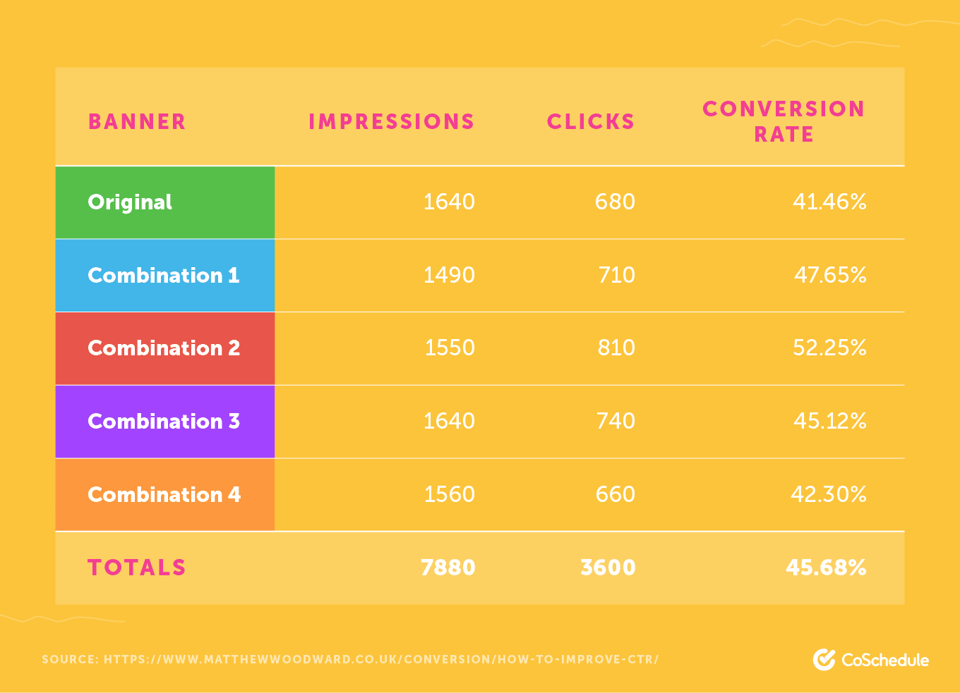 Source: Matthew Woodward
The red banner combo performed best, securing a 20% improvement in conversion rates.
HubSpot did a similar “red vs. green button” test. Again, the bright red button was a winner and generated over 2,000 visits to the linked page.
The bottom line: brighter buttons do perform better. However, fixing the color alone will not dial up your conversions on command (especially if other page elements are lackluster). But it’s a good place to start.
2. Standard button design = best design. A website button should look like... well, a button.
It can be filled or ghost, with rounded corners or shadows. But, there’s no point in changing its look beyond that. Buttons need to be recognizable. Or else they won’t be clicked.
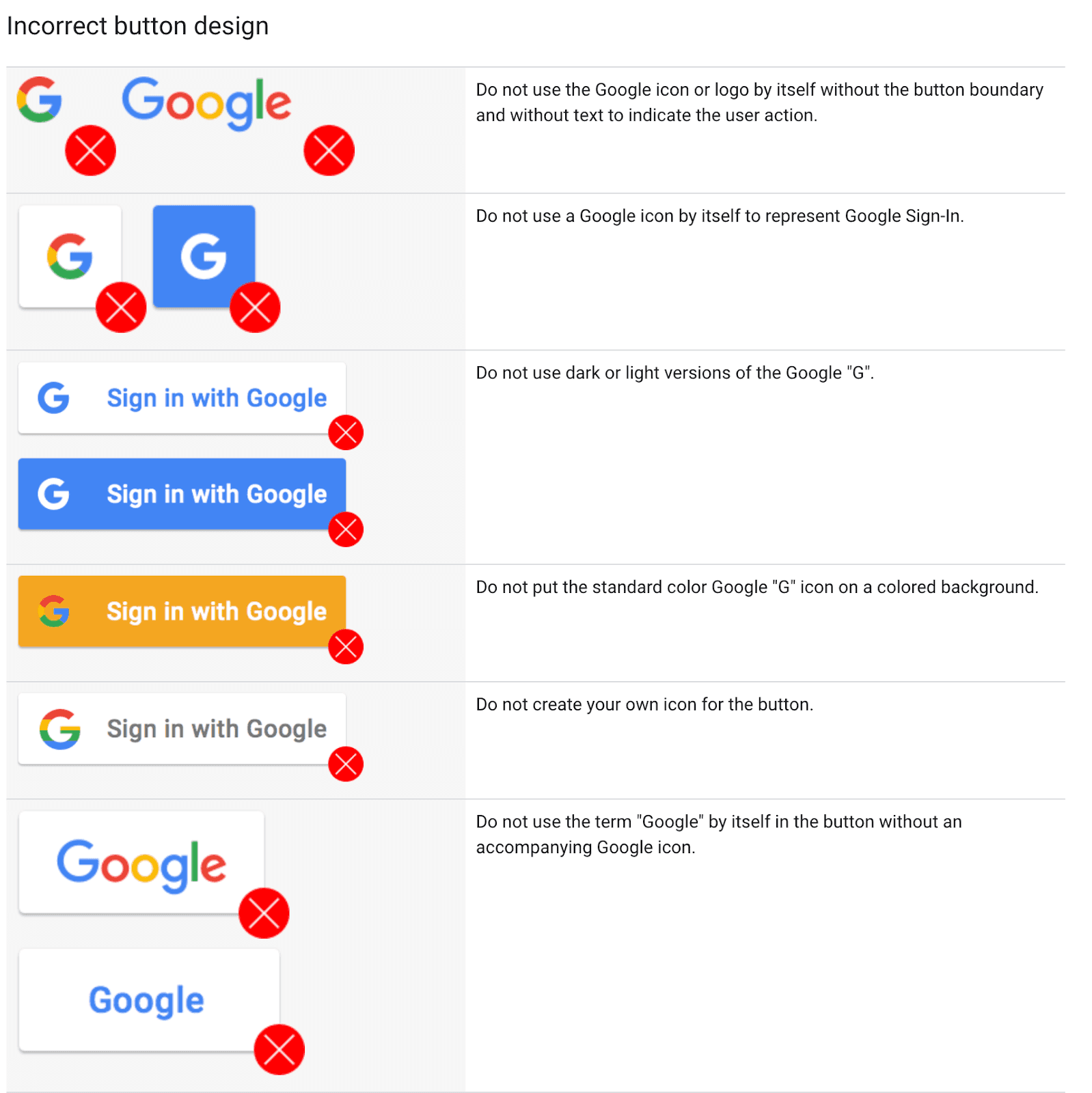
Google has tight branding and design guidelines for incorporating its Sign-In Button. These serve as a good illustration of common dos and don’ts in button design:
Source: Matthew Woodward
The red banner combo performed best, securing a 20% improvement in conversion rates.
HubSpot did a similar “red vs. green button” test. Again, the bright red button was a winner and generated over 2,000 visits to the linked page.
The bottom line: brighter buttons do perform better. However, fixing the color alone will not dial up your conversions on command (especially if other page elements are lackluster). But it’s a good place to start.
2. Standard button design = best design. A website button should look like... well, a button.
It can be filled or ghost, with rounded corners or shadows. But, there’s no point in changing its look beyond that. Buttons need to be recognizable. Or else they won’t be clicked.
Google has tight branding and design guidelines for incorporating its Sign-In Button. These serve as a good illustration of common dos and don’ts in button design:
 3. Buttons are to be discovered. The entire point of a button is to stand out and offer hotkey access to a certain feature (or action). Thus, don’t try to sneak in the buttons where they do not belong or hide them too deep inside your web app.
Mind the button hierarchy too. Ghost buttons serve best for secondary choices, as most people will instinctively click the solid color button.
3. Buttons are to be discovered. The entire point of a button is to stand out and offer hotkey access to a certain feature (or action). Thus, don’t try to sneak in the buttons where they do not belong or hide them too deep inside your web app.
Mind the button hierarchy too. Ghost buttons serve best for secondary choices, as most people will instinctively click the solid color button.
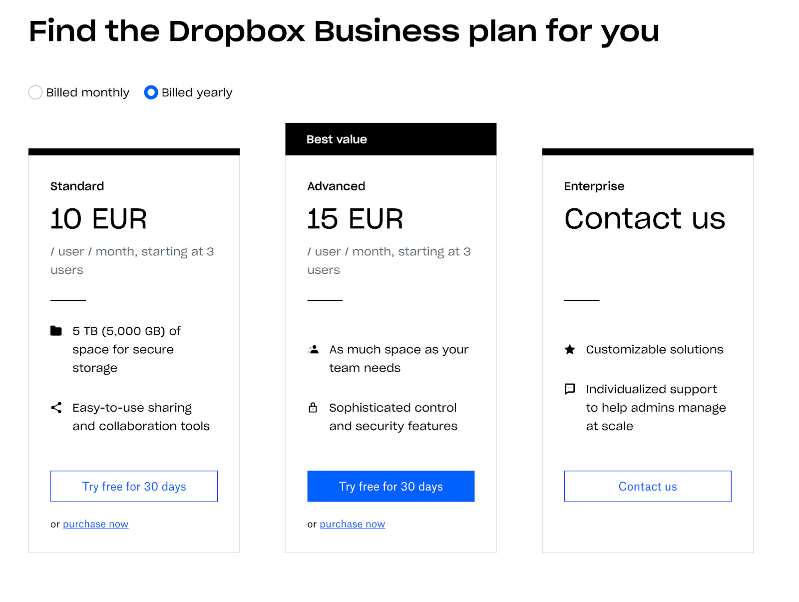 Source: Dropbox
(You can guess were most clicks land, right? Credit: Dropbox)
Now, let’s move on to the copywriting part and break down the key elements of a UX-friendly button:
1. Clear value proposition – as a user I understand what will happen once I click that button and what are the benefits of doing so.
Let’s get back to the Dropbox example again. Their pricing form with buttons does several things effectively:
Source: Dropbox
(You can guess were most clicks land, right? Credit: Dropbox)
Now, let’s move on to the copywriting part and break down the key elements of a UX-friendly button:
1. Clear value proposition – as a user I understand what will happen once I click that button and what are the benefits of doing so.
Let’s get back to the Dropbox example again. Their pricing form with buttons does several things effectively:
- It provides a recap of the benefits.
- It communicates the cost front and center.
- The button has a different color from the rest of the text, so users can immediately understand that it has a different purpose.
- It features the magic ‘power word’ – free.
 Source: UX Planet
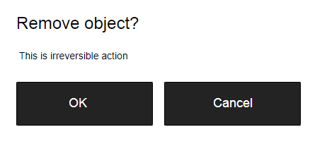
Give important commands a proper label – remove, delete, send, etc.
Great user experience is all about reaching an absolute understanding. Being clear about action consequences is an important part of that.
3. Tooltips are buttons’ best friends. Tooltips (or infotips) are user-triggered pop-up windows providing additional cues and instruction about page features and elements. They are a solid alternative to over-descriptive or over-confusing buttons.
PayPal expertly uses tooltips (design- and copy-wise) during its product tour for new users:
Source: UX Planet
Give important commands a proper label – remove, delete, send, etc.
Great user experience is all about reaching an absolute understanding. Being clear about action consequences is an important part of that.
3. Tooltips are buttons’ best friends. Tooltips (or infotips) are user-triggered pop-up windows providing additional cues and instruction about page features and elements. They are a solid alternative to over-descriptive or over-confusing buttons.
PayPal expertly uses tooltips (design- and copy-wise) during its product tour for new users:
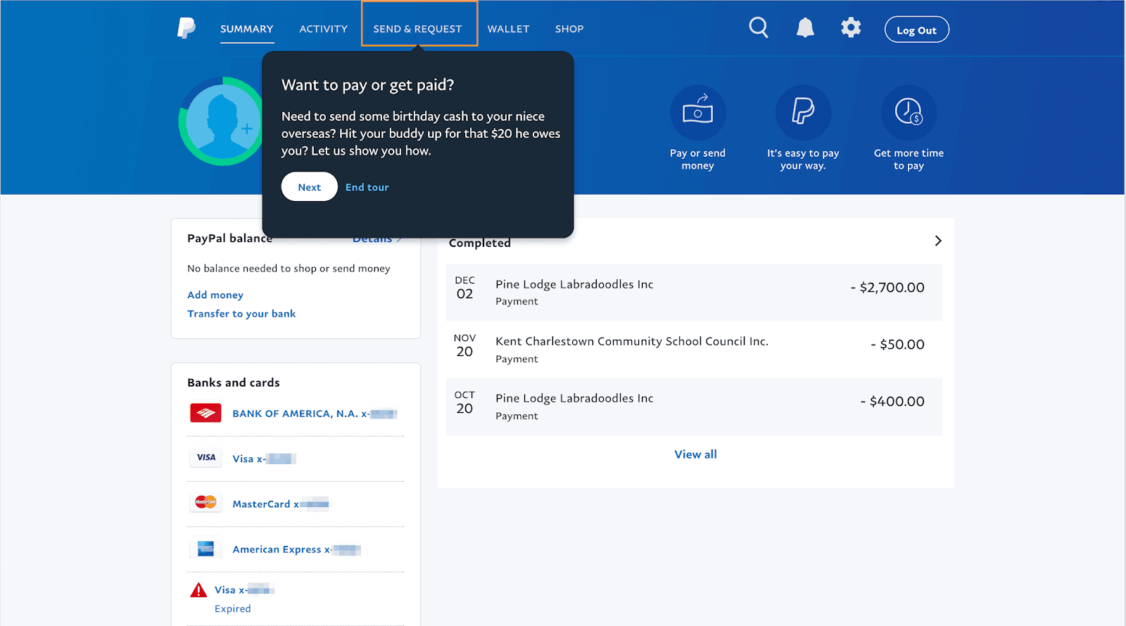 Source: Really Good UX
PayPal’s UX copy is conversational, friendly, and explanatory, rather than preachy. It uses relatable examples to illustrate how Send & Request works.
Here are some quick tips for creating tooltip content:
Source: Really Good UX
PayPal’s UX copy is conversational, friendly, and explanatory, rather than preachy. It uses relatable examples to illustrate how Send & Request works.
Here are some quick tips for creating tooltip content:
- Keep it short – under 30 words.
- Tooltips should inform, explain, and/or illustrate the feature.
- Don’t restate the visible UI text in a tooltip.
Recommended Reading: How to Easily Plan Copy for an Entire Website the Best Way
Get Organized and Create a Master Copy Doc
The more complex the app, the more UX copy there is to write, tweak, and re-optimize. To stay productive with UX writing, you can create a master copy doc for your project. Copy doc is a shared file featuring:- Project information including data on target audience, user research, main goals/tested hypotheses, design specs
- Project visuals: logo, mood boards, prototypes, mockups, key UI elements, etc.
- Brand voice, tone, and style guidelines for the project
- Copy table that includes all main headlines and subheads (with variations), taglines, body copy, CTA and button copy, microcopy, etc.
- Where each copy element goes
- How it interacts with and complements the design
- What’s missing and what can be further optimized