How To Create Opt-In Forms: 5 Ways To Convert Traffic Like Crazy

 Without a doubt, everyone wants to turn their website visitor into a customer. But did you know that 95% of first-time visitors are not ready to purchase from your website right away? In fact, it takes on average three to four visits to your website for prospects to actually think of buying from you.
This means if you’re selling a product or a service on your website, you could be losing many potential customers unless you build an email list and nurture them to purchase your products.
Nonetheless, persuading visitors to submit your opt-in forms is key to the success of your business.
Now, opt-in forms require various elements to attract leads and encourage completions. Each of these elements is essential for boosting sign ups by reducing friction.
In this post, let us discuss various key elements of high conversion opt-in forms, and how each element can contribute to improving your conversion rate.
Without a doubt, everyone wants to turn their website visitor into a customer. But did you know that 95% of first-time visitors are not ready to purchase from your website right away? In fact, it takes on average three to four visits to your website for prospects to actually think of buying from you.
This means if you’re selling a product or a service on your website, you could be losing many potential customers unless you build an email list and nurture them to purchase your products.
Nonetheless, persuading visitors to submit your opt-in forms is key to the success of your business.
Now, opt-in forms require various elements to attract leads and encourage completions. Each of these elements is essential for boosting sign ups by reducing friction.
In this post, let us discuss various key elements of high conversion opt-in forms, and how each element can contribute to improving your conversion rate.
How To Create Opt-In Forms: 5 Ways To Convert Traffic Like Crazy
Click To Tweet1. Make Your Lead Generation Form Visually Appealing
Studies show that 55% of visitors spend fewer than 15 seconds on your website. Evidently, if you’re looking to increase conversion rate, you’ll need to grab the attention of your visitors as quickly as possible with a beautiful opt-in form. While prettiness of your form can be pleasing to eyeballs, the primary goal should be to make your form stands out from the rest of the content of your page, so it easily grabs the attention of your visitors. QuickSprout’s lead generation form is one of the perfect examples of a visually appealing opt-in form. Wondering what makes the QuickSprout’s form stands out? Let’s take a look at them below.
- Subtle shadow: You can notice a subtle shadow below the bottom corners, providing the form a little popping kind of effect.
- Directional cues: Using a directional cue has an inevitable role in designing a high converting opt-in form. It shows your visitors where to focus in your form. In the QuickSprout example, the header points downwards where the fields and button are placed.
Recommended Reading: How To Write Landing Pages That Will Boost Your Conversions
The below example of Constant Contact’s form is another example of using directional cue that points CTA button.
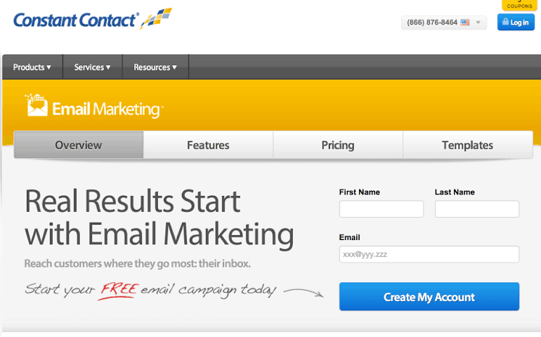
Use directional arrows on opt-in forms to direct user actions.
Click To TweetActionable Tips for Creating a Visually-Appealing Opt-in Form Design
When it comes to from design, below are a few tips that might help you:- Create pretty opt-in forms using a form generator: You don't necessarily have to be a designer in order to create an eye-catching form. If you’re on WordPress, you may use a free plugin like Optin Forms or use a premium SaaS solution like OptinMonster.
- Visually appealing landing pages: While opt-in forms are an essential element of your landing page, make sure all other elements are also optimized for conversion. WordPress offers various landing page plugins for designing a page.
- Here are some other popular options to consider:
2. Increase Perceived Value With Compelling Content Upgrades
What is the most important thing that encourages people to subscribe to your list? If you ask me, it is the opt-in bribe you offer your leads for subscription. Undoubtedly, visually appealing design attracts eyeballs to your opt-in forms. However, design alone is not sufficient to encourage people to subscribe to your list. It doesn’t matter how pretty your design is, unless you convey the benefits of subscription you can’t expect many sign ups. In order to encourage sign ups, make sure you offer something valuable which your prospects can’t refuse. That being said, you shouldn’t necessarily offer something huge as an opt-in bribe, but make sure it should be perceived as high-value.Encourage signups via opt-in forms by offering something prospects can't refuse.
Click To Tweet- It focuses on solving a pain point: Solving a common pain point is one the best ways to encourage leads to subscribe to your list. In this case, QuickSprout offers a guide that tells how to double traffic in just 30 days. Because gaining traffic is a time-consuming task, this is an undeniable offer.
- Images: Another thing I liked about the form is that it shows the free course as a bundle of books and CDs, which definitely raises the perceived value of the opt-in bribe.
- Specifying dollar value: It also mentions how worthy the offer is by specifying its dollar value— yet another great way to increase perceived value.
Recommended Reading: 10 Stunning Examples Of Visual Content Marketing
Content Upgrades: Increasing Actual Value vs. Perceived Value
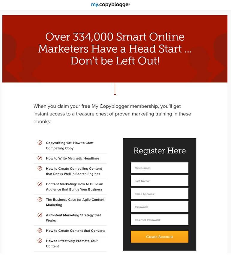
While it is always possible to raise the perceived value of your content upgrade, one of the drawbacks of this approach is that since more and more marketers are offering generic opt-in bribes like ebooks, it is hard to differentiate yours from your competitors.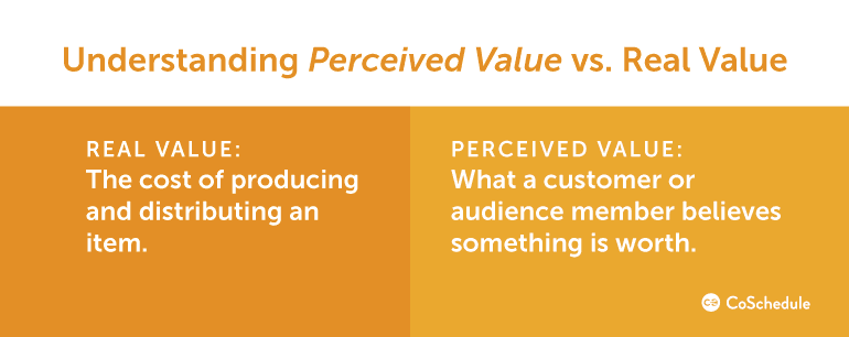 And this is the primary reason why the team at CopyBlogger launched a free paywall for MyCopyBlogger rather than a generic opt-in bribe such as an ebook. They wanted to offer both perceived as well as actual value than traditional methods.
If you haven’t heard about MyCopyBlogger yet, it is a premium content library consisting 15 eBooks and a 20-part internet marketing course. In order to access the content, subscribers are required to log in to the site by entering their email address.
And this is the primary reason why the team at CopyBlogger launched a free paywall for MyCopyBlogger rather than a generic opt-in bribe such as an ebook. They wanted to offer both perceived as well as actual value than traditional methods.
If you haven’t heard about MyCopyBlogger yet, it is a premium content library consisting 15 eBooks and a 20-part internet marketing course. In order to access the content, subscribers are required to log in to the site by entering their email address.
 Below are the results of this approach.
- This strategy of increasing perceived value and actual value boosted the sign up rate by 400%.
- Besides the sign up rate, the lead quality remained high and it helped to generate $300,000 in Authority sales in their first month.
Recommended Reading: How To Use Social Media Analytics To Create The Best Content
3. Reduce the Number of Form Fields
Undoubtedly, reducing the number of form fields is one of the easiest ways to increase sign up rate. And it has been proven by many studies.- By analyzing contact forms of 40,000 of their customers, Dan Zarrella at HubSpot found that conversion rates improve when unnecessary fields are eliminated.
- Blivakker.no found an 11% rise in sign up rate when the number of form fields is reduced.
- Expedia eliminated just one field resulting in a $12 million profit.
Increase signup form completions by eliminating unnecessary fields.
Click To Tweet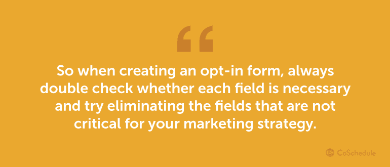
Number of Fields: Lead Quantity vs. Quality
With that said, do keep in mind that the quality of your leads is as important as the conversion rate. For that reason, if you’re eliminating the number of fields for boosting conversion, make sure to test the quality of your leads as well. For instance, while auditing the lead flow, the team at B2B software company Iron Mountain found that eliminating number of form fields tremendously reduces the quality of leads. For them, in order to qualify a lead, simply gathering name and email address are not just enough. So, instead of reducing the number of form fields for boosting sign ups, they focused on improving qualified leads. A form submission is considered qualified if a lead submits accurate information for sales inquiry. At the end of the test, the A/B test with form design variations improved qualified leads by 140%.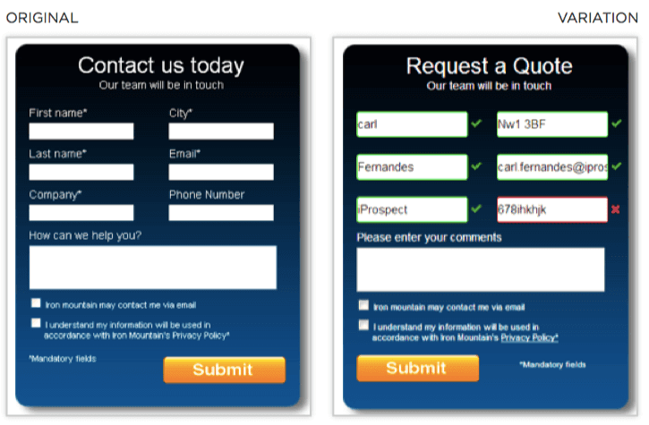 Below are a few lessons you can learn from this case study.
- Validate fields: Leads submit accurate info if the fields are validated. This can help improving lead quality.
- Qualified leads improve efficiency of sales teams: If you’re a B2B business, qualified leads help your sales team to focus on selling rather than researching contacts.
- Capturing more info: Gathering more info helps in personalizing follow up emails tailored to the lead’s industry.
Two Additional Actionable Tips
Aside from validating form fields, below are a few tips to follow.- Add help text: Provide helps tips next to each field explaining why each info is being collected.
- Use ghost text: Ghost text helps users to identify in what format each field should be filled in. However, if you insist users to insert irrelevant fields, for example, dashes for a phone number, chances are it will create friction, which in turn reduces conversion rate.
4. Make the CTA Button Stand Out
Make sure your users can easily differentiate your CTA from rest of the opt-in form elements. This strategy can help to grab the attention of your potential leads and encourage clicks. In one case study, Dmix tested comparing green and red button colors in their CTA. After testing 600 subjects, they found that conversions increased by 34% when they used red button. The reason why red button outperformed the green in the above example is that the red stands out from the rest of the design. So it draws attention and encourages click.
Recommended Reading: The Ultimate Guide to Using Color Psychology In Marketing + Free Color Schemes
Below is another example of using a button that doesn’t blend into the design.
 Additionally, make sure your CTA is actually a button. This separates the button from other elements placed on your page, which persuades visitors to click on it.
For example, RIPT tested their original call to actions against a new CTA button.
Additionally, make sure your CTA is actually a button. This separates the button from other elements placed on your page, which persuades visitors to click on it.
For example, RIPT tested their original call to actions against a new CTA button.
 When the control is tested against the original, they immediately saw a rise in sales.
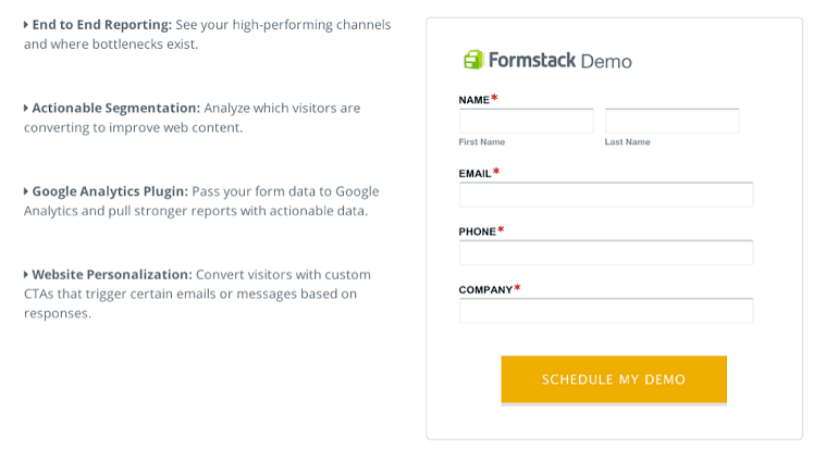
The copy of your CTA button is as important as the color. According to a survey by Formstack, little changes in button copy can help boosting conversion rates tremendously.
With that said, you shouldn’t blindly follow someone else’s test on your opt-in form. The only way to improve conversion is to conduct a test on yours and learn how various CTA versions resonate with your audience.
When the control is tested against the original, they immediately saw a rise in sales.
The copy of your CTA button is as important as the color. According to a survey by Formstack, little changes in button copy can help boosting conversion rates tremendously.
With that said, you shouldn’t blindly follow someone else’s test on your opt-in form. The only way to improve conversion is to conduct a test on yours and learn how various CTA versions resonate with your audience.
Recommended Reading: How To Write A Call To Action In A Template With 6 Examples
5. Place Forms Above-the-Fold
Placing an opt-in form above-the-fold is a common practice to grab the most attention of your visitors. Entrepreneurs-journey.com offers a good example of a form that is placed above-the-fold. The best thing about this leaderboard sized opt-in form is that unlike popups, it grabs attention without annoying visitors.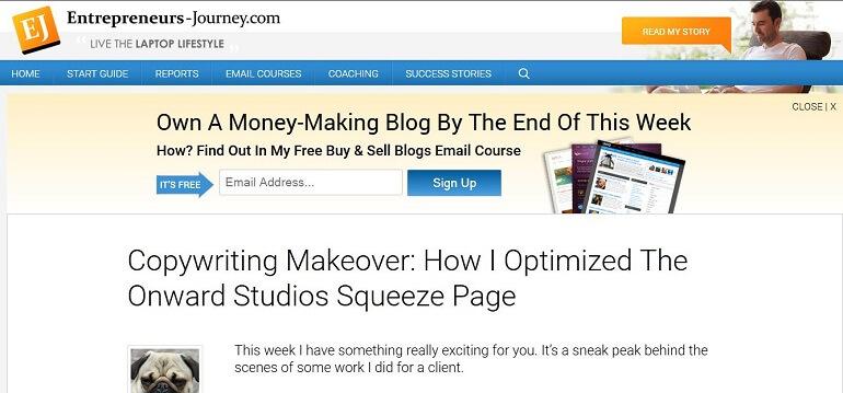 In fact, visitors can also choose not to display the form if they wish not to view it.
Such placement is advisable, especially because Google recently announced that they’ll start penalizing "intrusive interstitials" like popups on mobile devices from Jan. 10, 2017.
So if you’re currently using any kind of intrusive opt-in forms for growing your list and are concerned about receiving a Google penalty, you might want to remove it from your website and place it above-the-fold for mobile devices.
While above-the-fold placement can be an easy tactic to grab the attention of your visitors, it is not a "one size fits all" solution for driving more conversions. Let’s take a look at when you shouldn’t place your form above-the-fold.
In fact, visitors can also choose not to display the form if they wish not to view it.
Such placement is advisable, especially because Google recently announced that they’ll start penalizing "intrusive interstitials" like popups on mobile devices from Jan. 10, 2017.
So if you’re currently using any kind of intrusive opt-in forms for growing your list and are concerned about receiving a Google penalty, you might want to remove it from your website and place it above-the-fold for mobile devices.
While above-the-fold placement can be an easy tactic to grab the attention of your visitors, it is not a "one size fits all" solution for driving more conversions. Let’s take a look at when you shouldn’t place your form above-the-fold.
Should opt-in forms be above-the-fold? It depends.
Click To TweetWhen Above-the-Fold Isn't The Best Option
Did you remember the age old marketing lesson AIDA? AIDA stands for Attention, Interest, Desire, and Action.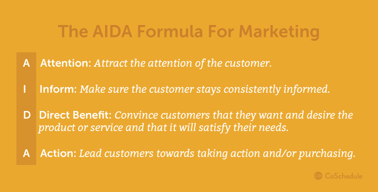
Remember the AIDA formula when building opt-in forms.
Click To Tweet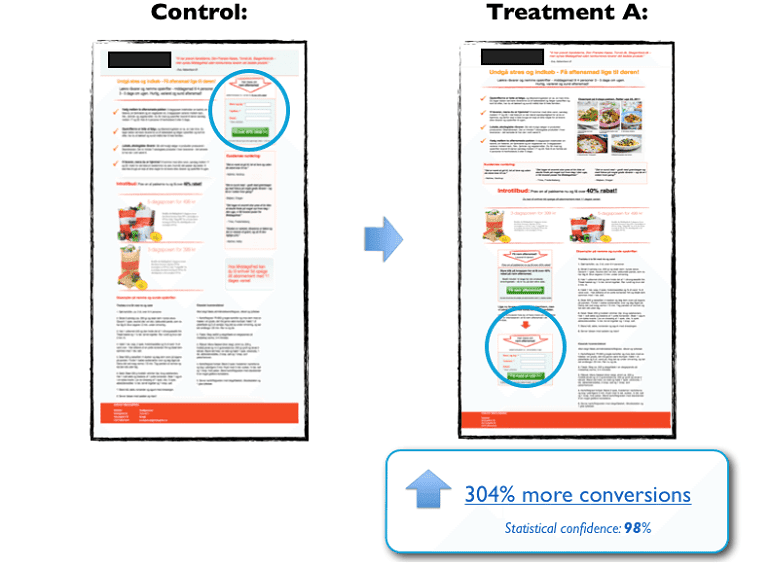
Optimize Your Opt-In Forms And Drive More Conversions!
I hope this article gives you some insights on creating a high converting opt-in form for your next list building campaign. Every website and its audiences are unique. It is always better to test what brings better result before making assumptions. What is your favorite tip for creating a high-conversion lead generation form? Share your thoughts with us by dropping a line below in the comments section.Are you doing everything you can to create successful opt-in forms?
Click To Tweet


