How to Make More Meaningful Visual Content | #OverheardAtCoSchedule
 How do you make your visual content stand out? That’s a simple question with a complex answer. Developing a distinctive visual identity takes time and talent. It’s not something that happens by accident, either. Building a consistent visual brand requires a thoughtful and intentional approach.
The payoff is worth the investment. By spending time making your blog posts visually appealing, you can differentiate yourself from the countless number of other blogs in your space. Ideally, your audience will be able to spot your posts from a mile away, based on your visual design alone. That helps build strong mental associations between your brand and your content quality.
So, how can you cut through the clutter with stronger visual design? That’s what our own graphic designer Ashton Hauff and co-founder Garrett Moon explore on this episode of #OverheardAtCoSchedule.
How to Make Visual Content More Meaningful | #OverheardAtCoSchedule
Click To TweetTranscript
Garrett: Hi everybody, I'm Garrett from CoSchedule, and this is Overheard at CoSchedule, the show where we turn the cameras on and interview Ashton about stuff. Hi everybody, I'm Garrett from CoSchedule, and this is Overheard at CoSchedule. Today we're going to be talking about visual content, which I'm pretty excited about because I think the visuals on the CoSchedule blog are one of the things that really make us stand out from other pieces of content out there, and Ashton is the designer behind most of those graphics. Ashton, talk to me about visual content. You're the expert. What makes great visual content? Ashton: Yeah, I think the most important part about visual content is the idea behind it, because every great visual- Garrett: For sure. Ashton: ... starts with a really great idea. At CoSchedule, we try to make sure all of our visuals are very intentional and very purposeful so we don't just add to the noise of the graphics and the visuals out there.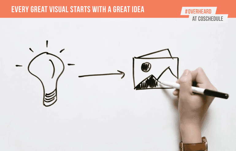 Garrett:
It's a good word, purposeful. I like that, purposeful visuals. Give me some examples of that, unpack that a little bit.
Ashton:
Definitely. I read all of our content, no matter what form it might take, and I really try to pick apart those really important pieces of information and make a visual out of it. That could be header graphics, that could be quotes from our podcast guests, that could be statistics and data that I make an infographic out of. Anything that's really important to our audience that we want them to learn and to remember.
 Garrett:
I think that might make you the only person who's ever read every piece of content that CoSchedule's ever published, which is pretty good.
Ashton:
Yeah.
Garrett:
I like that a lot. I think you were talking about really incorporating the graphic. It's not just a photo that you're going to slap in there, it's actually something that really incorporates the message of the post, really. Now we're transitioning to actually making those visuals. What tips do you have for actually creating compelling visuals?
Ashton:
For sure. I think the first thing that I always go to is color. That's just a huge realm, and color psychology can be such a great help for that, and so I always ask myself, "What's the mood or the tone that I'm trying to convey with this visual?" So I start with color. The second thing is we always want to make it fun. At CoSchedule, we're all about making things awesome and fun, so that could be gifs or memes, anything to make it emotional and exciting. The last thing we like to do is use themes to really help any complex topics, and just bring it really to any skill level.
Garrett:
I think that might make you the only person who's ever read every piece of content that CoSchedule's ever published, which is pretty good.
Ashton:
Yeah.
Garrett:
I like that a lot. I think you were talking about really incorporating the graphic. It's not just a photo that you're going to slap in there, it's actually something that really incorporates the message of the post, really. Now we're transitioning to actually making those visuals. What tips do you have for actually creating compelling visuals?
Ashton:
For sure. I think the first thing that I always go to is color. That's just a huge realm, and color psychology can be such a great help for that, and so I always ask myself, "What's the mood or the tone that I'm trying to convey with this visual?" So I start with color. The second thing is we always want to make it fun. At CoSchedule, we're all about making things awesome and fun, so that could be gifs or memes, anything to make it emotional and exciting. The last thing we like to do is use themes to really help any complex topics, and just bring it really to any skill level.
 Garrett:
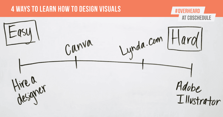
For those who are going to transition to the old text posts now to more visual posts, what are your top two tips for getting started on creating visuals?
Ashton:
Top two would be to just hire a designer. Not everyone is gifted in that area and just maybe doesn't have the time to learn. The second tip is to use Canva. Canva is such a great tool out there no matter what skill level or what you're trying to design.
 Garrett:
Yeah, I think it's great to start making the visuals as important as the content you're creating. For us at CoSchedule, it's been a huge differentiator. I remember the day we decided to start creating visuals and resources for every post, and it's been a huge help. Hopefully it's a help to you as well. That's Overheard at CoSchedule.

