How To Write the Best About Us Page (With 50+ Examples & A Free Template)
 What’s the first page you read when you find a new company and want to learn their story?
If you’re like a lot of folks, it’s the company’s about us page.
Those pages, usually found in the footer navigation on most business sites, are powerful pieces of an effective website content strategy. However, they’re sometimes overlooked, too.
When they’re written well, they can help your company show off its personality, differentiate itself from the competition, and leave a positive impression on potential customers.
So, why ignore those potential benefits when you can do it right and reap the rewards?
That’s exactly what this post will show you how to do. Here’s a quick summary of what you’ll find:
- What separates quality About pages from ones that are uninspired.
- Tons of real-life examples.
- A step-by-step process for writing a page of your own.
How to Write the Best About Us Page With 50 Examples and a Free Template via @CoSchedule
Click To TweetDownload Your Free About Us Page Template
Writing your page will most likely start with a simple Word doc. So, rather than create one from scratch, why not snag this free template instead? It lays out fields for everything you’ll need to hand over to a developer to get your page created. Download it now, then learn how to put it to use in this post.What Is An About Us Page?
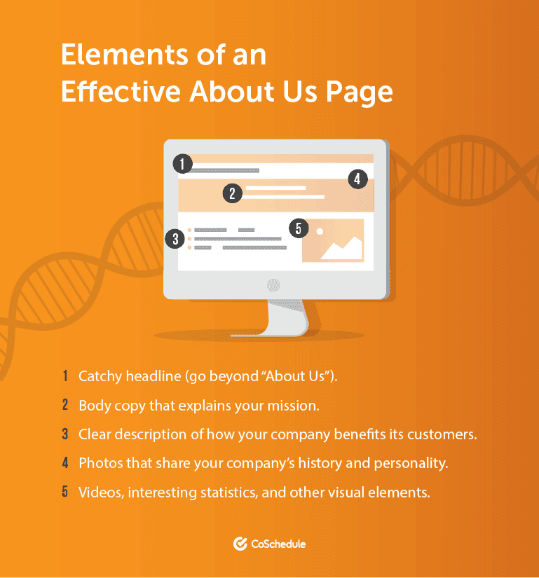
In simplest terms, it’s a page on your website that explains what your business does. That sounds straightforward enough, right? Sure, it does. But, because of this, they’re occasionally treated like nondescript pieces of content, created to fulfill a requirement on a checklist. That’s selling those pages short, though. Get it right, and they go from a line item no one looks at, to an essential element of telling your company’s story. Approached this way, they’re:- Useful pieces of your site.
- Essential pages for establishing who you are and what you’re about.
- Worth spending time on to get right.
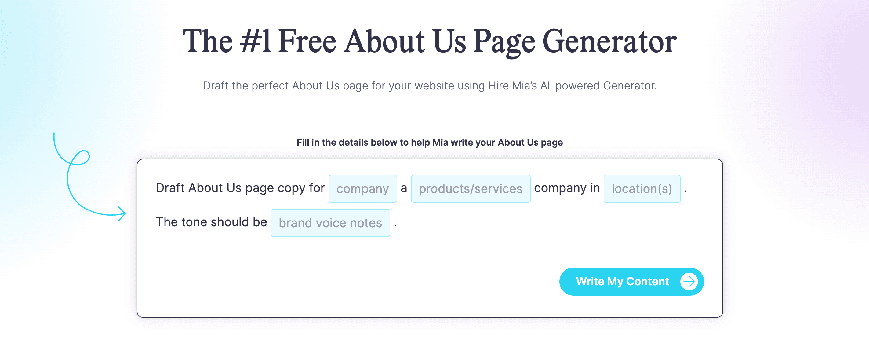
 Give CoSchedule's About Us Page Generator a try to help create a perfect about us page for your website!
 Source
Where Should These Pages Be Located?
Generally, they’re found in website footers: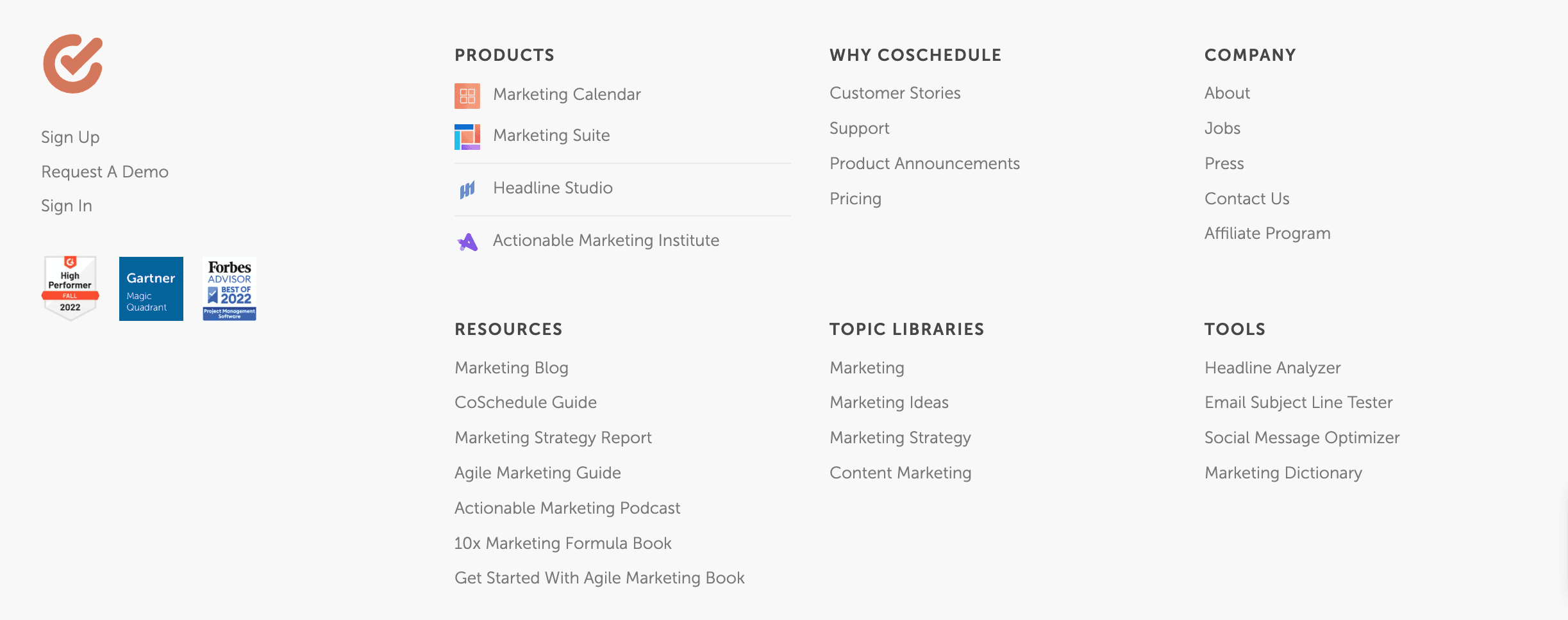
Why Are These Pages Important?
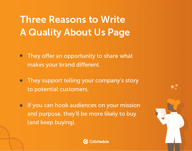
Every company claims to have core values and some kind of differentiator that makes them different than other companies out there. But, no other company on Earth shares your exact story or your specific reason for being in business in the first place. Conveying that difference and giving people a reason to care about you more than your competition can make the difference between someone making a one-time purchase and forgetting who you are, to becoming a loyal brand advocate.
Certainly, that’s a lot of weight to put on one website page, and it takes more than just one page to become a beloved brand (like having a good product and an actual mission, things no amount of content can cover up).
But, they do help, and they’re great because they let you put that story front and center.
Moz
A lot has changed since Moz was founded in 2004, so a rebranding was in order. At first glance, the clear mission statement attracts your attention and lets you know what is important to the company and how they view marketing.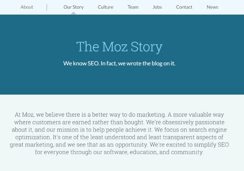 Source
In addition, the About Us page on Moz has clear headers, short blurbs, and a few pictures to help break up the text.
Moz is transparent about its humble beginnings, how it received funding, and most importantly, how it switched to the company’s core values of what it does best — search.
Cotopaxi
A company's true character shines through in the memories and associations its name conjures up. The origin of Cotopaxi’s name is an excellent spot to begin explaining the company's history. The main concept the company wants you to take away is its commitment to creating sustainable outdoor clothes and doing good. Davis Smith, the founder of the company, spent his formative years in Ecuador, and a mountain he grew up near helped inspire the business's moniker.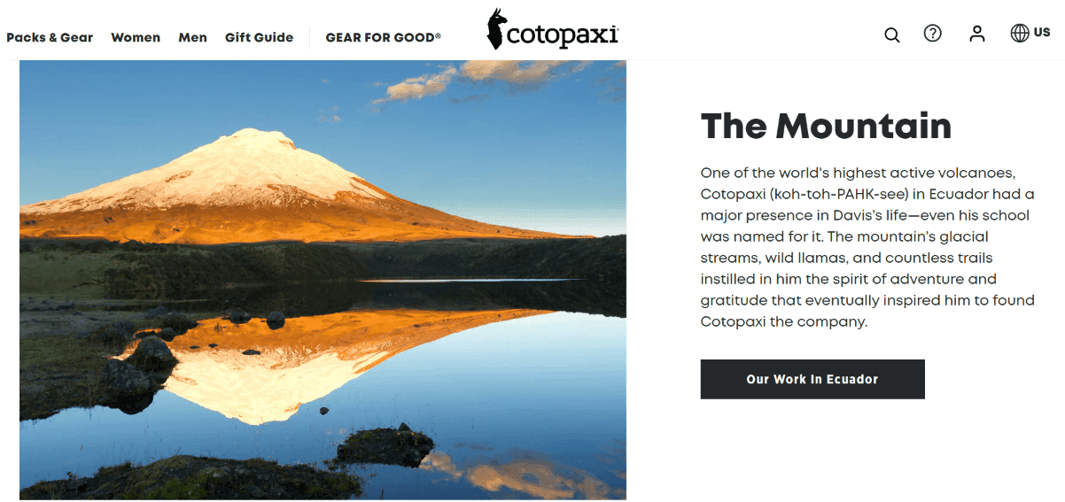 Source
By first sharing the origin of the brand name, the company can talk about the personal connection to South America and tie back into their various charitable missions.
Tarte Cosmetics
With a bold statement and a fun design, Tarte Cosmetics’ About Us page certainly catches the eye. The page includes a timeline starting from when Tarte was founded until now. Tarte shows us its humble beginnings to now being a massive company with a global following. Source
Showcasing the natural ingredients that go into making their products is an excellent way to generate trust with their consumers. It also confirms how committed Tarte is to using natural and safe ingredients in their cosmetics.
Morning Brew
Morning Brew “informs, educates, and empowers the leaders and decision-makers of today and tomorrow on the business world, money, and their career.” With this in mind, the page’s primary focus is to convey the company's mission. A little further down, you'll find three essential principles that guide how they interact with each other as colleagues and how they carry out their work.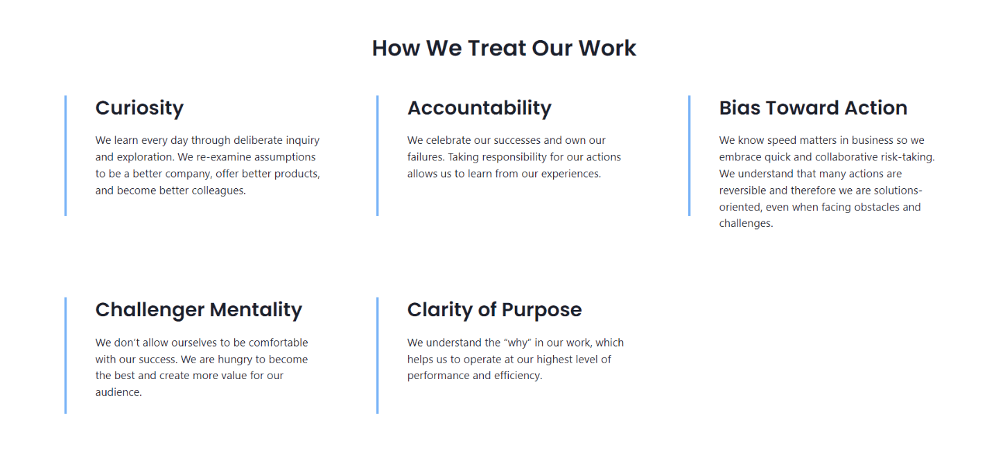 Source
You can find everything you’d want to know about Morning Brew on their About Us page. From a list of their brands, to details on their team and their dedication to diversity and inclusion, you can find it all on this page.
Ceros
The ‘About Us’ page of Ceros is interactive and compelling. You can see a chronology of the company's accomplishments beginning in 2006 as you scroll down the page. Following that, there is a long list of accolades awarded to the company. Ceros is the brand of choice for those looking for jobs. The use of ratings from Glassdoor inspires trust from readers, while the use of emojis adds a playful element that goes with their mission statement to “inspire and unlock creativity.” Source
Ceros keeps the text on the page short and sweet, with powerful statements like “liberating technology” by unlocking creativity. It catches the reader's attention and makes them want to know more about their work.
Home Depot
Hardware store chain Home Depot’s example here is straightforward, yet infuses strong imagery and the brand’s voice and tone well to rise above being generic. For example, rather than a basic “About Home Depot” headline, it works in language that appeals to their brand (being built from “right materials,” an appropriate allusion for a hardware store).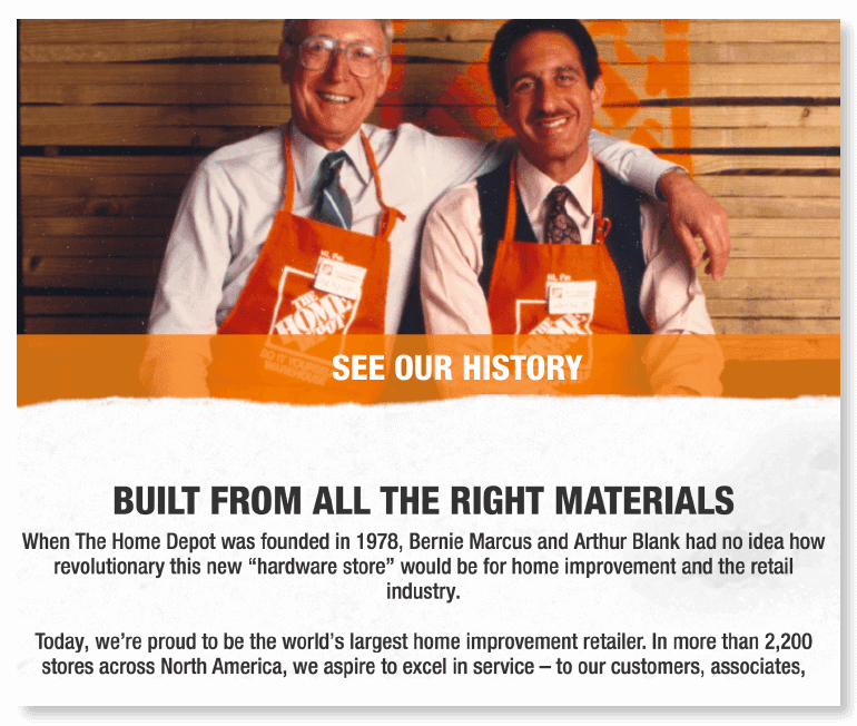 Source
Toyota
One small touch to take away from Toyota is considering putting people front and center, rather than products, on these pages (they’re about the people that make up your company, as much as they’re about what you make or sell, after all). Plus, the simple navigation bar works well to make it easy to move around the page, too: Source
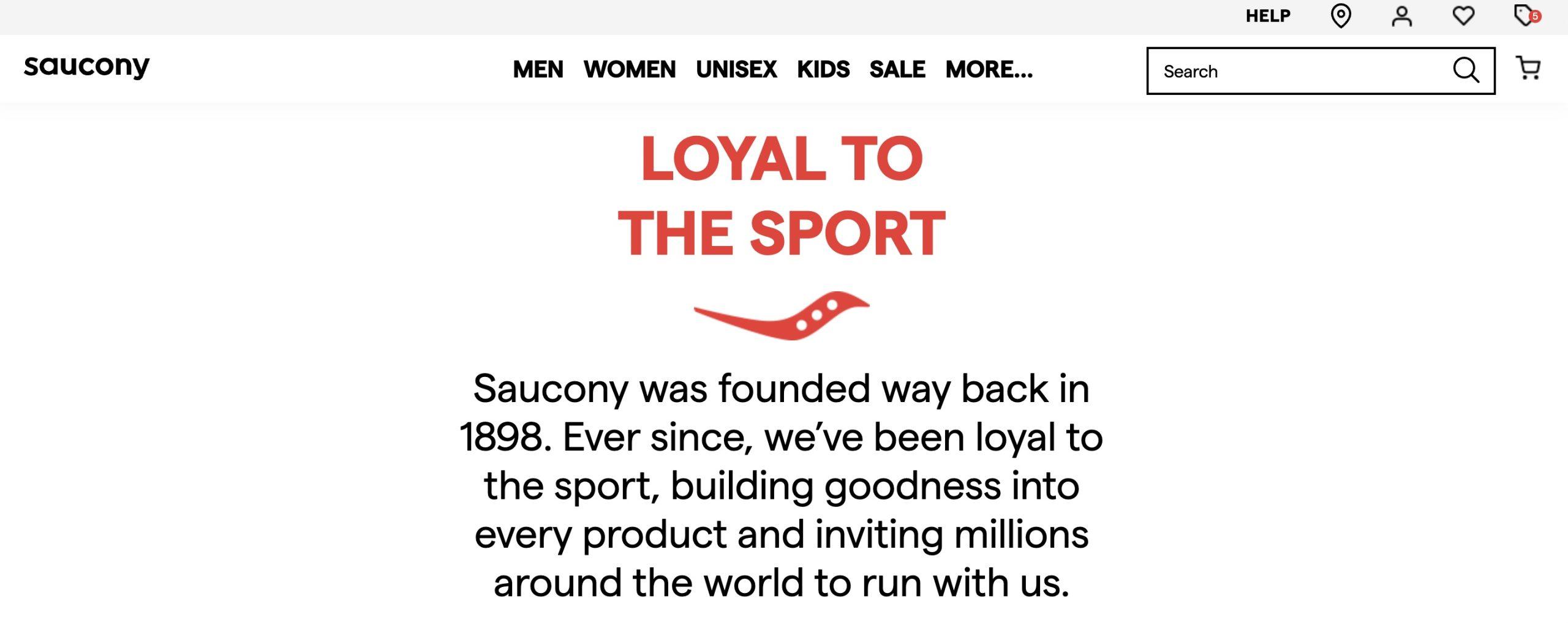
Saucony
Shoe and apparel manufacturer Saucony steps things up a notch with some striking design work and powerful visuals: Source
As you scroll down the page, it animates between chapters with different pieces of the brand’s story and history (note the chapter navigation tabs at the bottom):
 Source
If you have access to a skilled web development team with the time and resources to build something like this, the extra effort is well worth it.
Penguin Random House
When you first visit this page from Penguin Random House, you’ll find a tiled layout linking to multiple pages: Source
This works well because it makes it easy for readers to find exactly what they’re looking for (which might include anything from their company story to open job listings).
45 More Real-Life Examples of the Best About Us Pages Around
If you’d like to scope out even more samples, browse through the list below and click on any brand names that sound interesting. There’s a wide range of industries, companies, and websites.- Nike
- Microsoft
- Threadless
- The New York Times
- Adobe
- Amazon
- IKEA
- Spotify
- Sweetwater
- BMW
- Slack
- Sony
- Samsung
- Mod Cloth
- Stitcher
- Capital One
- Canonical
- CoSchedule (hey, that’s us!)
- Vox
- Zappos
- G2 Crowd
- Zazzle
- Redbubble
- UCLA
- Knock Knock
- Museum of Modern Art
- Intel
- HP
- Intuit
- Electronic Arts
- MailChimp
- Funko
- SEGA
- Revlon
- Wikipedia
- Mozilla
- Automattic
- Toggl
- Target
- Evernote
- New York and Company
- GAP
Step 1: Figure Out Everything Your Page Will Include
It’s easy to start writing before you have a clear plan, thinking you can wing it, and still get it done efficiently. This is a mistake. Working without some sort of plan or outline means you’ll be liable to miss details, waste time, and create a lower-quality page. So, figure out the following first:- Which sections will your page require? Some common pieces include your mission statement, a brief company description, corporate history, and core values.
- Who might you need to talk to for more information? Track down subject matter experts and anyone with a long tenure at your company who might be able to help fill in the information you’ll need. Set up some meeting times on your company calendar.
- How will you create graphics? If you have a design team, this question is answered for you. If you’re on your own, you may need to figure out what you can do on your own.
Step 2: Start With Your Mission Statement
More and more these days, people want to buy from companies they believe in. It’s not always enough to just churn out a product and put it in front of people. Rather, in many industries (particularly things like apparel and food), customers want to feel like they’re buying into a movement that says something about themselves. For example, think of a company like Toms of Maine. They make things like toothpaste and deodorant, products where there’s no shortage of competition and plenty of options available for price-conscious consumers.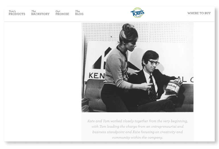 Source
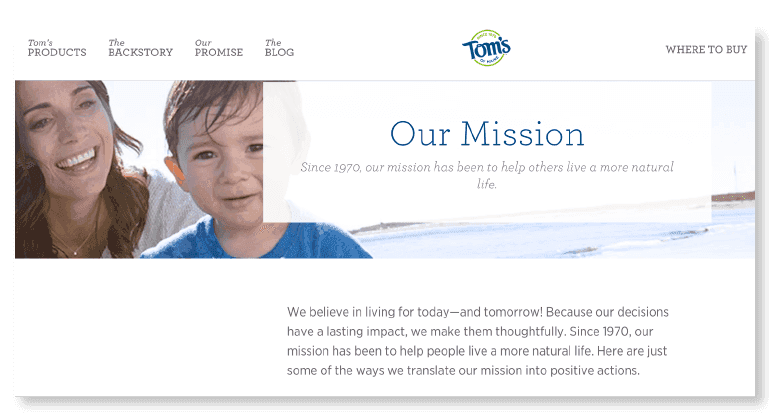
But, unlike most of those alternatives, Tom’s of Maine has a unique mission: to create products that are safe to use without potentially harmful side effects to the environment or yourself.
In fact, they were founded explicitly because co-founders Tom and Kate Chappell wanted natural hygiene products for their family and weren’t satisfied with what was on the market.
Here’s a look at their exact mission statement today:
 Source
Your company might not have such a grandiose mission. But you almost certainly have a reason for existing, even if you’re selling something as otherwise ordinary as toothpaste.
Step 3: Explain What You Do and Offer in More Detail
Beyond why you do what you do, people need to know in clear terms what you actually create or sell. Some points to consider including:- What exactly do you sell?
- How do your values and mission contribute to better-quality products?
- How does that impact your customer’s day-to-day life using your stuff?
 So, figure out the “why” behind your “what.”
Follow these two points to do this:
- Instead of talking about selling products, talk about the solutions those products solve.
- Instead of focusing on your company, focus on how you help your customers.
Step 4: Map Out Your Company History
Sometimes to know where you’re going, it helps to know where you’ve been. One way to show this to your audience is to map out your company’s history. Not only does this help customers get to know your company better, but it can also help reinforce your brand authority if you’ve been around for some time. Here’s a simple example from Marshall Amplification: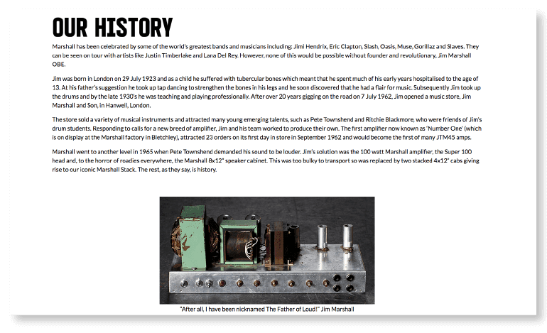 Source
And here is an illustrated example from CoSchedule:
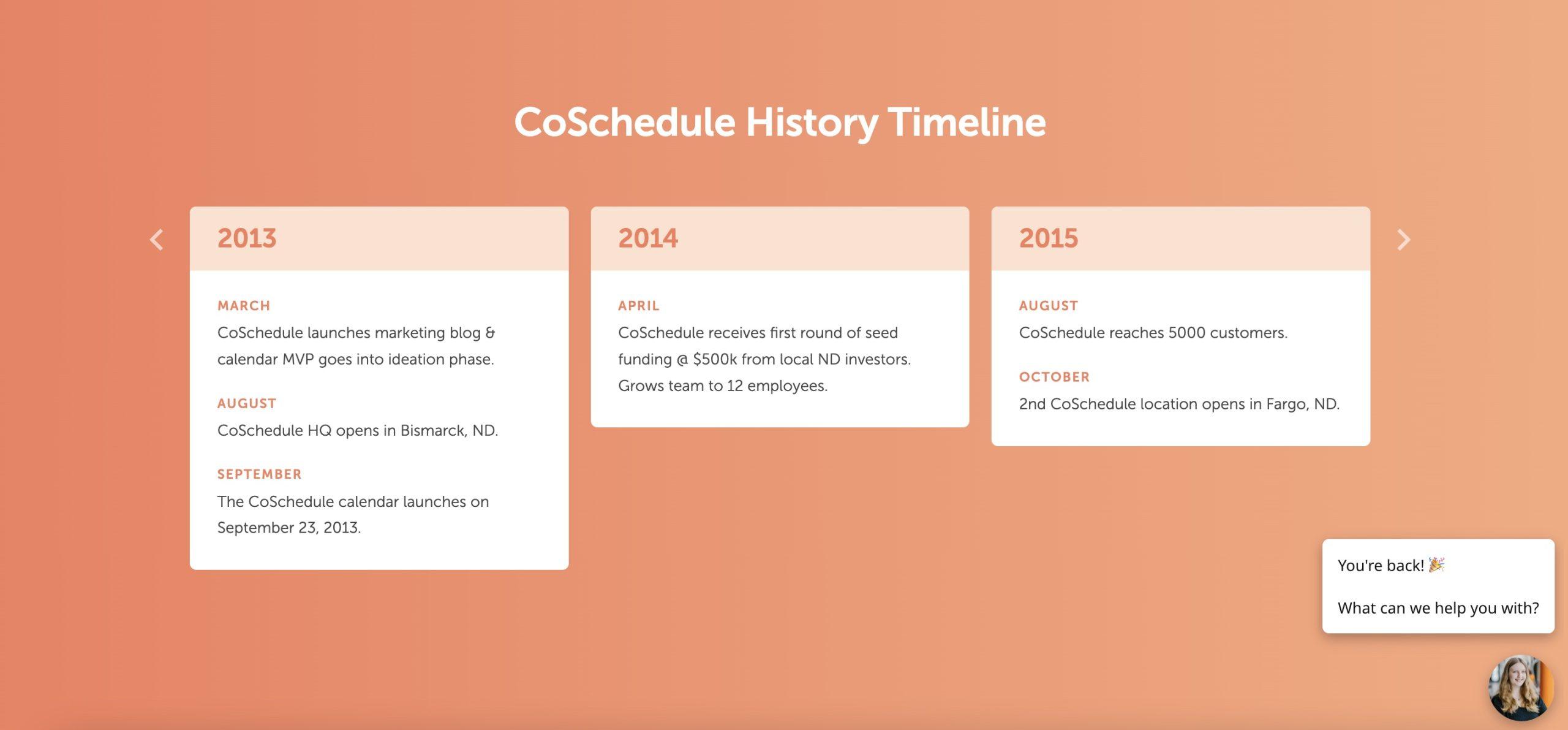 To get started, follow these steps:
- Figure out your company’s key historical milestones. Set up interviews with internal stakeholders who might be able to help (CMOs, founders, and executives may be good contacts).
- Create an outline. Open up a doc and list them in chronological order.
- Write a quick blurb for each one. If you’ll be creating a company history graphic, keep each point punchy to keep the visual flow moving.
- Timeline.js: Free and open-source tool for building interactive timelines.
- Piktochart: This freemium infographic design tool can be used to create timelines.
- Canva: Similar to Piktochart. Easy to use and offers tons of flexibility.
 Another option is to create a standalone company history page and then link to it prominently from your About Us page.
Step 5: Incorporate Your Values
Most companies have some sort of core values or principles. These are usually five or six points that guide your culture and business philosophy. These are often treated like something that’s pinned on the wall and forgotten, existing only because someone decided they needed to one day. But, when they’re thoughtfully crafted and ingrained into how your company operates, they can be powerful guideposts for how employees should approach their work and your customers. For example, look at Ben and Jerry’s. Their values are core to everything they do, and they make them clear on their website:
 Source
The page also includes an embedded YouTube video that helps communicate their mission and values:
Step 6: Include Visual Elements
Next, add your visual design elements. This might include:- Company photos.
- Designed graphics.
- Slide decks.
- Videos.
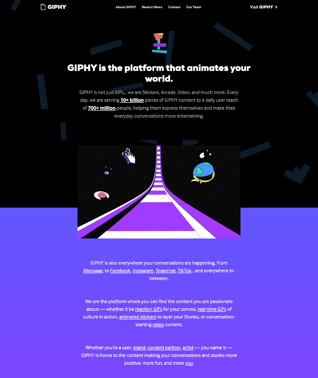
IMAGE TITLE: HEADLINE: DESCRIPTION: ON-IMAGE TEXT:This should give them enough to bring your idea to life. If you want your page's backdrop to stand out, GIPHY will show you how to do it right. After a brief animation outlining the company's mission and ideals, the page transitions into an augmented reality–style GIF that transports readers into the story. Because GIPHY's purpose is to showcase its proficiency in animated graphics, the company's narrative is most effective when it displays a variety of such effects, all of which are fresh, exciting, and original.
 Source
Step 7: Tell Them What’s Next
In addition to providing basic information about your company, the About Us page can be a gateway to other areas of your online presence, such as a blog post or a social media profile. If you want your readers to learn more about a topic, you should include links to related resources and give some thought to guiding them along their journey by encouraging them to:- Follow your social media accounts
- Subscribe to your email list
- Check out your products
- Submit a job application to your company
- Visit your blog
 Source
Tumblr has two calls to action at the end of its short About Us statement — links to explore the blogging platform and to learn more about the company.
At the end of the page, it also has the option to sign up for its mailing list.
 Source
This piece was originally written by Ben Sailer and published on October 1, 2018. It was updated on December 19, 2022.

