How To Find The Best Blog Image Context For Your Content
 It was mid-autumn, and the air was getting colder. I was walking with a friend down the street, heading to that evening’s symphony performance. As we passed by the county jail on the opposite side of the street, I stopped. I could not believe my eyes.
“Look at that!” I said to my friend. I pointed to the south entrance of the jail building.
Now I know that it is commonplace to see photographers with their clients out and about, shooting photos in alleys, the middle of the street, parks, and especially our state capitol grounds library which has soaring two-story Ionic columns and is about the only place around here that you can get that kind of architectural background. But I admit I was surprised to see a photographer out shooting a very-pregnant woman in a tube top on the steps of the county jail.
“What are they doing?” my friend asked.
“I imagine she is having some pregnancy photos taken. You know, the ones that show a baby bump.”
“But why in front of the jail?”
“I assume they want the Art Deco architecture in the background,” I said, hoping it wasn’t because the baby’s father was inside the jail or that she was establishing some horrific self-fulfilling prophecy of where her child would end up. “I’m not sure the subtlety of the Art Deco elements is really worth it if you have to use the jail as the background.”
Our discussion continued as we walked to the concert, ranging from how cold it would be to wear a tube top on that chilly evening to the proclivity for Art Deco to pop up in North Dakota architecture. But I’ve thought about that incident a lot since then, weighing the photographer’s decision to go for an interesting background for her photo and choosing to ignore the context that background provided. Not everyone would know the photo was in front of the jail, but many would.
Every image carries, and is in need of, context. This is important when it comes to choosing powerful images for your blog posts.
How To Find The Best Blog Image Context For Your Content
Click To TweetEvery Image Needs Context
Benign images—stock photos at their worst—carry very little context beyond that of you grabbing a photo for your blog post because you know it’s a best practice to have one. The problem is that even that seemingly innocuous context can work against your great blog post, suggesting that the copy that goes along with this plain vanilla image is just as unexciting. Every image needs context and has its own context, and all of this can work for or against your blog post and the likelihood that someone will read it.1. A picture is worth a 1,000 words. Any words.
A picture is worth a thousand words. But which thousand? On its own, a photo assumes the context the viewer is most comfortable with. Rare is the image that can’t be interpreted differently depending on what the viewer brings to it. One viewer sees complexity while standing before a Pollock painting, and another sees the handiwork of a kindergartner gone mad. That same painting evokes different reactions, too, depending on whether it is hanging in an art gallery or on the wall of an elementary school. A few weeks after the jail photo shoot, I met a friend for coffee. Out of curiosity, I asked her what she would assume if she saw the county jail in the background of baby bump-type photo. “I’d assume the father of the baby was in jail.” “Really?” Her reaction surprised me, but maybe she was correct. My assumption had been that the Art Deco elements were the goal, but then again, my major was in art and that’s how I see everything. Pollock’s painting will always be hanging in a gallery for me.The context of your images helps define the content in which they appear.
Click To Tweet2. The words you put with an image changes its impact.
Moving beyond the thousand words that your image brings with it, you can include words with images to change its impact. This works best with flexible or peripheral images, those that are illustrating an abstract concept or scenario that could be used lots of ways. These are powerful images because they evoke reader curiosity (which we’ll talk about in a bit). However, they also have to be framed into proper context or confusion arises. For example, imagine an image of a child, head down at a school desk. What does that image mean? If your headline or caption reads: “Almost half of children don’t eat breakfast before school”... ...your interpretation of that image would be different than if that same text read:
“How to blame your dog for eating your homework, and other productivity hacks”.
 The same image can mean very different things. The words you use with an image puts it into context so that you don’t have to wonder if the baby’s father was in jail or if the mother loved Art Deco architecture.
3. Images pulled out of context take on new context.
Several years ago, I was reading a story online about a man who had been arrested for abusing children after quite a manhunt. The story had only one photo, a small headshot of the reporter who wrote the story. It was the newspaper’s practice to include the headshot of the author. The headshot was a few paragraphs down, embedded in the text of the story, on the right. The problem was that there was no other photo for the story. As this story was shared on social media, the bold headline that told of a man who had committed a horrific crime against children was associated with an image of the reporter. By the next day, the headshot was pulled from the article, so this unfortunate realization must have occurred to the newspaper, too, but I’d already seen the article shared on social media with the grinning reporter next to the headline, insinuating he was the criminal.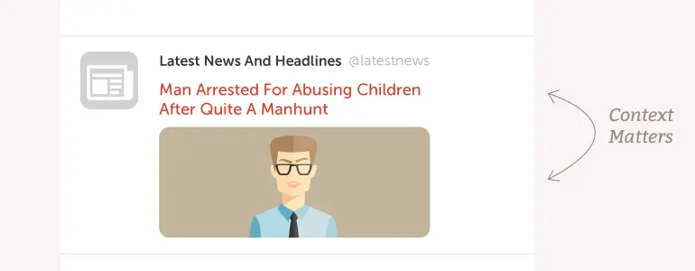 The first rule would be that you should always have a featured image for every blog post so that your headshot or a random ad doesn’t become the image on social media. But there’s more to it than that. A clever or innocuous image that relies on the body copy of a blog post may seem fine, but when it gets shared on social media, all that people may have to go by is the headline and the image. Is the right context still there?
More than ever, headline clarity matters. But so does headline-image match. Look at your blog post’s featured image, the one that you (and others) will be seeing when it is shared on social media. Is the context all wrong? Is the message not what you expected?
Choosing Powerful Images That Work
It isn’t easy choosing an image to go with a blog post, matching image with message. Most of the time is devoted to the actual blog post, and it’s pretty common to toss an image in as an afterthought just before you publish. The image, however, is doing some serious work (such as helping your blog post get read on already image-saturated social networks), so you should give it serious consideration.1. Your image must stand out.
Getting your image to stand out isn’t easy. Every social network is overrun with images. The methods you’ll use to get your image to stand out are, quite simply:- Color
- Startling image
Using humor.
Humor is probably the easiest way to go when it comes to creating a startling image that stands out, but when everyone does it...no one does it well after a while. This is particularly the case with memes. I know that a lot of blog posts recommend using memes and other pop-culture images, but I suggest proceeding with caution in how you choose those types of images. We’ve all seen the Boromir “One does not simply…” meme to death, or the Dos Equis Most Interesting Man In The World meme. Neither are particularly funny at this point, and are almost completely ignorable. In other words, they are no longer a startling image because they became overused. Humor startles when it’s fresh and stinks when it’s stale.Shake up assumptions.
Startling images are hard to come by, at this point, and completely subjective. However, you can use an image out of typical context and make a strong point for your blog post that is completely within your context. An example is an image I found for a post Garrett wrote several years ago. Despite the age of the post, that image still comes to mind even now. In his post, he introduced the concept of content marketing to readers, and discussed how it was different from traditional marketing forms. While looking for an image to illustrate the post, I considered the usual suspects: stock photos of computers, people, pens on notebooks, guy holding a loudspeaker—you know the kind of generic images I’m talking about. And then I found this: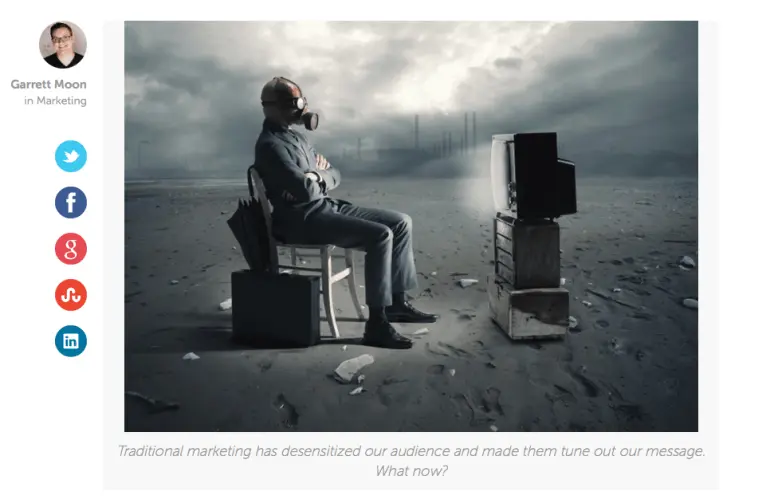 The color (or the lack thereof) is striking, but the image itself is also startling. And the image, in conjunction with the title (“What Is Content Marketing?”), is startling, too. It inspires curiosity that could get someone to read your blog post, because what would a post-apocalyptic dystopia have to do with content marketing?
When I stumbled across the image in the stock photo gallery, I was immediately drawn to it, and it suddenly occurred to me that it perfectly illustrated the problem that content marketing solved. In the wasteland of marketing, there had to be a better solution.
I captioned the image, “Traditional marketing has desensitized our audience and made them tune out our message. What now?” and used it to tap into the initial problem that filled the introductory paragraphs of the blog post (to which content marketing was the eventual solution, of course).
Another example is this post, a blog post about capturing ideas. Avoiding the usual imagery of a lightbulb, post-it notes, or someone with question marks above their head, I went with goldfish in a bowl that had striking orange-blue (complementary/opposite) colors.
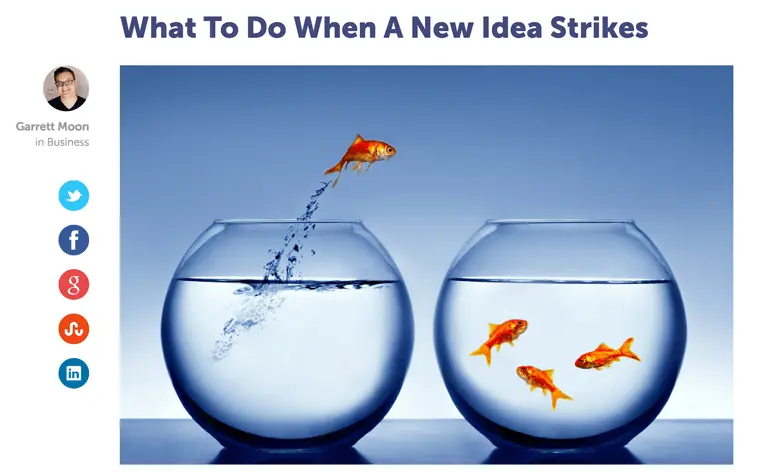 An example of blog image context with an unusual, interesting visual.
2. Your image should illustrate the idea.
Not every post will have a post-apocalyptic dystopian photo to go with it (nor should it), but you should always try to match your graphics up to the big idea in your post. What I mean is that your post is about something bigger than a computer keyboard or a jar of pens or whatever other generic stock photo image you so often see on blog posts. Boring imagery often illustrates objects that are related to the topic instead of the higher concepts. Sure, a computer is related to content marketing, but who cares? This is tricky, particularly if you are pressed for time and know that you need to have an image with every blog post so that it fares well on social media. It takes serious time to find or create images that perform this level of illustration. One of my favorite illustrations is the one Ashton did for a blog post I wrote about creating content for fragmented audiences.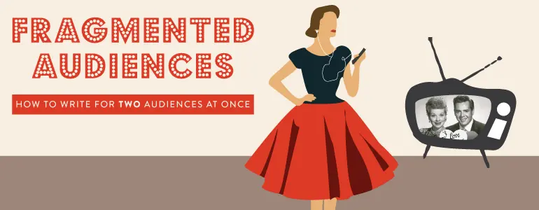 When Ashton finished the illustration and sent it to me for review, I absolutely loved it. She illustrated the big idea perfectly, showing two forms of fragmentation (generational and device use) in one simple image. The image hit on concrete points in the post as well as showed, at a glance, the challenge a fragmented audience presented to content marketers.
The post-apocalyptic dystopia image from #1 fits this criteria, too, by addressing the big idea behind the problem which requires the solution outlined in the blog post.
Any image is better than none (mostly), but part of your editorial planning should be about deciphering the big idea in your post and finding or creating imagery that illustrates that instead of peripheral objects or actions that don’t mean anything.
3. Your image could evoke curiosity.
As long as your image isn’t fighting the proper context (i.e. suggesting the opposite of what your blog post is about), it could function successfully even if it is vague (sort of like the examples in #1). Let’s take a look at an old blog post of mine from several years ago. The blog post is about how the people you follow on social media can actually change you and how you view and react to things. When I set about trying to find an image that would go with the post, I wanted to avoid social media logos, stock photo people, or those creepy white stock photo balloon stick figures. But this was a tough topic to find an image for. Should I find something that illustrated the concept of following? Of social media? Of change? These were abstract ideas, which are hard to find images for. I decided to focus on the idea of “view”, and I ended up using this image: It was visually strong with its graphic circles and bold red element, fulfilling #1. It’s a photo of camera filters, suggesting the idea of how the people we follow on social media filter our understanding and view. Now, in hindsight, I’d have gone back into the post to rework the copy a bit to highlight this concept, freely using the camera/lense/viewfinder/filter analogy so that it would make better sense to the reader. That would have made it work better.
How Will You Explore Blog Image Context?
In a nutshell, this post is about understanding how context can affect a reader’s interpretation of an image, and what you can do to frame that context. And then, it’s about playing around a bit with context, bending those rules as far as you can so that you choose blog post images that really get attention and get readers to read.How To Find The Best Blog Image Context For Your Content
Click To Tweet

