Mobile Marketing Strategy: How to Build One the Smart Way

 How is your mobile marketing strategy doing?
If you can’t answer this question, it’s time to change that. Data shows that marketing is going mobile more and more by the day. In fact, there’s a good chance you’re reading this on a mobile device right now.
Let’s take a look at some numbers:
How is your mobile marketing strategy doing?
If you can’t answer this question, it’s time to change that. Data shows that marketing is going mobile more and more by the day. In fact, there’s a good chance you’re reading this on a mobile device right now.
Let’s take a look at some numbers:
- Mobile accounts for 65% of the time people spend consuming media
- 59% of smartphone owners expect websites to be mobile-optimized
- 68% of companies are investing in mobile marketing
- How to understand the way your audience uses their mobile device.
- How to optimize your brand’s overall mobile presence.
- How to measure the impact of your efforts.
Mobile Marketing Strategy: How to Build One the Smart Way
Click To TweetDownload Your Free Mobile Marketing Strategy Pitch Deck Template + Infographic
Doing mobile marketing right requires cross-team collaboration and leadership buy-in. To help state your case, use this free Mobile Marketing Pitch Template. It’s pre-built with important statistics you can use to build the business case for investing in mobile marketing. It also includes fill-in-the-blanks sections to tailor your proposed strategies, tactics, and recommendations to your own situation. Plus, we’ve also included a free Mobile Marketing Infographic packed with stats and curated research. With these resources and the information in this post, you’ll have everything you need to educate your team and implement a comprehensive mobile marketing strategy.Why Should You Care About Mobile Marketing Strategy?
According to Hitwise, nearly 60% of searches come from mobile devices. That’s an enormous number. For marketers, that means your content needs to be optimized for mobile experiences. If it isn’t, you could risk missing opportunities to convert more website visitors into customers. This number is an average compiled from data across 11 different industries. Even at the low end of the graph, 39% is still a significant amount of searches.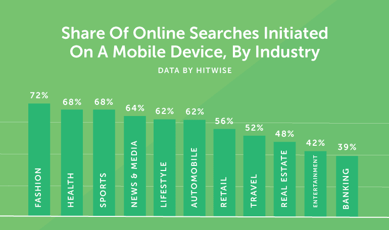 There’s one thing this data makes abundantly clear: you need to develop a mobile marketing strategy. Like so many things in the marketing world, this is easier said than done. However, with the right approach, you can make sure you’re not missing out on as much as 72% of your total potential audience through organic search.
If you’re ready to build your own mobile content strategy, keep reading. We’re about to dig into:
There’s one thing this data makes abundantly clear: you need to develop a mobile marketing strategy. Like so many things in the marketing world, this is easier said than done. However, with the right approach, you can make sure you’re not missing out on as much as 72% of your total potential audience through organic search.
If you’re ready to build your own mobile content strategy, keep reading. We’re about to dig into:
- Develop a strategy for mobile marketing
- Optimize content for users on the go
- Plan and execute your strategy with CoSchedule
Ready to build your #mobile #marketing strategy?
Click To TweetDeveloping a Mobile Content Strategy
Plan your work. Then, work your plan. We say this all the time at CoSchedule. If you’re going to succeed, you need to know what you’ll do, before you sit down to get it done. Preparing a mobile marketing strategy is no exception. It isn’t enough to ask your developers to build you a responsive website and then call it a day (although responsive design is important). You need to put real thought into how you’ll reach mobile audiences, and what your online presence really looks like to those users.Recommended Reading: The Complete 14-Step Content Strategy That Will Boost Your Results By 434%
Understanding How Your Audience Uses Mobile Devices
Knowing where your audience uses their phone or tablet can help inform how you reach them. For example, people traveling to a new city will likely look for restaurants, hotels, and events near their destination. A farmer might browse their social media while riding in the tractor (no, seriously). An office worker could catch up on industry news with their iPad while lounging on the couch. Each of these people has a different purpose for being on their device. Accordingly, they have different expectations, too. If you know how they’re likely to find you, then you can be better prepared to provide them with the right content, at the right time. Here’s how you can gain this insight.Run A Survey
Ask, and you shall receive. Run a simple poll with Polldaddy or Survey Monkey and ask people how they use their device. Here are three simple questions your survey can include:- Which types of mobile devices do you use? [Phones, tablets, etc.]
- Where do you access content with your phone or tablet? [At work, at home, while traveling, etc.]
- What types of content do you consume on your mobile device? [News, entertainment, video, blog posts, social media, etc.]
Use Google Analytics
Google Analytics can give you some idea how your audience is using their mobile devices, too. Log into your account. Then, click Audience, and drill into the Mobile drop-down: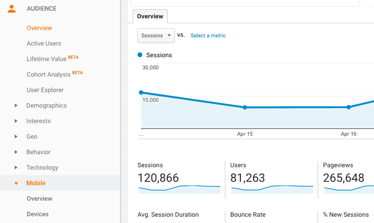 Next, click onto Overview. Here, you can get a breakdown of how many of your website visitors are on mobile or tablet.
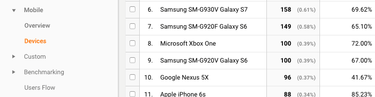
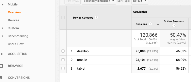 Under devices, you can also see which specific phones or tablets people are using to find you:
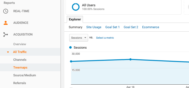
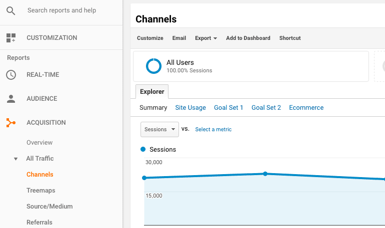
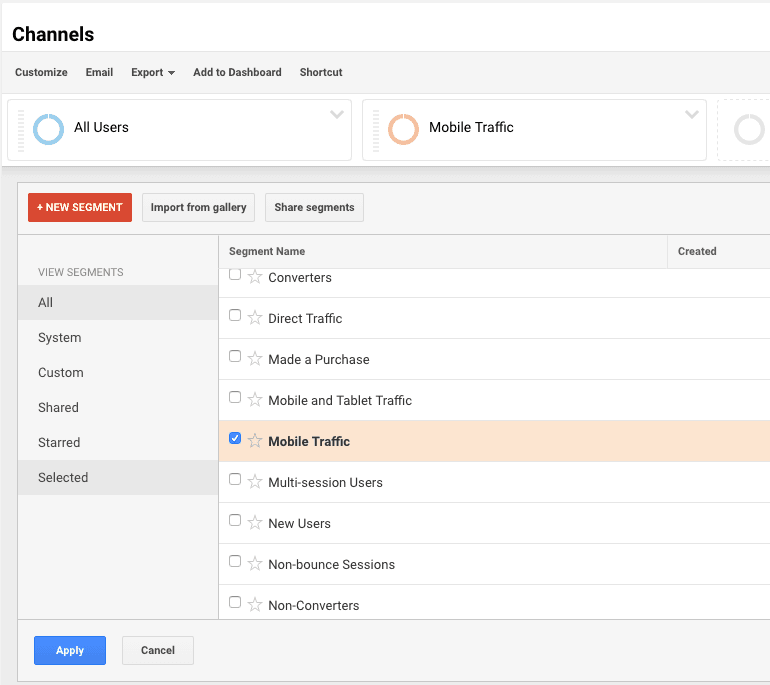
 Next, click on Users Flow. Then, click All Users, and scroll down to and click Mobile Traffic. Once you’ve done this, click Apply. You’ll then see something like this:
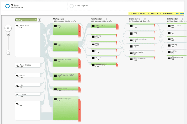 Now, you can see where mobile users land on your site, and where they go next from there. This can help you determine which pages and content are most interesting to your mobile audience.
NOTE: Google Analytics separates Mobile (as in mobile phones) and Tablet traffic. If you’d like to see your user flow from tablets, repeat the previous steps, but scroll down to the bottom of the All Users window, and find Tablet Traffic: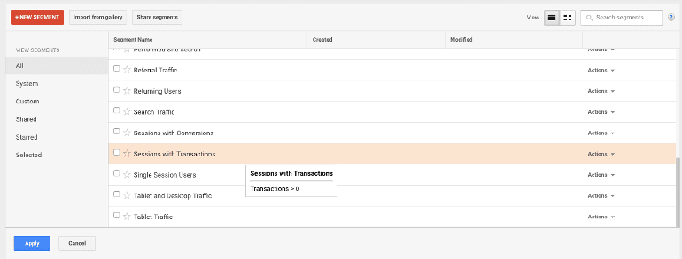
Optimizing Content for Mobile Devices
When you’re ready to execute your mobile marketing strategy, you’ll need to be prepared to optimize your content specifically for mobile users.Writing for Mobile Devices
Phone screens are relatively small. Even larger phablet-type phones are small compared to the PC you’re probably writing your content on. That means you’ll need to write in a way that’s easily readable on a smaller screen. Here’s how. Use Bullet Points: Bulleted text is easily scannable. If you have information that can be condensed down to list form, bullet it out.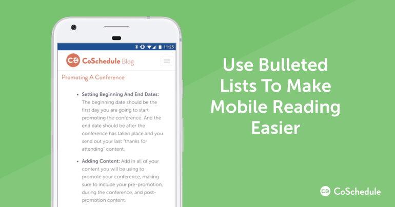 Write Short, Punchy Headlines: This is a matter of space. Shorter headlines fit better on smaller screens. If you can keep them down to six or seven words, they’ll be more likely to hook the attention of someone scrolling by. Longer headlines may get cut off the screen, and therefore be less appealing to click.
Here’s an example of a well-optimized headline for mobile:
Write Short, Punchy Headlines: This is a matter of space. Shorter headlines fit better on smaller screens. If you can keep them down to six or seven words, they’ll be more likely to hook the attention of someone scrolling by. Longer headlines may get cut off the screen, and therefore be less appealing to click.
Here’s an example of a well-optimized headline for mobile:
 And here’s an example that could be condensed:
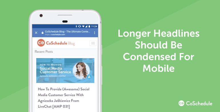 In this example, the headline is shortened and legible on the graphic, which is easier to read on a mobile device.
It might not be possible to optimize every headline you write this way. However, it’s worth keeping this in mind as you and your team are crafting content.
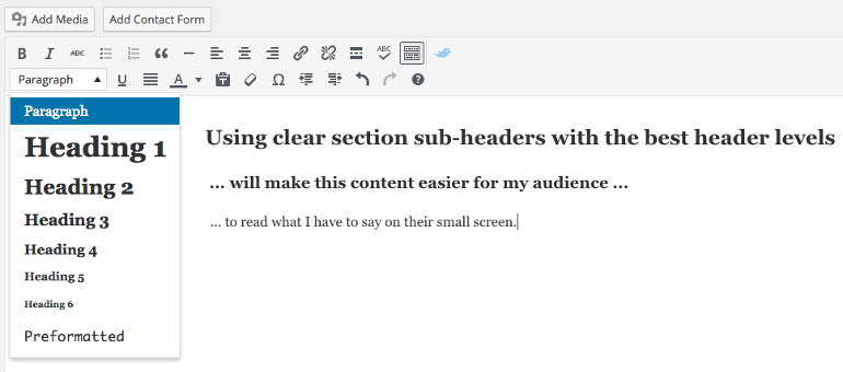
Use Clear Section Headings: Make use of H2 and H3 headings. If possible, avoid using anything H4 or smaller, since it can create a cluttered visual appearance with too much visual hierarchy going on. If you’re using WordPress, here’s where you’ll find your header controls:
In this example, the headline is shortened and legible on the graphic, which is easier to read on a mobile device.
It might not be possible to optimize every headline you write this way. However, it’s worth keeping this in mind as you and your team are crafting content.
Use Clear Section Headings: Make use of H2 and H3 headings. If possible, avoid using anything H4 or smaller, since it can create a cluttered visual appearance with too much visual hierarchy going on. If you’re using WordPress, here’s where you’ll find your header controls:
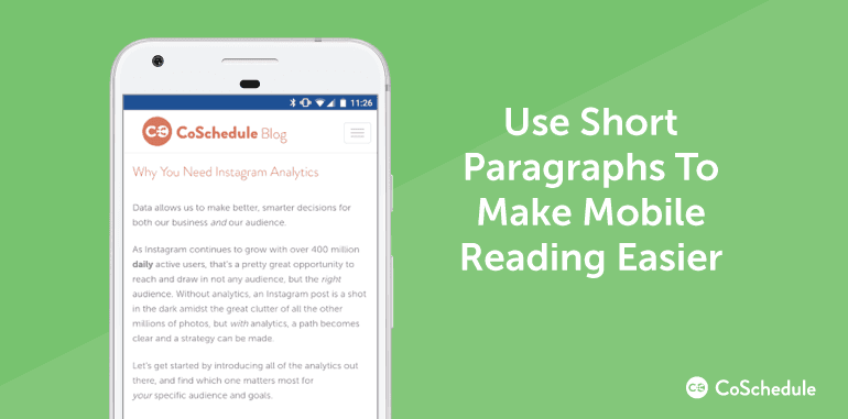
 Keep Paragraphs Brief: Giant walls of text are a pain to read on phones. Keep your sentences under 25 words and paragraphs two or three sentences each. You can exercise a small amount of leeway on this but do so sparingly.
Here’s an example of a piece with crisp, concise paragraphs:
Keep Paragraphs Brief: Giant walls of text are a pain to read on phones. Keep your sentences under 25 words and paragraphs two or three sentences each. You can exercise a small amount of leeway on this but do so sparingly.
Here’s an example of a piece with crisp, concise paragraphs:
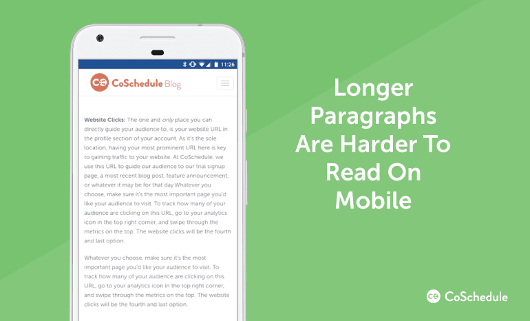
 And here’s another that’s decidedly more difficult to read:
 Front Load Email Subject Lines: Email subject lines get cut off at a shorter length on mobile than they do on desktop. So, place your most attention-grabbing copy at the beginning of your subject line.
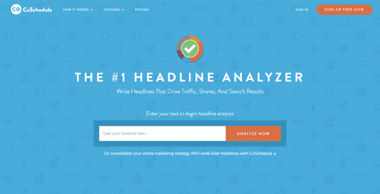
If you’d like to preview what your subject line might look like, use our Headline Analyzer Studio. Enter your subject line:
Front Load Email Subject Lines: Email subject lines get cut off at a shorter length on mobile than they do on desktop. So, place your most attention-grabbing copy at the beginning of your subject line.
If you’d like to preview what your subject line might look like, use our Headline Analyzer Studio. Enter your subject line:
 Then scroll down to here:
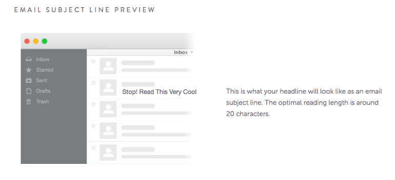 You’ll now have an idea how your subject line will appear.
Recommended Reading: This is the Way to Write Email Subject Lines That Get More Clicks
Optimize Your Visual Content For Mobile
Well-optimized can make or break your mobile experience, too. Follow this advice to keep your mobile presence finely tuned. Use Optimal Image File Sizes: Upload images to your site or blog at the exact size you want them to appear. Otherwise, your CMS will be forced to resize them as your pages load. This will cause them to load slower, and potentially cause users to bounce and visit a different site. If you have a high number of large images on your site (and you’re using WordPress), there may be a quick fix solution here for you. WP Smush is a WordPress plugin that can detect and compress large image file sizes on your site, and bring them down to a more reasonable size:
Technical Website + Blog Considerations
Beyond your actual content creation, your blog and website need to be built with mobile in mind. Here are some ways to ensure both are easy to use on phones and tablets. Use A Responsive Site Design (Or Have a Separate Mobile Site): There is some debate out there over when to use responsive design versus having a separate mobile site. In either case, it’s important to have a site that looks good and works well on phones and tablets. If you’re a marketer, this is something you likely don’t have much control over. It’s also something your development team should understand. However, if this is a pain point or roadblock, discuss with your developers. Here are some talking points you can drop:- 80% of all internet users have a mobile phone. Why leave money on the table?
- Mobile users have different expectations than desktop users. If your site doesn’t cater to them, they’ll leave (and buy from someone else).
- Google favors websites that offer a strong mobile experience.
 And get your analysis in moments:
Mobile Search Engine Optimization Considerations
The way people search, and the things they search for, might be different when they’re on the go (versus when they’re on their laptop or home computer). Keep these things in mind while you’re working on search engine optimization. Optimize For Voice Search: People using their phones are often in busy places and might not stop to type in a search query. Things people on the go typically search for include words like “how”, “what,” or “where.” For example, “How do I get to the nearest coffee shop?,” or “Where is the Museum of Modern Art?” So, how do you find which terms someone might be using to find businesses like yours? Start by doing thorough keyword research as you normally would. Next, consider targeting terms incorporating strings of conversational language around your core keywords. Here’s an example:- Typical Keyword: Brunch new york city
- Voice-Optimized Keyword: where is the best brunch in new york city?
Recommended Reading:
Create the Right Pages to Attract Mobile Searches: In order to show up in local searches, it helps to have the right pages on your site. These could include:
- Location pages (for brick and mortar stores). You want people to find where you are after all, right?
- Posts pertaining to local topics. Remember when we mentioned optimizing keyword research for local search? Create content around those keywords. For example, if people search for "best coffee shops minneapolis," a coffee shop could create a post like, "What Makes Our Coffee Shop the Best in Minneapolis?"
- Your hours and contact information. This is basic stuff, but you’d be surprised how many websites miss details like this.
Recommended Reading: SEO Content Strategy: How to Skyrocket Your Traffic By 594%
Implement Location Data In Your Sitemap: If you have a physical location, local SEO should be a top priority for your business. One way to improve your appearance in local searches (which are often mobile searches, too) is to add location data using schema.org markup.
This video from Simon Hayer walks through this process step-by-step:
- Location
- Contact Information
- Opening Hours
- Price Range
- Review Ratings
- Upcoming Events
 If I’m looking for something to do in my city, this search result gives me a preview into upcoming events before I’ve even clicked a link. It also takes up more space on the search results page.
And if I’m in a hurry or on the go, guess which search result people in this situation are going to tap? It’s the one that’s most noticeable and most useful in that moment. Be the company that provides those kinds of results.
If I’m looking for something to do in my city, this search result gives me a preview into upcoming events before I’ve even clicked a link. It also takes up more space on the search results page.
And if I’m in a hurry or on the go, guess which search result people in this situation are going to tap? It’s the one that’s most noticeable and most useful in that moment. Be the company that provides those kinds of results.
Mobile Email Marketing Considerations
According to Salesforce, 79% of marketers say email marketing drives ROI. Plus, according to research from Kahuna cited on Email Monday, 86% of emails are opened on a mobile device. That means there’s a lot of opportunity to capitalize on mobile email marketing. Know The Numbers: If you believe what works for desktop should work for mobile when it comes to email, consider these statistics:- Mobile accounts for 54% of all email opens (versus 16% on desktop).
- 70% of users delete emails that don’t work well on their phones.
 If you use a similar service (such as MailChimp, AWeber, Constant Contact, or another provider), building mobile-optimized templates should be similarly easy.
However, if you use custom-built email templates, talk to your developer about making them more email-friendly. They’re likely busy people, though, so be prepared to make a case for why it’s important. Here are some talking points you can use to begin your discussion:
If you use a similar service (such as MailChimp, AWeber, Constant Contact, or another provider), building mobile-optimized templates should be similarly easy.
However, if you use custom-built email templates, talk to your developer about making them more email-friendly. They’re likely busy people, though, so be prepared to make a case for why it’s important. Here are some talking points you can use to begin your discussion:
- “Improving the mobile-friendliness of our emails is important for users and bottom line, since research shows 70% of people will delete an email that doesn’t look good on mobile.”
- “Email drives [INSERT ROI PERCENTAGE] for us, and a better email experience could increase that even further.”
- “Our current email [INSERT METRIC] is at [INSERT PERCENTAGE]. However, we know from research findings that 79% of users read email on their phones. We think a better mobile experience could improve our email marketing performance significantly.”
TIP: Be prepared to hear that if your emails are underperforming, it could be because your email content is at fault. Compare your desktop vs. mobile email performance to pull numbers showing this isn't the case (assuming it's not actually the case). If desktop email performance is strong but mobile isn't, then you have a starting point to begin investigating whether mobile-friendly design could help.
Mobile Social Media Marketing Considerations
It feels obvious to say so, but social media is huge on mobile. However, you might be surprised by just how huge. According to Marketing Land, a full 80% of social media activity happens on a mobile device. Here are some tips for making the most mobile for social media marketing. Develop An Event Hashtag Strategy: People want to share their thoughts when they’re at events. So, if you’re hosting an event, develop a unique hashtag. You can bet attendees on their phones will make use of it. Consider Pinterest (If You’re Not There Already): According to Mobile Marketing Watch, “Pinterest is the most mobile social network and 64% of its referred traffic comes from either smartphones or tablet devices.” If capturing the attention of mobile audiences is a priority, then consider creating a Pinterest profile, if your business hasn’t already. Make Social Sharing Buttons Easily Accessible: Again, this is something you’ll need to work out with your developers and designers (if you’re not using an out-of-the-box website or blog theme). If you want people to share your content on mobile, then it needs to be easy to do without thinking about it too hard. Don’t Ignore Instagram: Think your brand can’t benefit from being on Instagram? Think again, especially if you’re targeting teens or young adults. According to WordStream (citing the Pew Research Center), 32% of teens consider Instagram to be “the most important social network.”Mobile Advertising: Are Marketers Missing Opportunities?
People spend a lot of time on their phones. You probably didn’t need us to tell you that. However, did you know U.S. consumers spend an estimated 87 hours a month browsing on their smartphones, according to Smart Insights? That is a staggering amount of time. It might also make you question how you spend your own time a little bit. One thing it should absolutely make you question, though, is how much you’re spending on mobile advertising. According to the same report from Smart Insights, while mobile users spend 24% of their time consuming media on their phone, mobile only accounts for 8% of advertising spending. Take a look at this chart: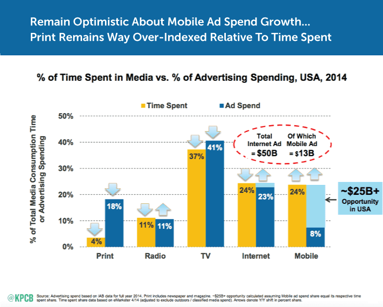 Of course, competitiveness for ad space could differ depending on your industry. One thing that’s clear, though, is there’s opportunity out there for those willing to go after it. If you’re ready to dive deeper into mobile advertising, Single Grain has you covered with this guide.
Could mobile advertising be a missed opportunity for your organization?
Click To TweetMeasuring Mobile Marketing Performance
Once you’ve started optimizing your content strategy for mobile, you’ll want to measure how you’re doing. Fortunately, you can get a lot of insight out of Google Analytics. Visit your account and click Mobile in the left-hand navigation. Under Overview, you’ll see high-level data for your site’s mobile performance: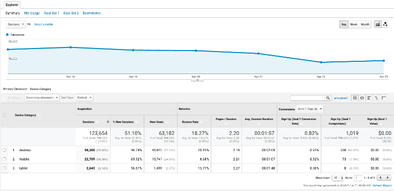 You’ll notice you can also see desktop and tablet stats in the same place. This makes it easy to see how your mobile marketing is performing relative to other types of devices.
Next, click on Acquisition and drill into All Traffic:
You’ll notice you can also see desktop and tablet stats in the same place. This makes it easy to see how your mobile marketing is performing relative to other types of devices.
Next, click on Acquisition and drill into All Traffic:
 Then, click Channels, and All Users:
 Next, scroll down to Mobile Traffic and click Apply:
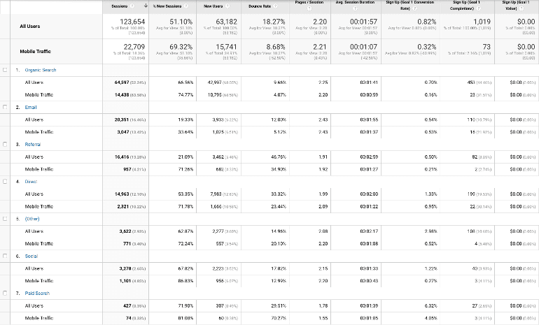
 Now, you’ll be able to see your mobile marketing performance broken down by channel. You’ll also be able to compare mobile stats to your overall performance per channel:
Which Data Should I Be Concerned With?
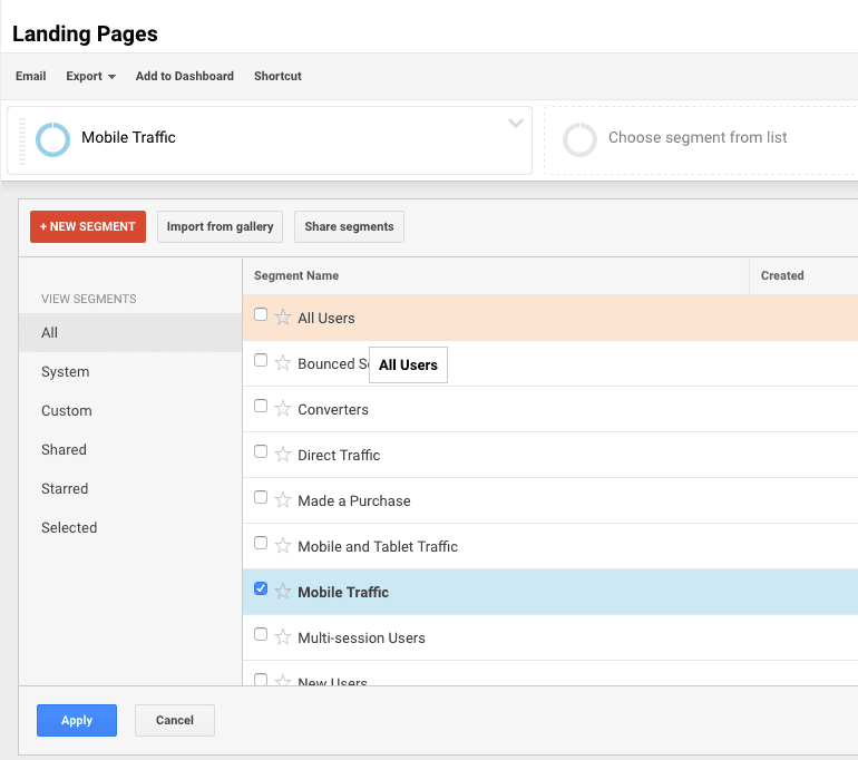
There’s a lot of data you can pay attention to here. However, which data points are the most useful for measuring mobile marketing performance? Let’s look at a few basic metrics. Traffic: Are people finding your site? If they’re not, something could be off with your mobile presence. Since you’re reading this post though, you’ll have no problems crushing it, right? Mobile Landing Pages: In addition to mobile traffic, also pay attention to where mobile visitors are landing. To find this information in Google Analytics, drill down through Behavior > Site Content > Landing Pages: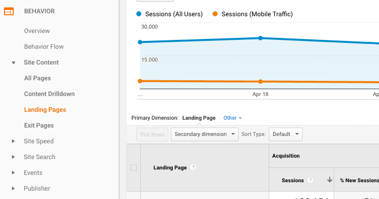 Then, make sure you have Mobile Traffic selected (if you haven’t already). If you’d like to look at just mobile landing pages, be sure to deselect All Users:
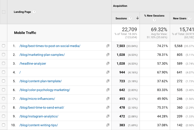
 Now, scope out your top mobile pages:
 Now, there are a couple things to note here:
- Where is your mobile traffic going? Are there pages optimized for mobile that aren’t getting traffic? Or, is there anything else that jumps out as a surprise?
- Which pages are performing best on mobile? Which pages are converting best? Which are driving the most traffic? It may be worth creating more content that’s similar.
 While your mileage may vary, don’t be too alarmed if mobile conversions are lower than desktop.
Bounce Rate: If people are quick to leave your site, something could be turning them away.
However, keep in mind that mobile bounce rates may be a little bit higher than your desktop or tablet bounce rate. According to Rocket Fuel, “Mobile users are more likely to bounce across the board, so it should reasonably follow that any website with a large, growing percentage of mobile traffic will see a higher bounce rate.”
Depending on your site, your mobile bounce rate could be “10% to 20% higher” than desktop. If your mobile bounce rate is considerably higher than desktop though, your mobile site could be turning visitors away. This could be a sign to talk with your development team.
While your mileage may vary, don’t be too alarmed if mobile conversions are lower than desktop.
Bounce Rate: If people are quick to leave your site, something could be turning them away.
However, keep in mind that mobile bounce rates may be a little bit higher than your desktop or tablet bounce rate. According to Rocket Fuel, “Mobile users are more likely to bounce across the board, so it should reasonably follow that any website with a large, growing percentage of mobile traffic will see a higher bounce rate.”
Depending on your site, your mobile bounce rate could be “10% to 20% higher” than desktop. If your mobile bounce rate is considerably higher than desktop though, your mobile site could be turning visitors away. This could be a sign to talk with your development team.
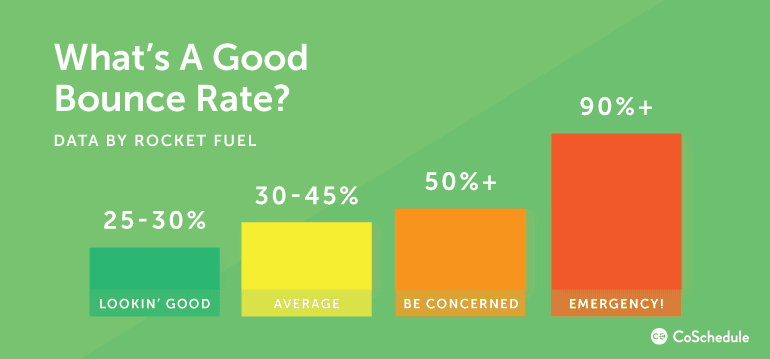 Source: http://www.gorocketfuel.com/the-rocket-blog/whats-the-average-bounce-rate-in-google-analytics/
NOTE: If your bounce rate appears close to zero, but you know you’re attracting traffic, your Google Analytics account may be incorrectly configured.
Going Beyond Google Analytics: Tools And Guides
If you’re ready to step up your mobile marketing measurement, you may require more powerful tools than Google Analytics. Here are some tools and guides to get you started: Tracking Conversions With Neil Patel: Neil Patel is powerful platform is great for tracking all kinds of metrics on a granular level. Follow this guide to use it to track mobile conversions. Measuring Mobile Ad Campaigns With Mixpanel: If you have a mobile app, Mixpanel can help you track how people are using it. Follow this guide to get started.Which #metrics matter most for #mobile #marketing?
Click To TweetCoSchedule Mobile App: Schedule Social Posts on the Go
Before we end this post, let’s talk about our new social scheduling mobile app. With it, you can post to your business or client’s social accounts no matter where you’re at. Given the always-on nature of social media marketing, this is helpful for maintaining the social component of your overall mobile marketing strategy. Here’s what you can do:
- Schedule social messages on the fly. Add social messages to your content calendar at any time. Whether you’re at a conference or on your commute, you can always be prepared to post.
- Stay in the loop away from your desk. No WiFi? No problem. You can now know exactly what social posts you have scheduled, no matter where you’re at.
- Avoid panic attacks. Triple-check, pause, or update any social post, anywhere.
- Stay social. Social media doesn’t always give you much time to react. Make sure you’re ready with the right response when a trending topic or real-time situation arises.
Have you seen the new social media mobile app from @Coschedule?
Click To TweetAdditional Mobile Marketing Strategy Resources
We’ve covered a lot of ground in this post. However, there’s still more to learn. When you’re ready to dive even deeper into mobile marketing, check out these resources:- Mobile Marketing Statistics Compilation: This is a comprehensive list from the folks at Smart Insights. It’s useful to keep around for reference in case you need numbers to build your case for taking on a mobile marketing-related initiative.
- Master Mobile Marketing: 35 Resources To Help You Maximize Your Apps Visibility: We’ve come all this way while barely discussing apps. This roundup provides 35 different resources you can use to optimize your mobile app’s performance.
Ready to Master Mobile Marketing?
We’ve covered how to plan a basic mobile marketing strategy. Now comes the hard part: rolling up your sleeves, and getting the work done.


