The Best Way to Write Sales Case Studies That Get Leads
 As you’re probably aware, social proof plays a major factor in buying decisions. In a survey of online consumers, 85% of respondents said they read up to 10 reviews before they can trust a business.
Not all types of social proof are created equal. A handful of product page reviews might be adequate in order to sell a $10 necklace on Shopify, but in order to sell a high ticket item of $1000 or more - you’re going to need more significant forms of social proof.
For B2B businesses, sales case studies are an excellent tool for driving leads.
Legendary marketer Neil Patel, co-founder of Neil Patel Digital, used email case studies to increase his deal closing ratio by 70%. He increased his sales by 185% by testing 3 different case studies.
In my business, I’ve also had been able to drive significant amounts of leads using sales case studies. You can too—just follow these tips.
Get Your Free Sales Case Study Template Bundle
Don't waste time writing your case study from scratch! Download these three templates and make the job easy:- Sales Case Study Template (Web): Use this Word-based template to craft your copy for your development team to turn into a web page.
- Sales Case Study Template (Word): If you'll be creating a downloadable PDF-based case study, use this Word template to compile your content before handing it to a designer.
- Bonus Audience Persona Template: Better understand the target audience for your case study by building an audience persona.
The Best Way to Write Sales Case Studies That Get Leads
Click To TweetSales Case Study Creation
There are a lot of steps that go into creating a case study. Let's cover them one by one.Create a Buyer Persona
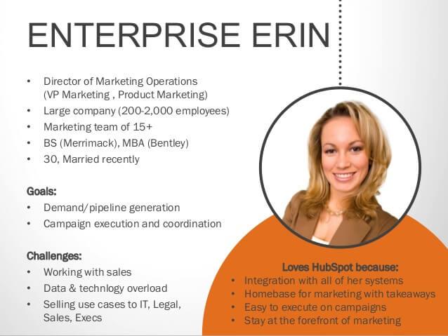
If you don’t already have one, I recommend creating a buyer persona document for your business. Hubspot generously offer a selection of downloadable buyer persona templates, but you can make your own if you wish using the following steps:- Give your persona a name, this allows you to think of them as an individual. You may even want to add a photograph too.
- Create a document with two columns. On the left, list the following demographic traits: age, gender, marital status, education level, income and location.
- Also on the left, add psychographic traits: interests, values, pain points and challenges.
- On the right, carefully craft your answer as best you can for the specific individual.
Select a Relatable Customer
When you know your ideal buyer intimately, you can pick a client for your sales case study who is a perfect representative of this persona - someone other potential clients will be able to relate to. Be sure to feature a headshot from the client, as well as a complimentary quote for maximum credibility. Ideally, this quote should pertain to one of the core strengths of your business (something that your competitors cannot replicate). Tips for creating a killer quote image:- Ensure you receive a high-resolution headshot from your client.
- Use a quote that pertains to the core strengths of your business (something that your competitors cannot replicate).
- Keep the color scheme consistent with the rest of the landing page.
- If you don’t have the resources to hire a designer, consider using Canva to create the quote image for free.

From Problem to Solution
Creating a compelling sales case study requires storytelling. First, you need to consider how your product helped your client go from point A (revisit the common pain points in your buyer persona) to point B. To find out this information, I recommend surveying your client via email (some marketers prefer face-to-face conversations, but I find email to be more efficient since they have more time to think about their answers and you’ve got a written record of the conversation to refer back to). Ask them:- What problems were you experiencing prior to working with us?
- What are your long-term goals?
- What made you choose us instead of a competitor?
- What are some of the (measurable) benefits you’ve received since working with us?
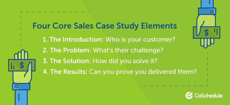
- Introduction: Provide background information about the client’s business, such as the size, business model and types of customers served.
- The problem: Describe what is hurting the business, in logical and emotional terms. For instance, ineffective resource allocation may be slowing production, which diminishes gross revenue, but it also leads to sleepless nights and stress for the business owner.
- The solution: Describe why the client chose you instead of a competitor, and what solution you came up with to solve their problem. This is a great opportunity to showcase your diligence in analyzing the client’s needs and your expertise in solving their problem.
- The results: While I like to include statistics throughout the case study, this is where you can really emphasize the positive long-term change you created, both for the life and business of your client.
 Hopefully, you’ve been tracking the metrics for your client work. Metrics such as total revenue, search traffic, email opt-ins, conversion rate and page views are great to include in a case study - so long as you’ve delivered an improvement over time.
Check out this example from one of Neil Patel’s case studies. He mentions a problem that is undoubtedly common in his niche, then describes his solution along with incredible statistical results for increased credibility.
Without these numbers, the claims could be viewed as boastful rather than authentic.

Landing Page Design
While you might want to feature your sales case study on your homepage or send the case study out as a PDF document to your mailing list, I recommend having a designated landing page for the case study. Weaving a powerful narrative, featuring potent statistics and making your client seem relatable is only one facet of creating a good sales case study. If your goal is to drive leads, your landing page needs to be optimized for conversions. I’ve spent countless hours split testing the headlines, copy, images and CTAs on landing pages, and while it can be tedious, it’s definitely worth it in the long-run for maximizing your conversions.
Especially if you’re diving cold traffic to your landing page through paid ads, it’s important that your landing page is tonally and stylistically consistent with the ad. When someone clicks through to your page, there should be no unpleasant surprises in terms of the color schemes and type of language used.
Dollar Shave Club does an excellent job of providing a cohesive experience for customers that click through to their site from Facebook.
 This ad directs to their home page, which aligns well with the ad's copy and imagery:
 In terms of structuring your landing page, I’ve found that the popular advice for structuring blog posts still applies. Headlines and short paragraphs help to break up walls of text and improve readability.
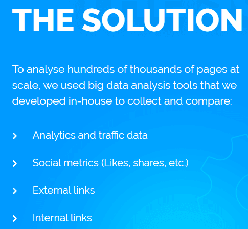
Bullet points are also great for communicating core information succinctly, as shown in this case study for Salesforce:
 If you have powerful statistics at hand, data visualization techniques can allow you to convey them in a more emotionally impactful manner.
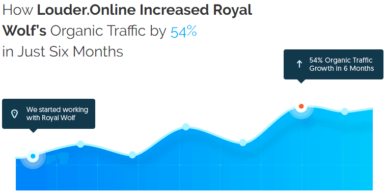
In my opinion, graphs and charts are excellent visual tools for showing how (with your help) a client moved from a miserable point A to a glorious point B. Having produced numerous testimonials, I’m consistently told by my clients that the data visualizations and other visual elements were their favorite parts of the testimonials.
As an example, check out this graph I produced for Royal Wolf to demonstrate the kind of results you can expect over a six-month period.
 Additionally, it’s important to remember that your landing page has one objective: to get visitors to opt-in to your email list. For this to happen, your landing page needs to flow smoothly from one point to the next, until they reach the inevitable opt-in form.
Mentions of other products and links to external sites only distract from this objective. When I see landing pages with abundant distractions, I immediately imagine a highway with roadblocks impeding the traffic.
Clear out those roadblocks and ensure that opting in is as easy as humanly possible.
To reference Neil Patel’s aforementioned case study, the CTA section really stands out (and has probably been split tested mercilessly for the best results).
 Backed by color psychology, orange is one of the most popular color choices for CTA buttons because it pops so well. I love to use orange CTA buttons on sites with neutral or low-key color schemes.
Also, Neil includes a headshot of himself to convey trust and indicate that he brings real customers to sites, not just browsers that will help boost your vanity metrics. This is a crucial distinction when you’re charging premium rates like Neil is.
Promoting Your Case Study
Once you've created your case study, the next step is to tell people about it. Here's how to to do just that successfully.Facebook Advertising
With over 2 billion active monthly users, Facebook is a great channel for finding people that are interested in every niche imaginable. By using Audience Insights, you can figure out what pages people are following within your niche - so you can target them with an ad for your sales case study. While there is an enormous amount of demographic information available in Audience Insights, my favorite feature is Page Likes. If you’re analyzing the fishing niche, type “fishing” into the interests bar on the left. After clicking on Page Likes, you’ll see what other pages people like who share this interest. The affinity score is important to look at because it shows the likelihood of someone liking a page compared to the average Facebook user.
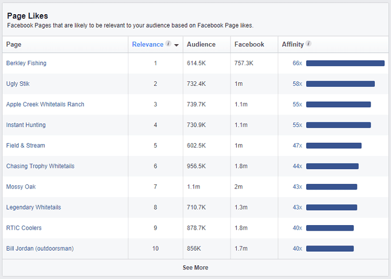 These insights are crucial when it comes to targeting. You will achieve the best results when you’re targeting interests that fanatics (rather than casual fans) would be interested in.
In my experience, it’s the fanatics who are more likely to opt-in to your email list or buy your product.
Before you start running ads, it’s important to know your Customer Lifetime Value (CLV). If you know exactly how much money you expect to make from an email list subscriber in the long-term, then you can budget your Facebook advertising campaign accordingly.
Before you start running social media ads, it's important to know your Customer Lifetime Value:
Click To Tweet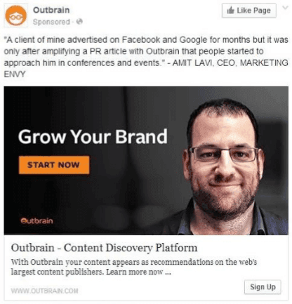
Social Media
If you don’t feel comfortable diving into paid traffic right away, that’s fine. You can still use social media to acquire leads for free. When posting a sales case study on social media, the same rules apply as when you publish a blog post: include a captivating image (such as a client headshot), use emotive language, be succinct, mention key statistics, and include all relevant hashtags. On Twitter, I recommend using your case study post as a pinned tweet, so it stays at the top of your Twitter feed and gets the most attention. In my opinion, Instagram is one of the best platforms for promoting a sales case study. Lots of brands include landing pages (rather than homepages) in their Instagram bios to grab leads, you can do the same with a case study landing page. Foundr, a digital magazine for entrepreneurs, uses its Instagram bio to link to this landing page promoting a $79 startup guide.
If you take the time to post high-value content and follow lots of people who like posts by competitors in your niche (so that they follow you back), you will definitely generate some attention on your Instagram page.
If a link to your case study is the first thing they see on your page and it’s relevant to them, you’ll easily be able to extract contact information from your Instagram followers.
Content Upgrades
A content upgrade is a special type of lead magnet that pertains to a specific blog post. After a person has finished reading a post, you can offer them a free ebook, checklist or case study which gives additional information about the subject - in exchange for the person’s email address. In my experience, highly specific content upgrades usually result in better conversions than generic lead magnets—since you’re delivering value on a topic that they have a proven interest in.In my experience, highly specific content upgrades usually result in better conversions than generic lead magnets.
Click To TweetEmail Marketing
 Sales case studies aren’t only a tool for getting people onto your mailing list. Personally, I find it impactful to include case studies as part of my autoresponder sequence - to warm up people who are already on my list (just remember to segment your list so you don’t resend the case study to people to joined your list via your case study landing page).
Market Hero is an excellent autoresponder that features an abundance of email design themes, a simple drag-and-drop interface and calculates your CLV for you. When you know your CLV, you also know how much money you can spend acquiring leads without taking a loss.
This infographic from Neil Patel breaks down how to calculate CLV as well:
 Successful email marketing involves building rapport, offering high-quality actionable advice and subtly conveying your expertise. Sometimes it’s okay to go for the hard sell via email, but you’ll push people away if you do this too much (a painful lesson I learned in my early years as a marketer).
Aside from the occasional sales email, the majority of your messages should be delivering value—case studies fit in perfectly with this strategy.
As an additional tip, try including a link to your case study in your email signature. This is particularly useful for sales staff or anyone else in your organization that frequently interacts with potential clients.
#Case #study tip: include a link in your email signature.
Click To Tweet


