How to Make Your Infographics More Successful With the Right Best Practices

 All too often, an agency or team will spend weeks coming up with a solid concept, crafting compelling copy, and drawing up stunning designs for their infographic… only for it to fall flat when it’s finally ready to be shown to the world.
Why?
Did they misjudge their audience’s interest in the topic?
Did they miss a step in the process of bringing an infographic to life? Did they bully Zuckerberg as a child, leading to Facebook’s algorithm being specifically devoted to pushing their content to the bottom?
If you’ve got a story worth telling, then it’s worth being shown to the world. At Lemonly, we believe one of the best ways to tick both boxes is with a brilliant blend of copy and design that makes the abstract actionable, the boring brilliant, and the complex concise: an infographic.
All too often, an agency or team will spend weeks coming up with a solid concept, crafting compelling copy, and drawing up stunning designs for their infographic… only for it to fall flat when it’s finally ready to be shown to the world.
Why?
Did they misjudge their audience’s interest in the topic?
Did they miss a step in the process of bringing an infographic to life? Did they bully Zuckerberg as a child, leading to Facebook’s algorithm being specifically devoted to pushing their content to the bottom?
If you’ve got a story worth telling, then it’s worth being shown to the world. At Lemonly, we believe one of the best ways to tick both boxes is with a brilliant blend of copy and design that makes the abstract actionable, the boring brilliant, and the complex concise: an infographic.
 Your content’s performance involves a number of variables, of course, but the fact of the matter is this: a finished piece of content is only the first step in the ever-evolving process of content marketing.
If nobody sees your stuff, does it really matter how insightful or aesthetically pleasing it is?
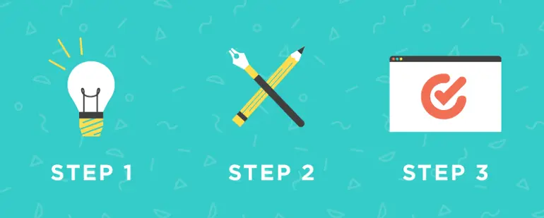
And besides, everybody’s busy. Creating content that goes nowhere isn’t in the best interest of anyone’s time. Any good content marketing team should go into every project with a plan for posting and promoting their pieces online — here’s our three-step suggestion.
Your content’s performance involves a number of variables, of course, but the fact of the matter is this: a finished piece of content is only the first step in the ever-evolving process of content marketing.
If nobody sees your stuff, does it really matter how insightful or aesthetically pleasing it is?
And besides, everybody’s busy. Creating content that goes nowhere isn’t in the best interest of anyone’s time. Any good content marketing team should go into every project with a plan for posting and promoting their pieces online — here’s our three-step suggestion.
How to Make Your Infographics More Successful With the Right Best Practices by @lemonly via @CoSchedule
Click To TweetBonus Checklist: How to Make Infographic in 7 Steps
This post is packed with advice on creating infographics the right way. But, how do you actually follow a process to create a single infographic? Follow this guide created by CoSchedule's own design extraordinaire, Ashton Hauff.Follow this infographic design checklist to make sure every one you create gets done right.
Click To TweetStep 1: Nail Your Infographic Copy + Design
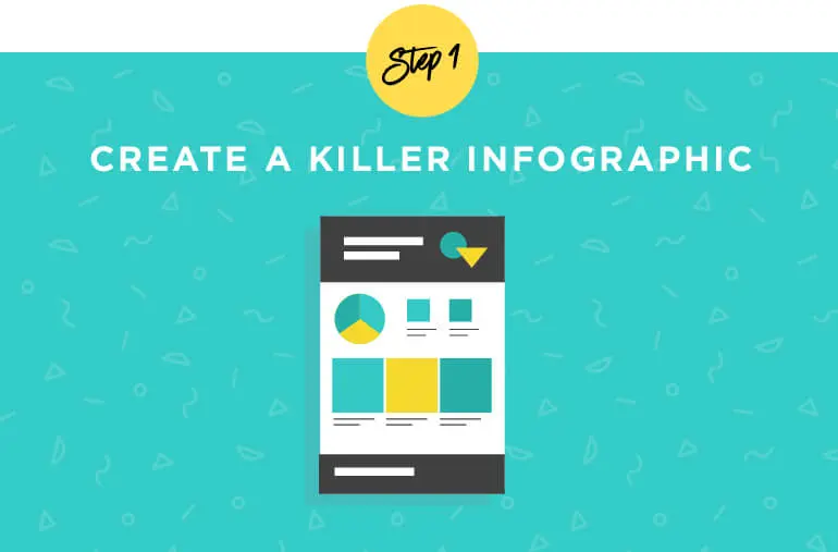 The first step might seem a little obvious, but it’s an important one across the content board.
If you’re going to get in the game, jump in head-first. With as many channels as are competing for consumers’ attention, the highest quality work will always rise to the top. Putting out consistent, quality content establishes a good reputation that will keep people coming back for more.
Call us biased, but we’ve found infographics to be hugely successful when it comes to explaining a process, spreading the word about a new discovery, suggesting a solution, or simply telling a story.
The first step might seem a little obvious, but it’s an important one across the content board.
If you’re going to get in the game, jump in head-first. With as many channels as are competing for consumers’ attention, the highest quality work will always rise to the top. Putting out consistent, quality content establishes a good reputation that will keep people coming back for more.
Call us biased, but we’ve found infographics to be hugely successful when it comes to explaining a process, spreading the word about a new discovery, suggesting a solution, or simply telling a story.
 Infographics combine data visualization with attractive illustrations to form a quick, easy-to-read piece of content that can do some serious heavy lifting.
Though they can be animated, static, or interactive, and can fit into nearly any form factor, the best infographics cover the same key bases.
Even if you’re not an Adobe master, keeping these in mind will lead to a strong infographic that’s well on its way to garnering big engagement for your brand.
Infographics combine data visualization with attractive illustrations to form a quick, easy-to-read piece of content that can do some serious heavy lifting.
Though they can be animated, static, or interactive, and can fit into nearly any form factor, the best infographics cover the same key bases.
Even if you’re not an Adobe master, keeping these in mind will lead to a strong infographic that’s well on its way to garnering big engagement for your brand.
Recommended Reading: How to Make an Infographic in 7 Easy Steps
Start With a Thesis
Great infographics immediately answer “What’s the point?” After all, you’re not just expressing your artistic side. Decide what you want your audience to take away once they close your window, and stick to it. Trying to do too much can water down your main point.Add Clear, Concise Copy
Much like the piece as a whole, having a plan makes writing compelling copy much more simple. Start with an outline that lays out your thesis and supports it with a few key points, then research your topic and add statistics to and other evidence that backs up your claims. Outlines help you keep your information structured and cut down on that intimidating feeling of staring down a blank Word document. It’s a good idea to stick to the “need-to-knows” — too much fluff and you’ll lose your audience.When it comes to infographic copy, stick to the 'need to knows." Too much fluff and you'll lose your audience.
Click To TweetRecommended Reading: The Most Complete Content Editing Process to Avoid Copy Disasters
Design Intentionally
Eye-pleasing visuals are a must, but the best infographics aren’t just beautiful. They’re designed from the ground up to provide a tailored experience only infographics are capable of. Start with an attention-grabbing and topic-clarifying header image, then make sure each section is designed to move the reader’s eye from key point to key point. Each Lemonly project begins with a wireframe and moodboard to make sure our designers are on the same page with every member of our clients’ teams. This may seem like an extra step at first, but we can’t imagine working without them or underestimate how much time they’ve saved us. You should also be mindful about the platform on which your audience is most likely to see your infographic. For example, if your audience is mainly on mobile, you should use larger text and make sure your layout works on several screen sizes.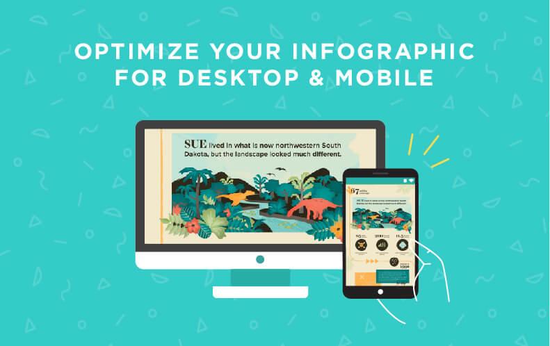
Don’t Leave ’Em Hanging
You already know great infographics tell you why they exist. But the best ones also have an answer for “What now?” Infographics have a gift for inspiring action, but they can’t do it ALL by themselves — tell your readers which course to take. “Make a donation.” “Download the app.” Or the classic “Learn more.” Even if you follow the first three steps to a T, without having a next step, there’s a good chance your readers will just go on with their day and forget your content. Including a call-to-action is one of the easiest and most important parts of the process, meaning there’s no excuse to miss it.Recommended Reading: How to Write a Call to Action With 6 Examples and a Template
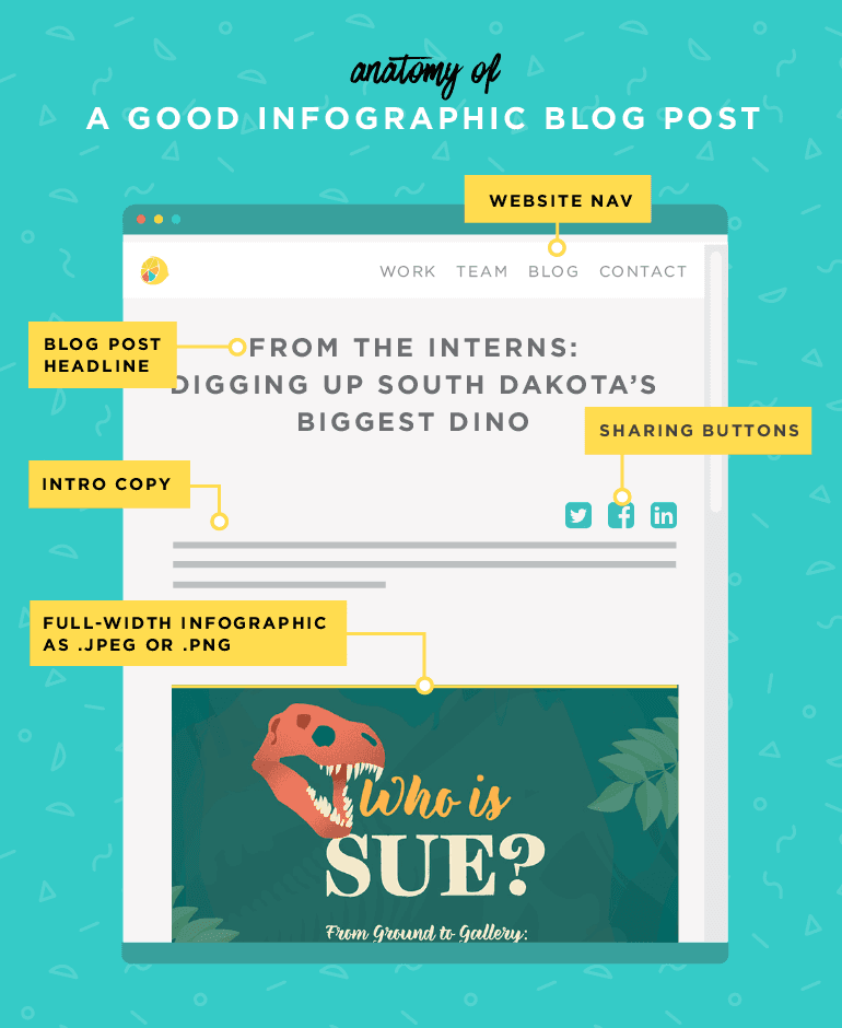
Step 2: Launch Your Infographic On Your Blog or a Landing Page
 Your infographic is complete, but your content process is just beginning.
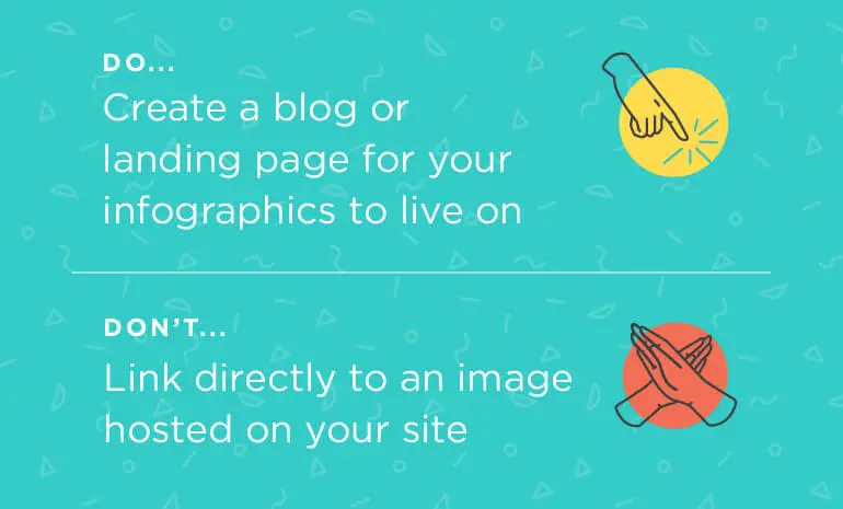
Give your content a place to live by establishing a blog or landing page within your website. This online home supplies readers with context in the form of introductory copy and gives you a convenient way to share your content.
You might be thinking it’d be easiest to simply upload a PDF or host an image on your site, but this is a bad idea. A page with no navigation is a dead end for readers and an invitation for them to leave your website quickly.
Your infographic is complete, but your content process is just beginning.
Give your content a place to live by establishing a blog or landing page within your website. This online home supplies readers with context in the form of introductory copy and gives you a convenient way to share your content.
You might be thinking it’d be easiest to simply upload a PDF or host an image on your site, but this is a bad idea. A page with no navigation is a dead end for readers and an invitation for them to leave your website quickly.
 A blog format also gives you opportunities to accompany an infographic with a video, including fun, relevant GIFs in your intro copy, or even experimenting with things like interactive fields for direct responses from your readers.
Much like your infographic’s call-to-action, you should also link to some recommended posts or other pieces of content at the bottom of your blog — after all, it’s always good to have readers explore the rest of your website, even if other pages don’t directly relate to your content’s topic.
A blog format also gives you opportunities to accompany an infographic with a video, including fun, relevant GIFs in your intro copy, or even experimenting with things like interactive fields for direct responses from your readers.
Much like your infographic’s call-to-action, you should also link to some recommended posts or other pieces of content at the bottom of your blog — after all, it’s always good to have readers explore the rest of your website, even if other pages don’t directly relate to your content’s topic.
Step 3: Promote Your Infographic
 So, your laser-focused and expertly designed infographic is sitting happily in its home on your blog or similar page. Nice! Now, it’s time to let it out into the world by doing what everyone does these days when they have something to say: posting it on social media.
If you read nothing else in this portion of the blog post, read this:
So, your laser-focused and expertly designed infographic is sitting happily in its home on your blog or similar page. Nice! Now, it’s time to let it out into the world by doing what everyone does these days when they have something to say: posting it on social media.
If you read nothing else in this portion of the blog post, read this:
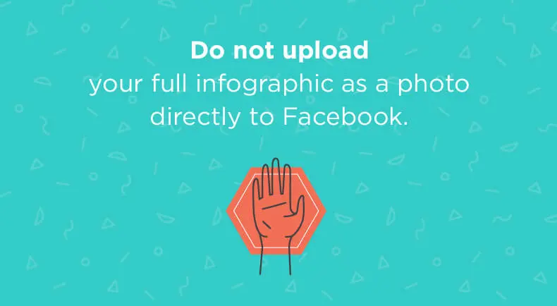 We’ve seen it. A lot. And it’s not pretty — a sad infographic in the News Feed all by its lonesome, surrounded by space with nobody able to read its interesting information. A tragedy not even Shakespeare could have devised.
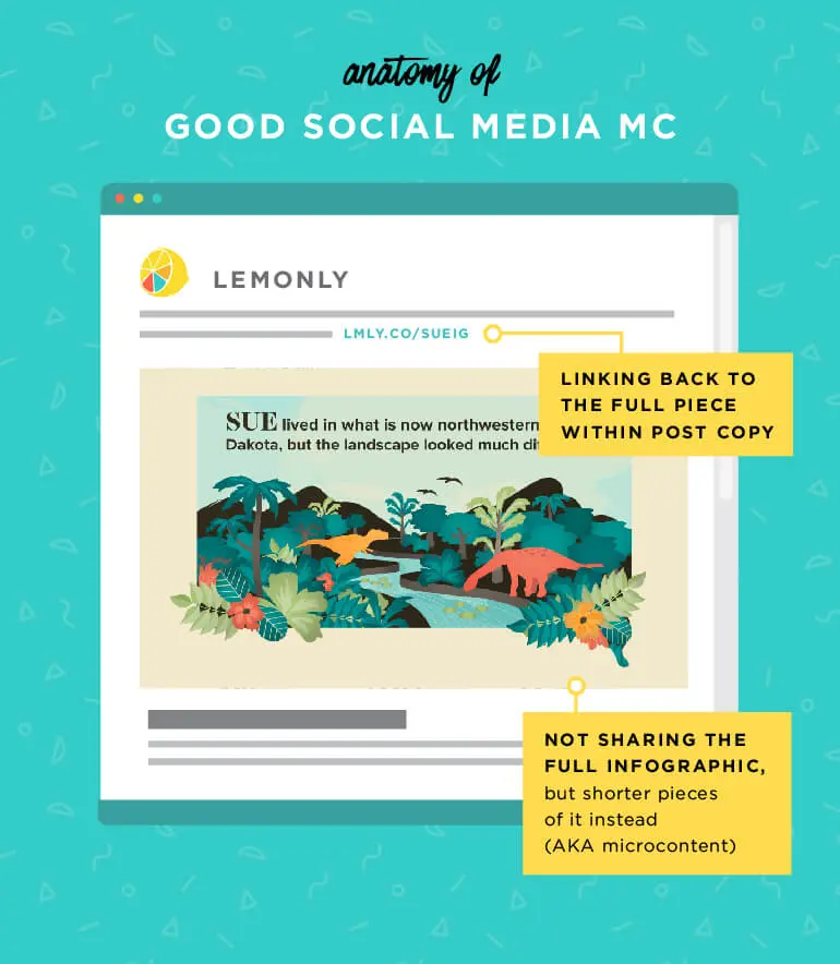
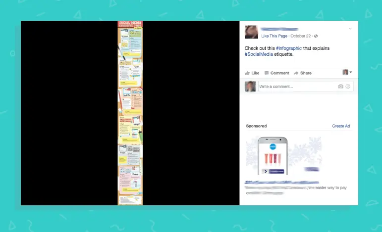 Instead, at the most, you should be sharing only a portion of your infographic.
For a quick fix, choose a compelling section of your infographic, crop it to a 2:1 ratio for a compelling piece of microcontent (a snack-sized graphic that communicates a simple point), upload it to Facebook, and include a link to your blog.
You’re already miles ahead of those poor neglected pieces.
Instead, at the most, you should be sharing only a portion of your infographic.
For a quick fix, choose a compelling section of your infographic, crop it to a 2:1 ratio for a compelling piece of microcontent (a snack-sized graphic that communicates a simple point), upload it to Facebook, and include a link to your blog.
You’re already miles ahead of those poor neglected pieces.
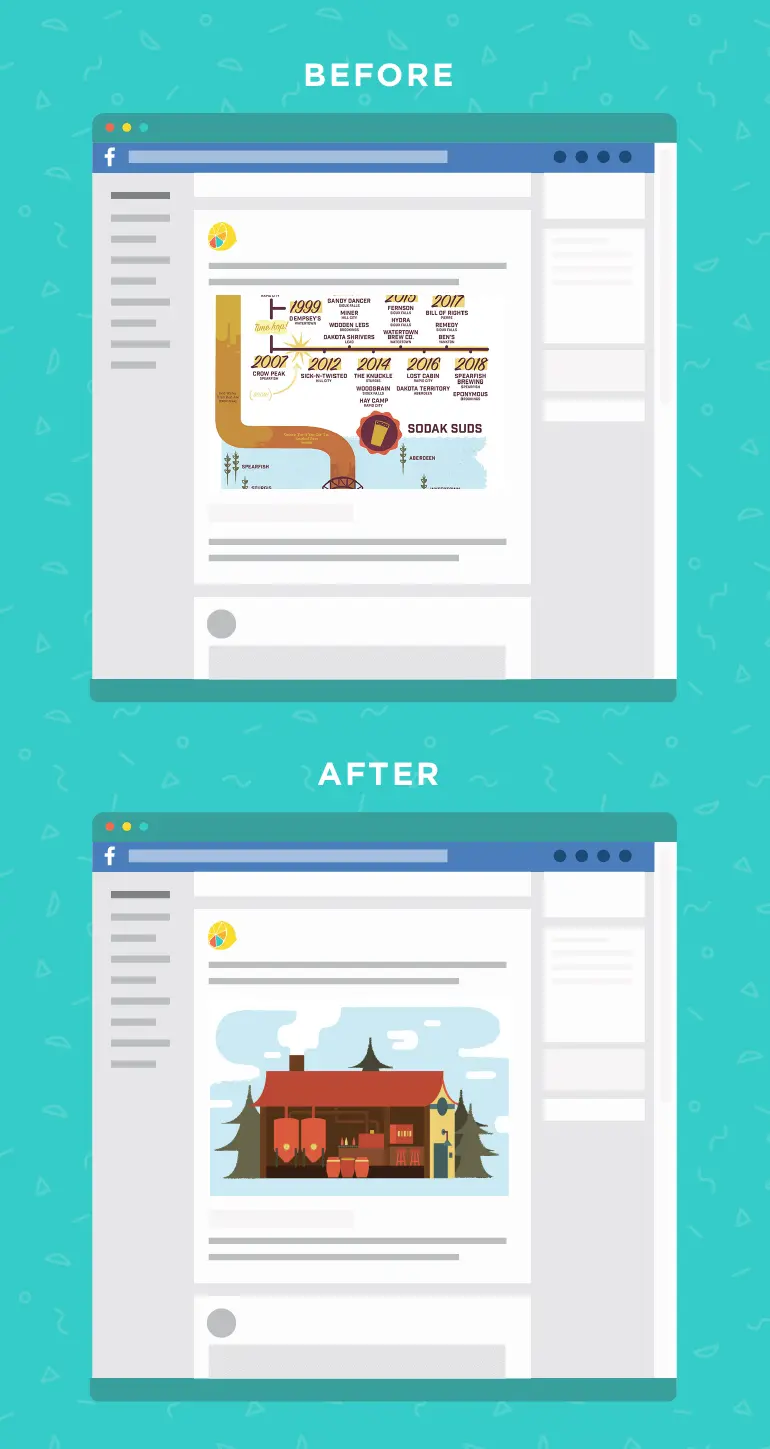
 But to really set your infographic up for success, you’re going to want to create a custom preview image.
Don’t panic — you don’t usually have to start from scratch. Often, you can adapt an image from within your infographic. Clean up some text, remove distracting elements, crop to the correct dimensions and you’re good to go.
A few examples:
Rather than Facebook’s default choice — a random section in the middle of the piece with no context at all — a quaint lil’ brewhouse became a lovely cover image for our South Dakota Breweries infographic.
But to really set your infographic up for success, you’re going to want to create a custom preview image.
Don’t panic — you don’t usually have to start from scratch. Often, you can adapt an image from within your infographic. Clean up some text, remove distracting elements, crop to the correct dimensions and you’re good to go.
A few examples:
Rather than Facebook’s default choice — a random section in the middle of the piece with no context at all — a quaint lil’ brewhouse became a lovely cover image for our South Dakota Breweries infographic.
 And two elements (a map and a couple strolling along the street) came together to form a pretty preview to our guide to the neighborhoods of Charlotte.
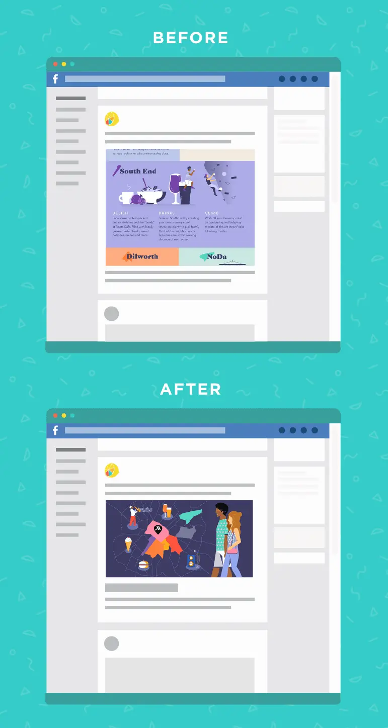 Voila! Don’t those look more enticing if you were scrolling down your News Feed? Two perfect preview images in just a few minutes.
 When Lemonly wants to share one of its infographics, we employ a couple of tools to simplify the process as much as possible.
For starters, we use CoSchedule (hey guys!) to plan our content calendar. It makes moving from idea to execution super simple — we can assign a member of the content team to oversee each project, create checklists to make sure must-haves (copy drafts, image previews for our blog page and social media channels, etc.) are checked off, and easily convert intro copy from Google Docs into WordPress.
We also make use of its WordPress plugins to assign each blog post a specific preview image for Facebook.
When Lemonly wants to share one of its infographics, we employ a couple of tools to simplify the process as much as possible.
For starters, we use CoSchedule (hey guys!) to plan our content calendar. It makes moving from idea to execution super simple — we can assign a member of the content team to oversee each project, create checklists to make sure must-haves (copy drafts, image previews for our blog page and social media channels, etc.) are checked off, and easily convert intro copy from Google Docs into WordPress.
We also make use of its WordPress plugins to assign each blog post a specific preview image for Facebook.
 We don’t just sit back and watch once each infographic has a home on our blog, though.
CoSchedule also makes it incredibly easy to execute what we call a web of content: a network of conceptually and visually consistent pieces that live across your channels and all lead back to your central infographic (or similar content).
We don’t just sit back and watch once each infographic has a home on our blog, though.
CoSchedule also makes it incredibly easy to execute what we call a web of content: a network of conceptually and visually consistent pieces that live across your channels and all lead back to your central infographic (or similar content).

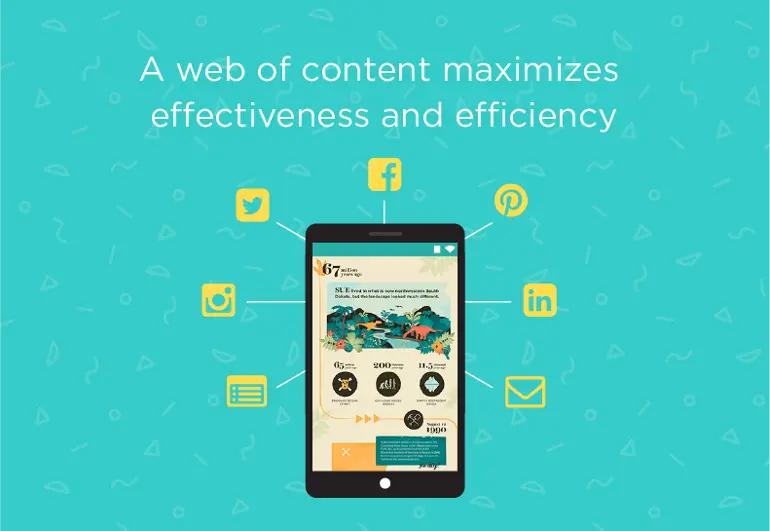 Think of it like a multi-million-dollar Star Wars advertising campaign. They don’t just cut together one commercial and call it good, right? It’s pretty much impossible to go any length of time without being exposed to another trailer, children’s toy, snack, beverage, or pretty much any other product that doesn’t involve a tie-in to everyone’s favorite far, far-away galaxy.
This example takes things to the extreme, but the theory holds up: By building a web of content, you create mutual support between your main execution and its extensions. Win-win!
Using CoSchedule, we can set up posts to go out days, weeks, or even months later, with easy linking back to the original infographic no matter what kind of content we want to put out.
Think of it like a multi-million-dollar Star Wars advertising campaign. They don’t just cut together one commercial and call it good, right? It’s pretty much impossible to go any length of time without being exposed to another trailer, children’s toy, snack, beverage, or pretty much any other product that doesn’t involve a tie-in to everyone’s favorite far, far-away galaxy.
This example takes things to the extreme, but the theory holds up: By building a web of content, you create mutual support between your main execution and its extensions. Win-win!
Using CoSchedule, we can set up posts to go out days, weeks, or even months later, with easy linking back to the original infographic no matter what kind of content we want to put out.
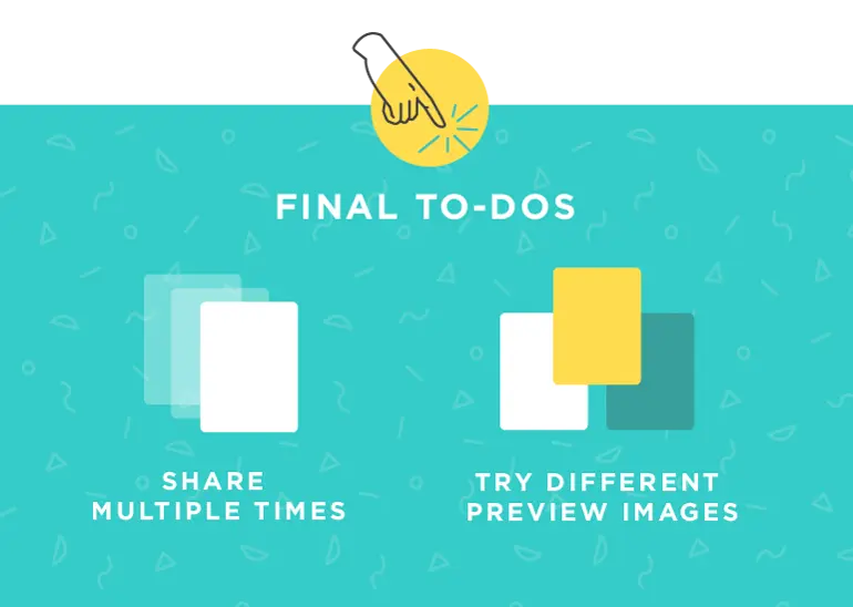 Remember to share your content multiple times. You spent a lot of time creating it, so be sure your audience has a couple chances to check it out!
You shouldn’t feel like you’re spamming your audience — repeated posts combat a multitude of problems. If you have a nationwide or even worldwide audience, posting time can have a huge effect on success.
Tough for something to catch on if half of the people who would find it interesting were asleep when you posted it, after all.
You also shouldn’t be discouraged to dip back into the archives for new social content. Followers you’ve gained since your piece was originally created and posted may find months-old content valuable or interesting, and viewers might even take away something completely different from repeated reads.
Getting your content in front of more eyes means more traffic — try it out!
Remember to share your content multiple times. You spent a lot of time creating it, so be sure your audience has a couple chances to check it out!
You shouldn’t feel like you’re spamming your audience — repeated posts combat a multitude of problems. If you have a nationwide or even worldwide audience, posting time can have a huge effect on success.
Tough for something to catch on if half of the people who would find it interesting were asleep when you posted it, after all.
You also shouldn’t be discouraged to dip back into the archives for new social content. Followers you’ve gained since your piece was originally created and posted may find months-old content valuable or interesting, and viewers might even take away something completely different from repeated reads.
Getting your content in front of more eyes means more traffic — try it out!
Recommended Reading: The Social Media Posting Schedule That Will Boost Your Traffic By 192%
We’ve discussed it a bit, but it’s also worthwhile to try a couple of different image options when sharing your full infographic.
Try overlaying text on a photo, using an illustrated portion of your infographic, use typography to spice up your title. Every user is different, and one type may be more successful in gathering pageviews than the next.
Trying multiple preview options is a great way to A/B test specific projects while fine-tuning your process for the future. If you’re promoting a post that links to your infographic, make sure you’re mindful of Facebook’s text rules so your audience isn’t limited.
Finally, it’s time to sit back and watch the engagement roll in.
TIP: TIP: Establish a platform for monitoring your posts, a benchmark for success, and a process for tweaking and re-posting. Use tools like Google Analytics, Facebook Insights, etc. to help you understand more about your content’s performance.
Now Make Your Infographics More Successful
 We know as well as anyone how much effort it takes to succeed with your content marketing. But with a commitment to quality, a consistent process, and an app or two to help you out, you’ll find that investing time in infographics as well as other types of content is well worth the effort.
Or schedule a customized demo with an expert now.
We know as well as anyone how much effort it takes to succeed with your content marketing. But with a commitment to quality, a consistent process, and an app or two to help you out, you’ll find that investing time in infographics as well as other types of content is well worth the effort.
Or schedule a customized demo with an expert now.


